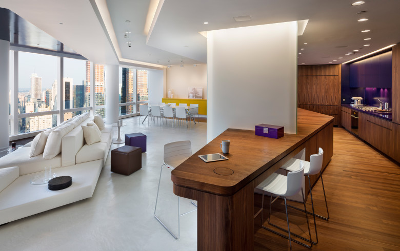
Market Street Penthouse
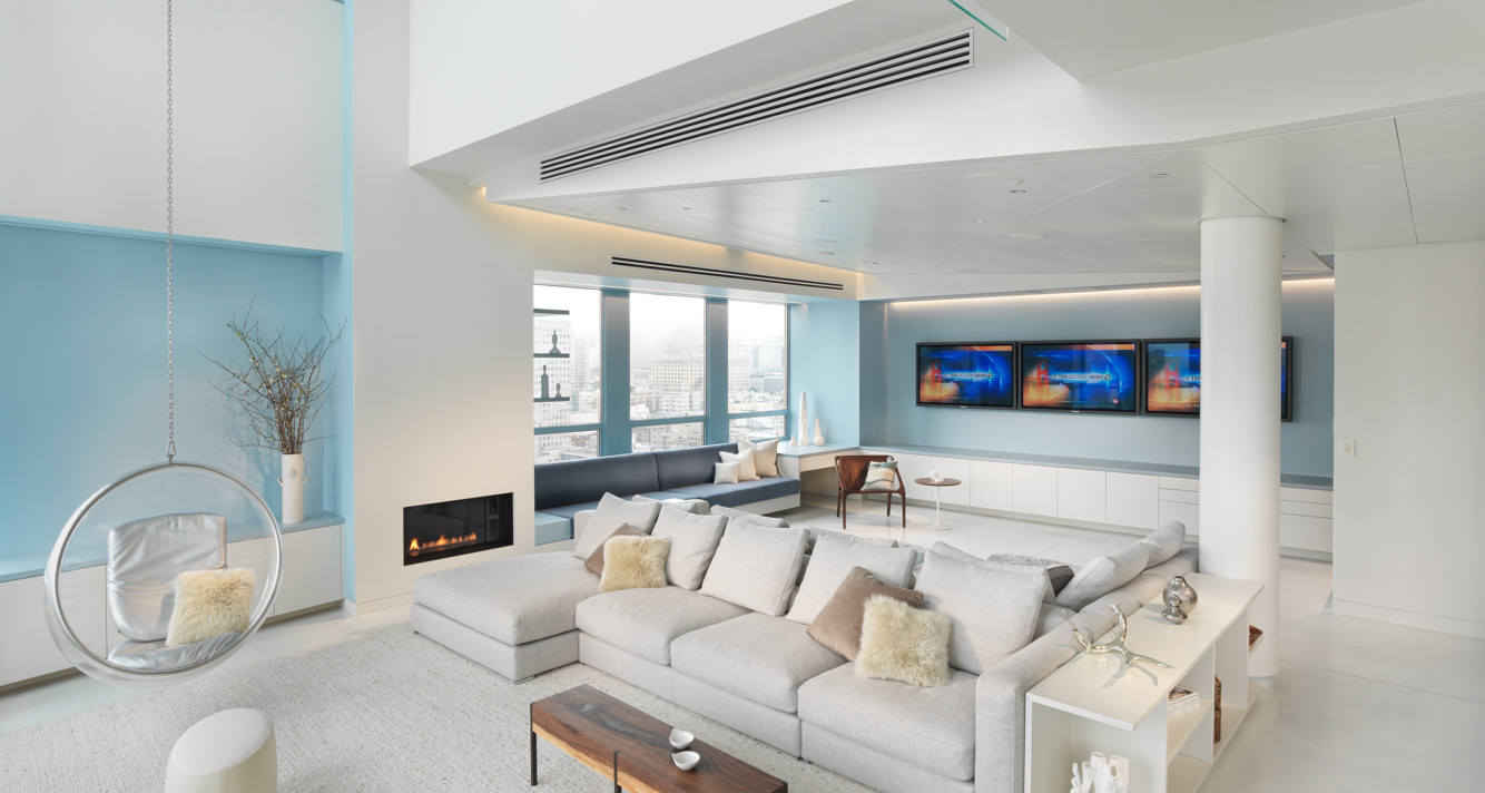
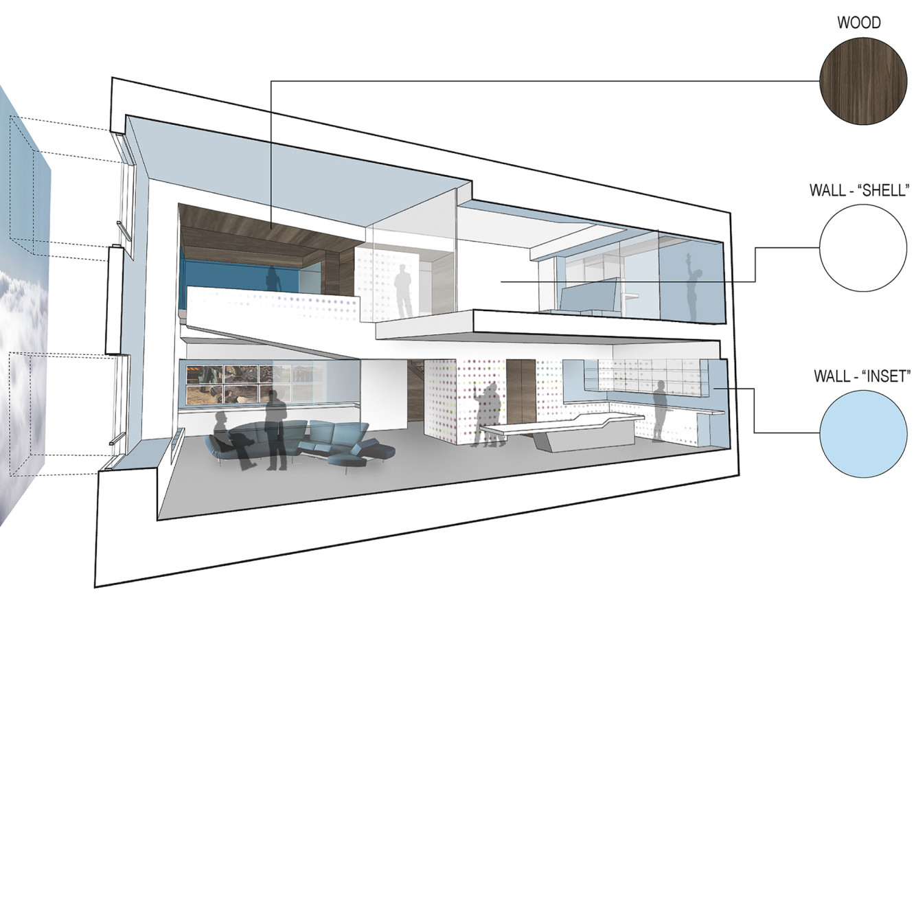
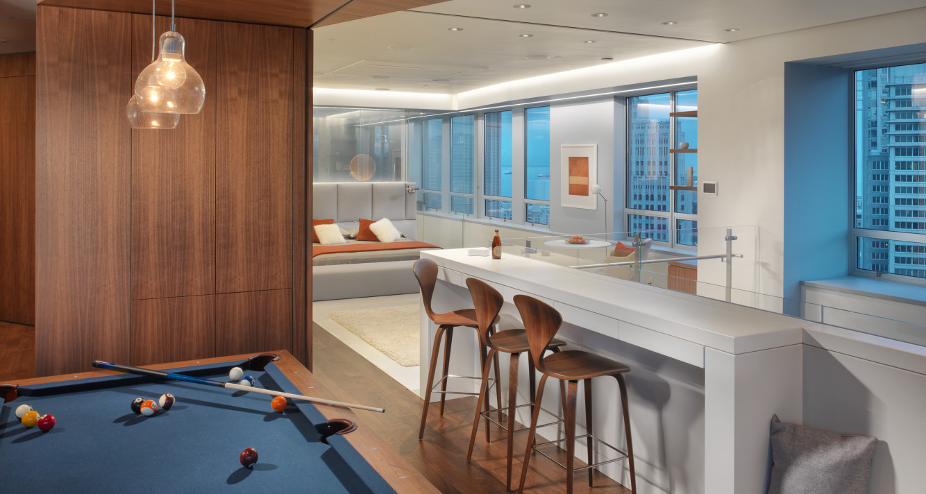
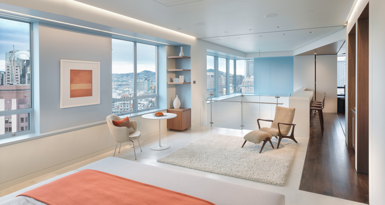
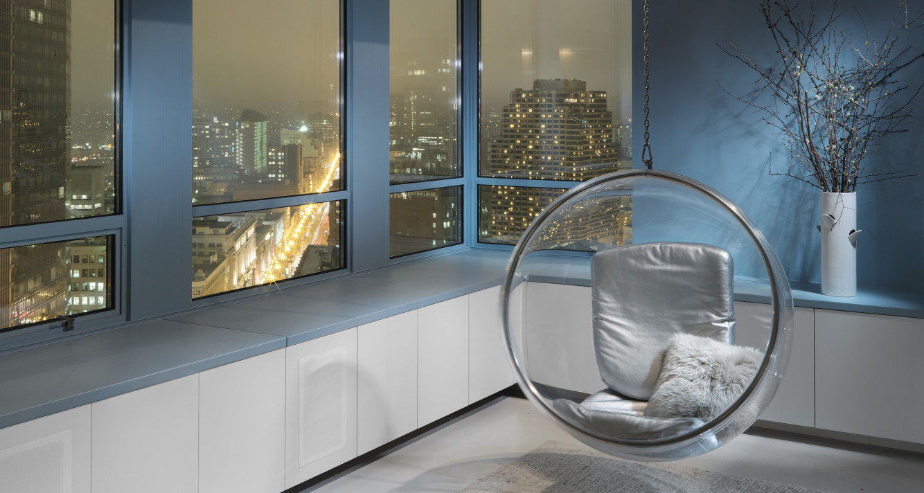
The challenge posed by the design of this duplex penthouse was how to take advantage of the best asset of this corner unit – its dramatic diagonal downtown views that were compromised by discontinuous groupings of conventional double hung windows. Our design strategy visually unifies these random punched openings within a “sky zone,” a recessed linear slot that dynamically wraps the perimeter of the apartment. Painted grey/blue, it visually blends with the actual skyline.
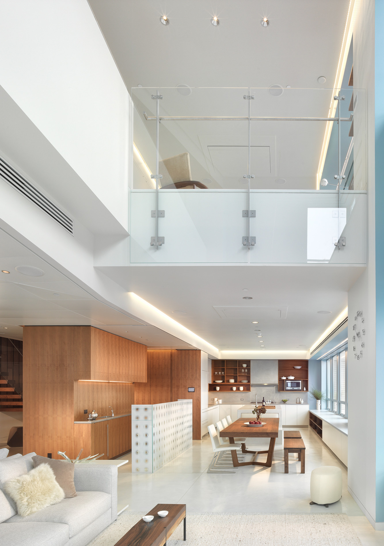
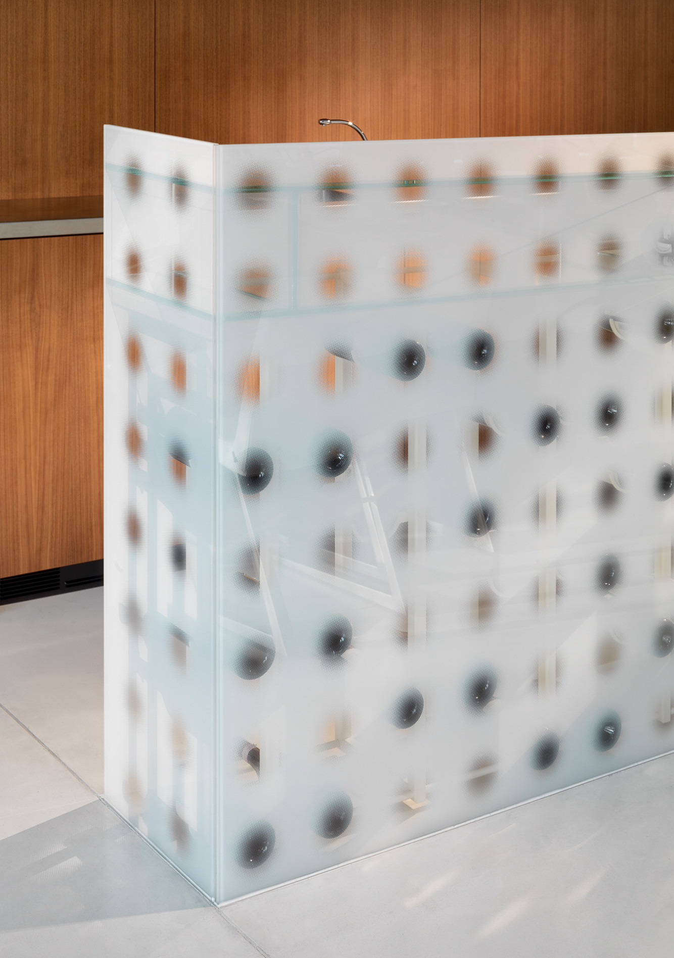
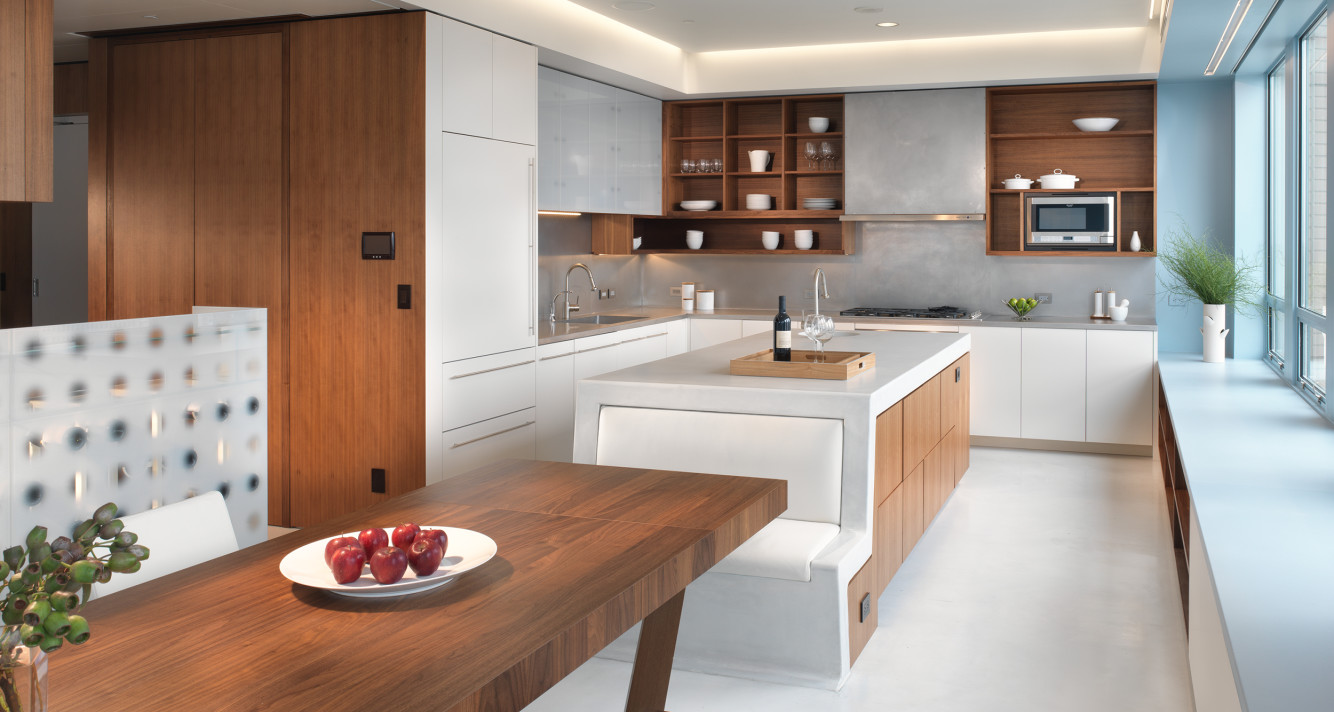
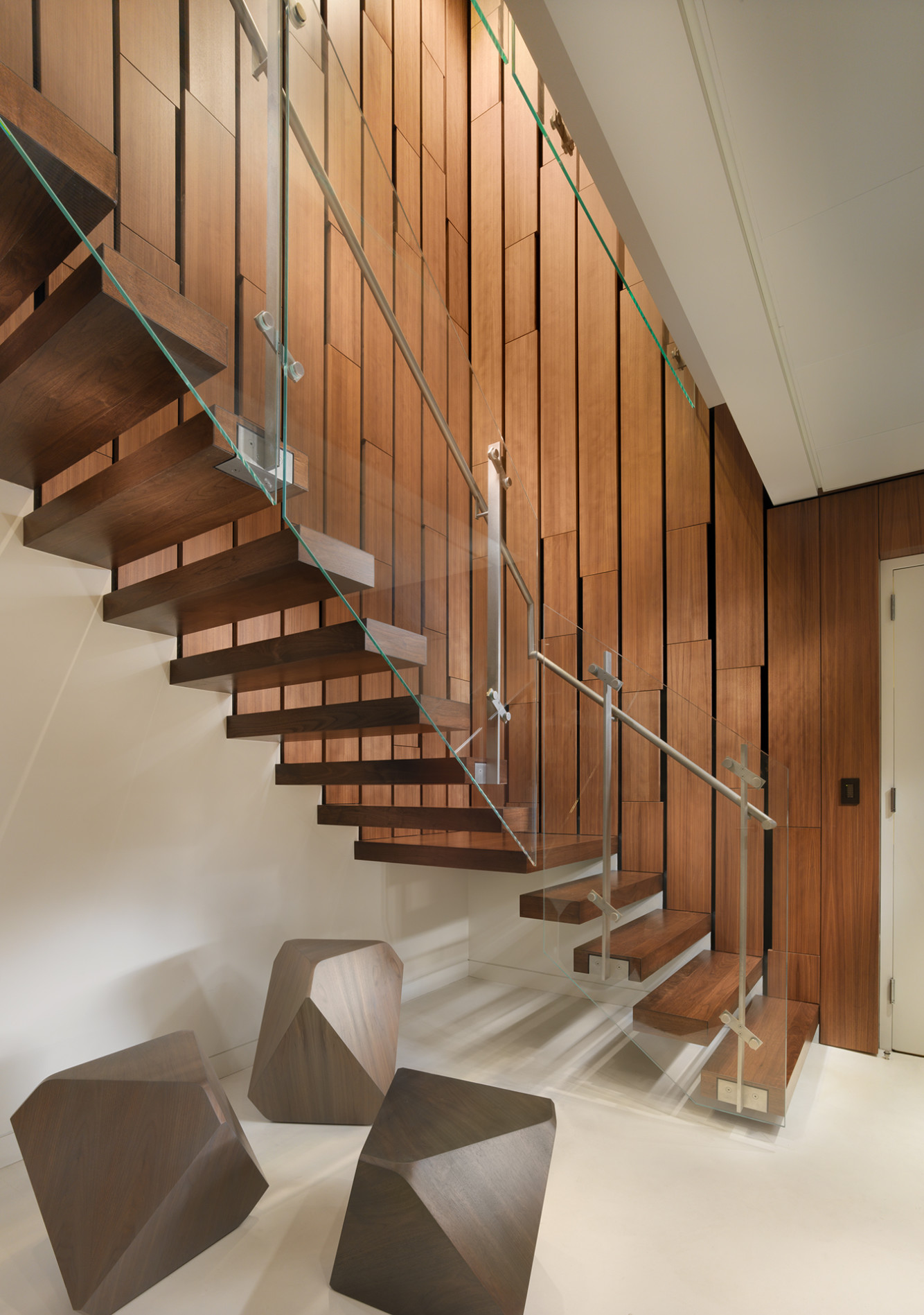
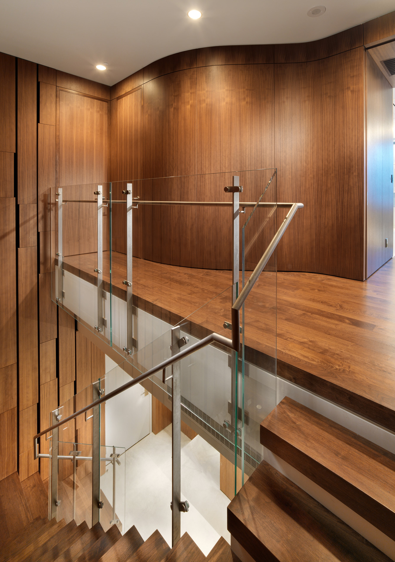
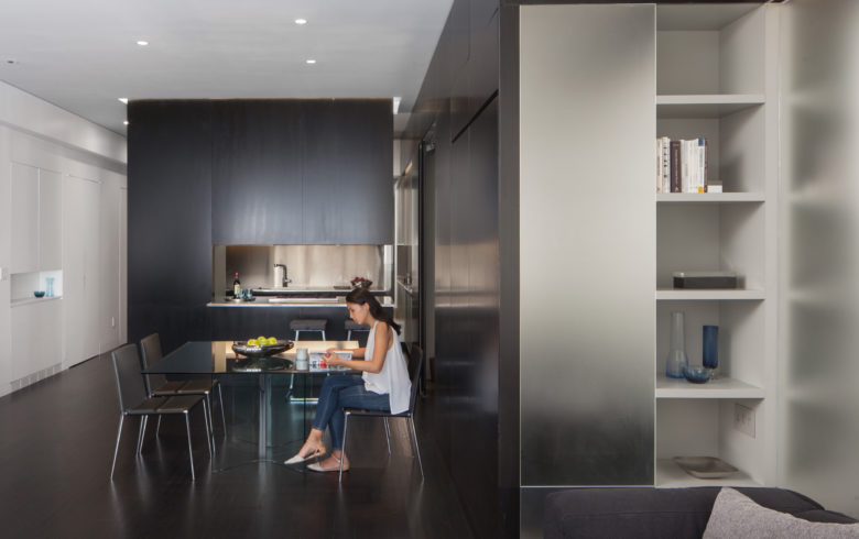
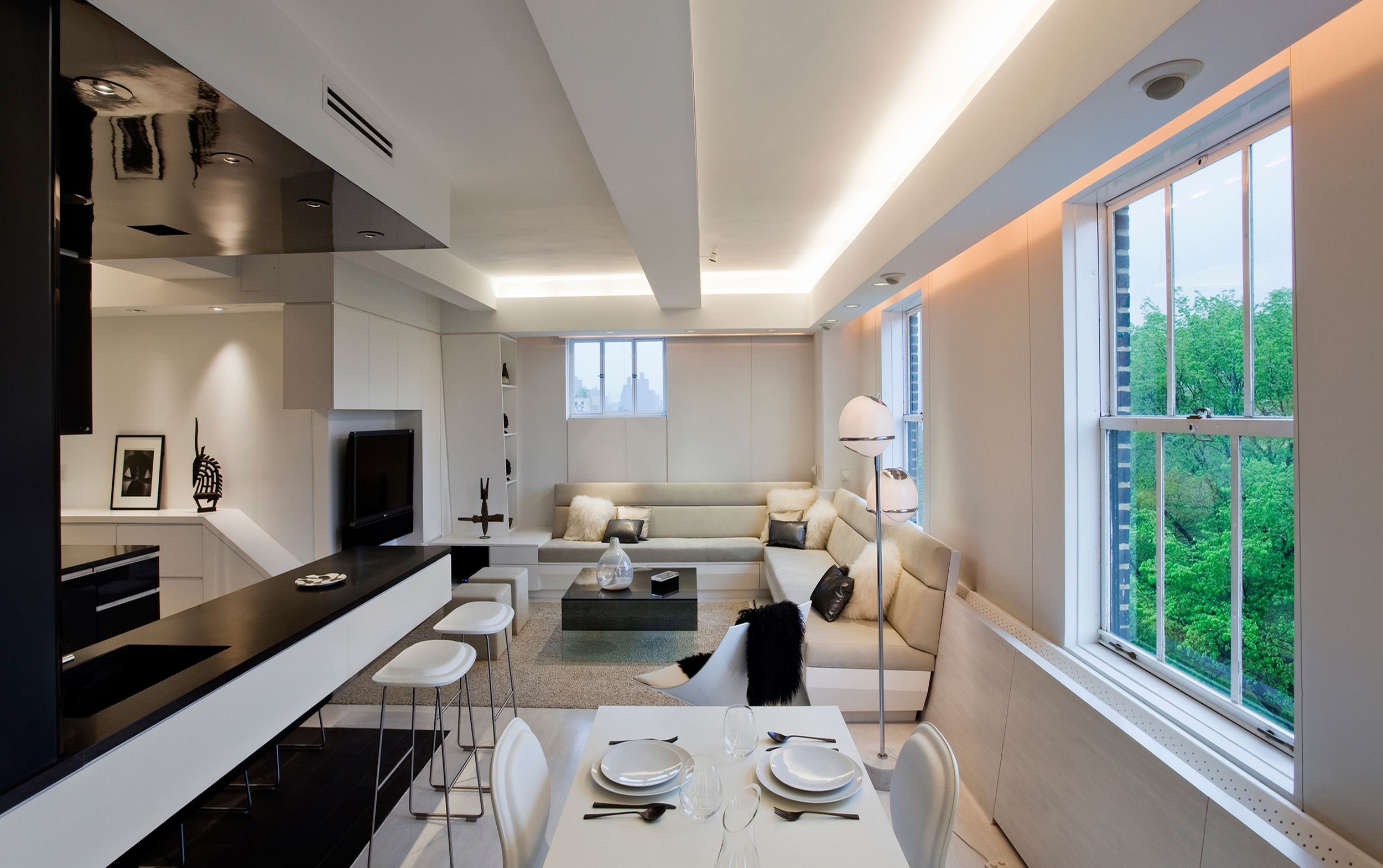
The duplex is programmatically sub-divided into two living strips that run parallel to this window wall. A darker inner band, lined with natural materials – walnut paneling and banquettes upholstered in deep blue mohair – defines the entry, stairwell and second floor pool/guest room. A bright outer zone, lit by windows, defines the double height corner living/media room and kitchen/dining area on the first floor and the master bedroom suite above. It’s contrasting neutral palette of white and grey synthetic materials – concrete, fritted-glass, and stainless and powder coated steel – focuses attention on the “sky zone” that frames city views. Interior apertures frame views between these contrasting areas.
| Location | San Francisco, CA |
|---|---|
| Size | 3,200 SF |
| Year | 2009 |
| Associate Architect | Winder Gibson Architect |
| Photos | Rien Van Rijthoven |
