Joel Sanders Architect

Alternative Futures: Questioning Design Standards

September 11, 2023

Published in Schneiderman, Deborah, Anca I. Lasc, and Karin Tehve, eds. Appropriated Interiors. New York: Routledge, 2022.

Since antiquity, Western architects have presumed that the user of the designed environment is a prototypical body, one who is by default white, able-bodied, cisgender, heterosexual and male. Leonardo da Vinci’s Vitruvian Man and Le Corbusier’s Modulor Man are only two examples of how architects have designed buildings based on the proportions of an “ideal” male body, one that people could aspire to but only approximate. However, by the turn of the 20th century, the notion of the “ideal” body that had formed the basis of the Western architectural tradition since the Renaissance gave way to a new conception: the “normal” or “average” body, one whose anatomical characteristics performing a range of tasks could be studied and measured using two techniques adopted by architects and designers—anthropometry and ergonomics.

These concepts were applied by capitalists to maximize workplace efficiency and by adherents of suspect ideologies like eugenics, a movement that emerged in Europe and the United States in the early decades of the 20th century dedicated to “scientific racism”—improving the human race by selectively breeding those with positive rather than negative genetic traits. In the name of science, these findings were enlisted to rationalize state-sponsored discrimination. So- called abnormal people were denied citizenship and voting rights and subjected to anti-miscegenation laws and sterilization based on the belief that nonnormative bodies belonging to women, people of color, immigrants and the disabled possessed innate physical or mental defects that rendered them misfits and, as a consequence, unfit to participate in the American public realm.

Racist, sexist and ableist thinking exemplified in movements like eugenics had spatial implications, restricting who was included and excluded from American public space at a range of scales.1 Sometimes these tactics were manifested in legislation like Jim Crow laws that mandated racial segregation in public restrooms, trains and restaurants from 1865 to 1965 and the Immigration Act of 1924, put in place to preserve the ideal of U.S. homogeneity that until 1952 denied Asians, Italians, Jews and Eastern Europeans from setting foot on US soil. However, more often than not, the construction of inaccessible spaces that excluded “undesirable” citizens was made possible through the implementation of design conventions, often enforced by building codes, that were passively accepted by architects and designers, many of which we have inherited to this day. Consider the steps leading to the entrances of public buildings elevated on podiums that make the transition between sidewalks and streets difficult to traverse for the elderly and people with mobility and sensory disabilities; sex-segregated facilities like restrooms, locker rooms and military barracks that discourage trans and nonbinary people from using them; border walls that prevent immigration into the southern United States; or substandard housing projects that work in conjunction with redlining to perpetuate structural racism and feed the prison industrial complex that disproportionately incarcerates Black men.

Unfortunately, these practices are not a thing of the past. The Black Lives Matter movement and the impact of COVID-19 on vulnerable communities have underscored the urgency for architects and designers to own up to our historical complicity in perpetuating structural racism, heteronormativity and ableism in America through design. In the name of social equity, we must become design activists, committed to inventing alternative modes of professional practice that will allow us to combat these strategies of inclusion and exclusion that are enacted through the protocols of professional practice that we take for granted.

In 2015, design activism led me to establish a new branch of my architectural studio, MIXdesign, a think tank and inclusive design consultancy dedicated to combating architecture’s indifference to the needs of what we call “noncompliant bodies”—people of different ages, genders, races, faiths and abilities that fall outside the cultural mainstream. We work with progressive clients to develop toolkits, recommendations and prototypes for making everyday building types— like restrooms, campuses, museums and residential spaces—safe and accessible for a wide spectrum of people with different identities and embodiments. Our intersectional approach is based on the conviction that human experience and embodied identities are constituted by a variety of interconnected factors, including age, gender, race, culture, religion and ability.

Our overall objective is to design public spaces that promote sharing among individuals, friends, families and caregivers while recognizing that there are no universal solutions. For each project, our goal is to allow the maximum number of differently embodied and identified people to mingle while providing accommodations for end users who have unique privacy or functional needs. Hence, our name: MIXdesign. We believe that looking at the world through the lens of noncompliant bodies will allow designers to not only create spaces responsive to their needs but also spawn design innovations that will enhance every-body’s experience.

Figure 1: This ideal is illustrated by Leonardo’s Vitruvian Man, a pen-and-ink drawing of 1487 depicting a white youth whose outstretched arms and legs conform to the circumference of a circle and a square.
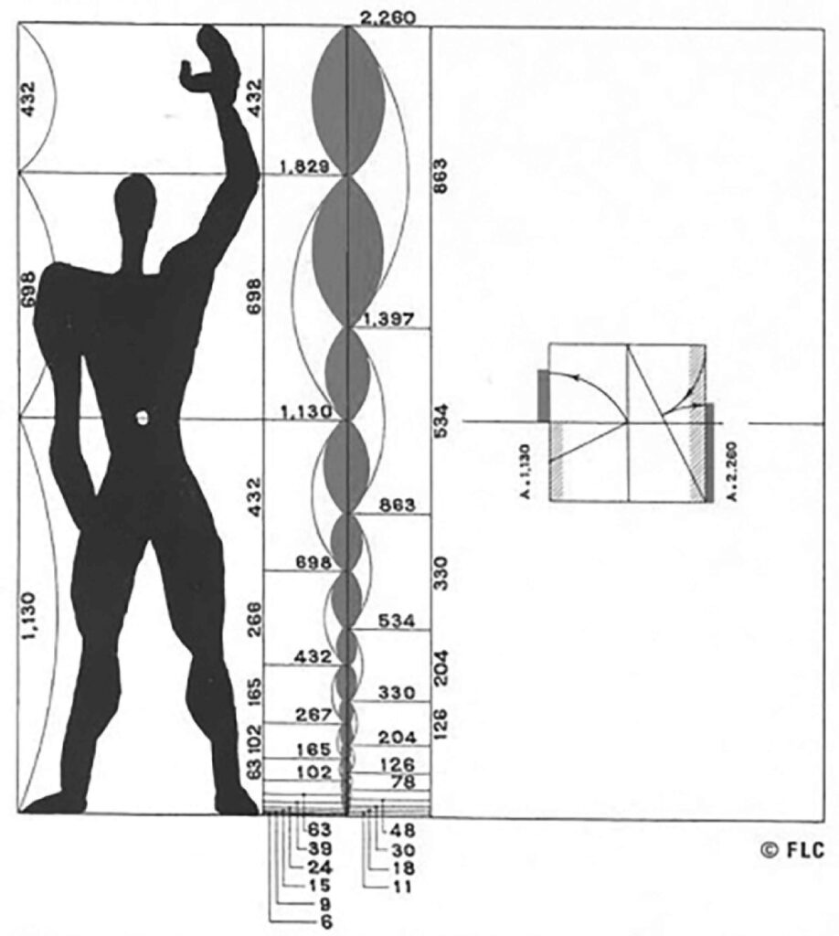
Figure 2 Le Corbusier’s Modulor Man.

To accomplish our mission, MIXdesign has been developing an inclusive design methodology that is the subject of this paper. It is predicated on interrogating and then offering alternatives to formulaic architectural conventions that unwittingly encode prevailing racist, heteronormative and ableist ideologies that perpetuate the status quo. This essay treats MIXdesign’s first and ongoing project, Stalled!, as a case study to elaborate our design process. Launched in 2015, Stalled! takes as its point of departure American debates surrounding transgender access to public restrooms to address an urgent social justice issue: the need to create safe, sustainable and inclusive public restrooms for everyone regardless of age, gender, race, religion and disability. As a typology that bridges allied fields— architecture, interiors, product design, planning and engineering—restrooms are an ideal lens through which to examine how design professionals are responsible for maintaining problematic cultural assumptions about the nature of human embodiment and identity through the procedures and practices that govern the design disciplines.

The organization of this essay follows the structure of the inclusive design methodology that informed the development of Stalled!. It consists of two parts, phase 1.0, Cross-Disciplinary Research through a Historical Lens, as a prerequisite for phase 2.0, Design Prototyping and Engagement 2 Our design approach builds upon, but in some important respects differentiates itself from, the work of our colleagues who also begin projects by studying the particular typology they are working on. Like them, we conduct literature reviews and comb through up-to-date sources to familiarize ourselves with the range of programmatic, legal, technical and environmental variables necessary for delivering a successful project. This entails consulting a range of information, including books, manuals and design guidelines, as well as codes that govern the programmatic technological and legal variables associated with a building type.

However, rather than accept these professional resources at face value, we examine them through a critical transdisciplinary and transhistorical lens. This approach is based on our strongly held conviction that the performance of embodied human identity takes place within familiar architectural “types”— ordinary structures categorized by use and associated with specific activities that distribute bodies within formulaic spatial configurations. These shape the way humans interact with each other and the world around them. However, MIXdesign rejects this concept of typology (founded by 18th-century neoclassical architects like Durand and inherited by such 20th-century architects as Aldo Rossi), which considers building types as timeless, transhistorical structures. In a similar vein, we reject the still-prevailing functionalist conception (endorsed by modernists like Le Corbusier and Adolf Loos) which considers types like bathrooms to be shaped by objective physiological and technological factors. Instead, we treat typologies as well as the guidelines and codes that describe them as historically contingent formal constructs shaped by the interplay of changing social, political, economic and environmental forces that perpetuate the dominant ideologies and values of those in power. Nevertheless, we believe that architects and end users can, through critical analysis, contest, modify or jettison these outmoded norms as a means to reinvent new unforeseen spatial configurations that allow a diverse range of differently embodied and identified people to productively perform activities as they interact in public and private space. This conviction is the guiding premise that drives all of our projects, including Stalled!.

Phase 1.0: Cross-Disciplinary Research through a Historical Lens

In 2015, my architectural design studio JSA/MIXdesign was invited to design the NYC headquarters for GLSEN (the Gay, Lesbian, and Straight Education Network), a nonprofit dedicated to making schools safe and nurturing environments for K–12 students. Building codes coupled with an uncooperative landlord prevented us from implementing the “gender neutral” bathrooms requested by our clients. At the same time staff at my architectural studio were confronting these work-related obstacles, I was following media coverage of national debates triggered by transgender people using public bathrooms. I reached out to Susan Stryker, a leading transgender historian, theorist and activist whom I had met at UC Berkeley College of Environmental Design over ten years earlier. Our informal dialogue initially conducted over email and phone led us to co-author an essay published in the South Atlantic Quarterly , which grew into Stalled!, an ongoing design/research initiative. Early on, Susan recruited legal scholar Terry Kogan to join our team. Over the years, Stalled! has since expanded to include Seb Choe, an inclusive design activist; Quemuel Arroyo, disability specialist; and Antonia Caba, formerly of Yale School of Public Health, as well as a wider network of experts and consultants.

American Restroom Politics 1880-2021

Susan, Terry and I began the Stalled! initiative by getting a thorough understanding of the trans restroom battles that were being waged across the United States. It seemed to us that the panic over the presence of transgender people in sex-segregated public toilets was part of a long-simmering partisan reaction to overlapping cultural and political events that were taking place at that time. They included the Supreme Court approval of same-sex marriage in 2015 and the 2016 Obama administration Title IX guidelines clarifying that the federal law banning sex discrimination in education programs and activities also protects students who are transgender. It also included an unprecedented cultural visibility for trans people in the mainstream media. This increased recognition and federal acceptance of trans people was met with considerable backlash.

A high-profile example is North Carolina’s House Bill 2, which mandated that sex-segregated restrooms be used according to the sex designated on a person’s birth certificate. Since we launched Stalled! in 2015, more than two dozen similar bills attempting to restrict gender-appropriate public toilet access for transgender people have been introduced in statehouses across the United States. When Trump assumed the presidency in 2017, his administration supported these efforts by withdrawing transgender-supportive interpretations of existing laws put forth by the Obama administration, including Obama-era Title IX guidelines as well as a series of policies that effectively erased federal recognition of LGBTQ people.3 During the time of this writing in the early days of the Biden administration, battlegrounds continue to be tangible architectural sites like restrooms.

Rather than looking at contemporary bathroom politics in isolation, the Stalled! team took a broader view and looked at them within a historical context. We quickly discovered that bathroom debates are not new. At different moments in US history, the public bathroom has registered anxieties triggered by the threat of previously marginalized groups moving into mainstream society.

Milestones include the creation of the “ladies’ room” as more women entered the paid workforce in the 1880s. Naysayers argued that if women were to leave the security of their homes, their mere presence in the workplace, previously an exclusively male domain, would be catastrophic. Women were considered physically and mentally weak. They would be vulnerable to male workers, who would find their presence a distracting temptation. In response to these claims, workplaces, like offices and factories, needed to offer women a home-like space as a refuge from the aggressive public male sphere. This special accommodation took the form of the first sex-segregated bathrooms (Figure 3), even though until that time men and women had shared unisex privies, typically freestanding outhouses.4 
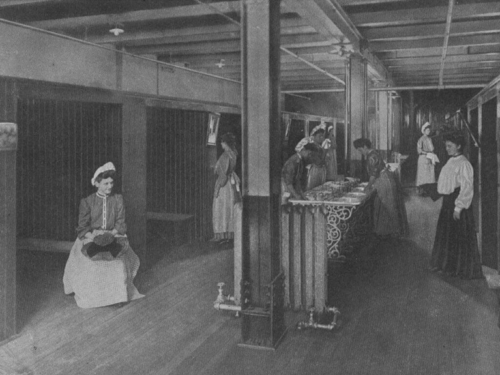
Figure 3 A women’s restroom in a Pittsburgh factory, photograph, 19th century.

Figure 4 A segregated waiting sign at a bus stop in Georgia, photograph, Library of Congress, 1943.

During the 1950s and 1960s, bathrooms were again a battleground in the fight to abolish “colored” bathrooms (Figure 4) during the civil rights movement. Jim Crow laws mandating bathroom segregation were based on long-standing arguments that were previously used to defend slavery and white supremacy. It was argued that African Americans, arrested in their evolutionary development, were bestial. Believed to be mentally inferior and physically unclean, they posed health and safety risks to whites, especially white women. Adding insult to injury, Jim Crow laws not only mandated that Black people be banned from sharing bathrooms with white people but also forced Black men and women to use one small, often filthy space, thus effectively denying Black people the privacy between the sexes, which opponents of all-gender restrooms argue is a “natural” right of humans.

During the AIDS epidemic in the 1980s and 1990s, restrooms again incited unsubstantiated fears, this time that straight men would be infected with HIV by sharing public toilets with gay men. Similar to Black men during Jim Crow, gay men were also portrayed as disease carrying and promiscuous. Now straight men, as opposed to women, were presented as defenseless victims. The men’s room was condemned as a germ-infested place where men could become infected by touching contaminated toilet seats and restroom fixtures, even after science confirmed that AIDS was only transmitted through the direct exchange of bodily fluids during sex. Making matters worse, men’s rooms were portrayed as notorious cruising grounds where gay men threatened to prey upon and corrupt straight men, compromising the health, safety and morality of the male body politic (Figure 5).

Figure 5 “None of These Will Give You AIDS” poster, New York State Department of Health, 1987.

In a similar vein, the disability rights movement demanded accessible public space, including restrooms. Obstacles included the engrained perception that the disabled possessed shameful physical and mental defects that required them to be sequestered in hospitals and, in some cases, sterilized by eugenicists in the name of social engineering. Beginning in the 1960s, activists mobilized to counteract these negative stereotypes and demand equitable access to spaces and services. The disability rights cause was reinforced by a shift in perception disseminated in the mass media following World War I, World War II, and the Vietnam War, when injured veterans were no longer portrayed as deviants but as patriots. Society was obligated to honor the sacrifices of those they previously shunned, providing disabled veterans with medical care and educational opportunities to integrate them back into mainstream society.5  Thirty years of grassroots activism, including events like The Capitol Crawl (Figure 6), inspired by tactics learned from the civil rights movement and strengthened by alliances with organizations like the Black Panthers, finally led to the passing of the Americans with Disabilities Act in 1990.
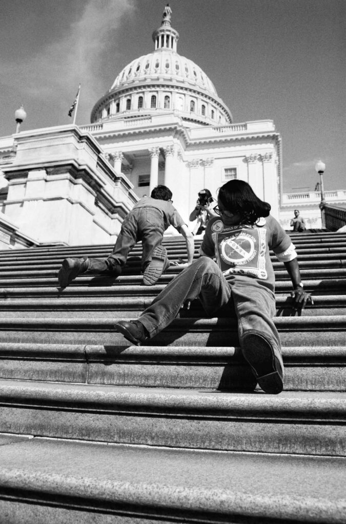
Figure 6 “Capitol Hill Crawl” photograph, Tom Olin, 1990.

The transgender bathroom debate is just the latest episode in this long history. In 2015, Campaign for Houston, a conservative group opposed to a proposed anti-discrimination ordinance, aired an infomercial that tapped into anxieties stirred by the prospect of trans people using public restrooms. Filmed in black and white, the political campaign, which masquerades as an infomercial, borrows from the language of horror films to describe the actions of a male stalker: an anonymous man enters a women’s room, washes his hands and hides in a stall until the arrival of his prey—a young white girl wearing a skirt. The clip ends with the frightened gaze of the unsuspecting victim looking up at her presumed assailant, who follows her into the toilet stall. The infomercial builds suspense through point-of-view shots that alternate between close-ups of the sex offender’s body seen in fragments (the back of his head, hands and feet) and cropped images of the bathroom fixtures he interacts with (ceiling light, dripping faucet, drain, paper towel dispenser and toilet stall) (Figure 7). Meanwhile, we listen to the female voice of a narrator whose cautionary words are overlaid in large capital letters over the screen.

Houston’s Proposition One Bathroom Ordinance: What does it mean to you? Any man at any time could enter a women’s bathroom simply by claiming to be a woman that day. No one is exempt. Even registered sex offenders could follow women or young girls into the bathroom, and if a business tried to stop them, they’d be fined. Protect women’s privacy. Prevent danger. Vote No on the Proposition One Bathroom Ordinance. It goes too far.

This informercial achieved its goal. The anti-discrimination law that was intended to protect the rights of all Houston citizens was defeated by singling out trans people and misrepresenting them as male perverts who stalk girls in the ladies’ room. Evidence-based statistics show that these claims are unsubstantiated: trans people—trans women of color in particular—are the likelier victims of restroom harassment and assault.6
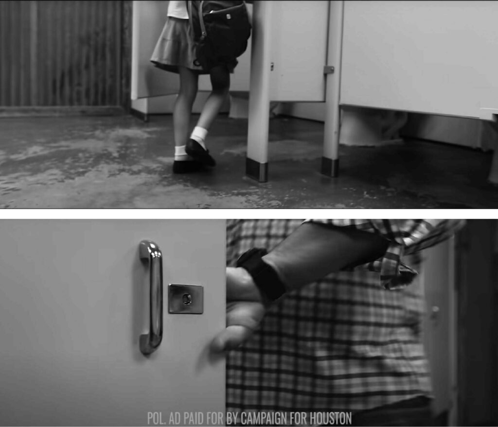
Figure 7 Stills from Campaign for Houston commercial (0:33) (0:26), YouTube, uploaded 2015, www.youtube.com/watch?v=D7thOvSvC4E&ab_ channel=CampaignforHouston.

Today, bathroom battles similar to the 2015 Houston Campaign continue. Yet again, the public restroom (by virtue of it being a physical space) transforms an abstract concern into a tangible peril and becomes the setting for nightmarish fantasies of “normal” citizens put at risk by physically interacting with “abnormal” people in public space. Again, unfounded fears are defended by enlisting variations of long-standing and recurring themes that falsely portray trans people—like women, Blacks and gay men before them—as infectious sexual predators who threaten the safety, health and morality of mainstream society through physical proximity in the public realm. However, not only do trans restroom debates dredge up long-standing fears and prejudices, they add a new one to the list—gender nonconformity. The authors of Stalled! believe that what some people find so threatening about trans people is that they call into question the idea that one’s gender is determined by anatomy and made manifest in sex-segregated spaces like bathrooms mandated by law. Trans, nonbinary, intersex and other gender-nonconforming people demonstrate there are many ways of expressing one’s gender that are independent from biological sex and don’t conform to the binary of sex-segregated bathrooms.

Bathroom Design History: Roman Antiquity to Modernism

Looking at trans debates in their political and historical context gave us a broader perspective that allowed Stalled! to call into question the way bathroom politics were myopically and inaccurately framed as a question of safety alone. This wider view prepared us to turn our attention to another aspect of the controversary that had been overlooked in the volumes of commentary about trans access to bathrooms written by politicians, lawyers and journalists—the physical space of the sex-segregated restroom itself.

We began by conducting an in-depth spatial and cultural analysis of generic public restrooms. We studied the illustrated manuals that professionals typically consult to create code-compliant restrooms, such as Architectural Graphic Standards, as well as resources like ADA guidelines and building codes. Without exception, these documents illustrate restrooms using austere black-and-white plans and elevations annotated with ergonomic dimensions. Usually, these single-line drawings include robotic human figures of men and women to depict the range of motion required to perform bathroom functions. The only concession to nonnormative bodies are ADA diagrams illustrating the circulation path and turning radius of a person—generally male—in a wheelchair.

We found that these seemingly neutral technical diagrams are predicated upon a series of erroneous cultural assumptions that shape bathroom design: they reinforce the tacit assumption that the design of restrooms, like other building types, is solely shaped by functional parameters determined by human anatomy, technology and infrastructure (plumbing and sanitation systems) whose inevitable outcome yields a single universal prototype, a configuration that sorts human beings into two categories—men and women—that need to be separated from one another. In this way, professional resources implicitly reproduce two interdependent and highly problematic cultural assumptions about gender: first, a “biological” conception of gender based on the notion that there are only two genders, male and female, and second, that these two genders need to be divided from one another in different rooms based on the notion of a universal need for privacy between the sexes that underpins legal arguments, including the case opposing all-gender restrooms that was meant to be heard before the Supreme Court.

However, the next step in our process—tracing the evolution of restrooms through the lens of architectural history—would allow us to test the validity of these tacit assumptions governing restroom design. There is a vast literature devoted to the history of bathrooms that traces their evolution, primarily from an Anglo-American perspective. A wide range of authors representing different fields—from architectural history to psychoanalysis—have explored this rich territory from a variety of theoretical, social, economic and technological perspectives. The following condensed survey of Western bathroom history from antiquity to today challenges our preconceptions about the formal and ideological underpinnings of this ostensibly timeless typology as encoded in architectural standards.

We take for granted that bathrooms, by necessity, combine in one space three activities—washing, eliminating and grooming—which history shows were separated from one another until the advent of water-delivery systems in the 19th century.7 From antiquity to the Middle Ages, washing and eliminating were communal activities conducted in separate locations. Romans washed in lavishly appointed public baths that some archeologists believe might have been used by men and women. Romans of all ages defecated in communal latrines that many archeologists conjecture might, in some instances, have been unisex. People sat on continuous wood or stone benches while engaged in conversation. One surviving mural depicts philosophers engaged in an impassioned debate while defecating.

During the Middle Ages, washing and eliminating were class based. Kings and knights bathed in individual tubs while commoners visited co-ed public bathhouses where men and women bathed and sometimes dined together in communal tubs, often perfumed with herbs and spices. Likewise, the nobility defecated in chamber pots cleaned by servants while commoners used communal unisex facilities that discharged waste into tanks cleaned by waters from the castle moat or through holes inserted in urban bridges that deposited human waste into the rivers below.

However, attitudes about restrooms changed during the Enlightenment, with the emergence of bourgeois values about privacy. Etiquette manuals discouraged conversation with people squatting in the street. For the first time, body parts and their byproducts needed to be hidden. By the 19th century, people became ashamed about urinating and defecating in public, especially in view of members of the opposite sex. They also became uncomfortable about coming into contact with their own and other people’s waste and bodily fluids. Theorists of abjection, like Julia Kristeva, Mary Douglas and Elizabeth Grosz, argue that abject substances like blood, feces and urine discharged from human orifices contradict the reassuring fiction that the human skin is an effective membrane that allows us to differentiate and control the relationship between ourselves and the outside world. Abject substances are painful reminders that we are mortal beings, made of flesh and blood, prone to deterioration, decline and death.8

However, two 19th-century technological advances—the advent of underground sanitation systems coupled with mass-produced plumbing fixturesallowed “mankind” to triumph over abjection through waste management. Modern architects like Le Corbusier and Adolf Loos famously championed plumbing: running water connected to toilets and sinks eliminated the sight and smell of waste. Their impervious porcelain surfaces were rendered in white, which conveys the reassuring visual impression of cleanliness.9

Affordable manufactured plumbing fixtures serviced by public sanitation systems resulted not only in the birth of the domestic bathroom but also made possible another significant development: the emergence of the first sex-segregated restrooms in the United States. Terry Kogan describes how American bathroom design was shaped by a “separate spheres” ideology that confined women, considered the “weaker sex,” to the home while men, physically and intellectually stronger, were free to occupy public space. Men and women alike used privies, freestanding wooden enclosures typically located in domestic backyards. Some were single user, while others accommodated multiple family members, sometimes of both sexes, who eliminated together. However, by the mid-19th century, women were increasingly leaving home to take part in public cultural and retail activities as well as to work. According to Kogan, men threatened by this challenge to patriarchy argued that this would adversely impact women’s health and well-being. In response, architects introduced women-only spaces, like parlors and sex-segregated restrooms, in libraries, hotels, department stores and factories, conceiving of them as safe havens that protected vulnerable females from the pressures of the male public realm.10

These milestones of bathroom history from communal Roman and medieval bathhouses and latrines to unisex American backyard privies proved that the sex-segregated restroom we take for granted is not an inevitability. Historical precedents refute the prevailing wisdom, reproduced in architectural standards and legal bathroom battles, that the configuration of separated men’s and women’s rooms answers to universal standards of privacy needed to be maintained between two genders, categorized by anatomical difference.

Phase 2.0: Design

Prototyping

Design history proved liberating. Stalled!’s exploration of Western bathroom permutations convinced us that we need not be limited by convention. Now we were ready to turn our attention back to the immediate problem at hand: coming up with viable prototypes for all-gender restrooms that, unlike the legal battles being waged across the United States, did not accept the conventional configuration of paired sex-segregated bathrooms as a given. Design history encouraged us to seek alternatives to the most common and code-compliant approach to all-gender bathrooms—the “single-user” solution. It supplements multi-user men’s and women’s rooms with a single-occupancy, ADA-compliant room equipped with sink and toilet and a sign using words or icons designating it as gender neutral.

A single-user bathroom provides more visual and acoustic privacy than stalls, making it the preferred choice for many (including trans people). An ideal solution from a user’s perspective would be for building owners to build enough of them to meet occupancy fixture counts (i.e. the number of toilets and urinals required by code). This is, however, rarely feasible because of the additional expense and area required to build single rooms rather than stalls, viable only in situations requiring few fixtures (like a small restaurant). Ideally, single-user bathrooms are grouped next to men’s and women’s rooms; sometimes they stand alone, leaving it up to the user to make the effort to find them.

By virtue of being an exception to the sex-segregated norm, the single-user arrangement has serious drawbacks, negatively impacting trans and nonbinary folk but also the general public. Not only does it reinforce the suspect notion of gender identity as an effect of biology, but it exemplifies the prevailing “separate-but-equal” approach to accessibility that caters to people with “special” needs through separate accommodations—entries, ramps and, in this case, isolated rooms—that stigmatize people who deviate from the norm by isolating them. These include trans and gender-nonconforming people as well as people with disabilities who are prevented from mixing with “normal” people in public space.

Stalled! advocates an alternative model that abolishes the binary. We are in favor of getting rid of the typical sex-segregated facilities characterized by American-style stalls whose revealing gaps compromise visual privacy. We recommend a multi-user solution that treats the restroom as a single open space with floor-to-ceiling partitions and communal areas for washing and grooming. Two early examples of this non-code-compliant solution, both located in New York City, were implemented at The Modern, Danny Meyer’s restaurant which opened in 2005 on the ground floor of the Museum of Modern Art, and Congregation Beit Simchat Torah, a synagogue for the world’s largest LBGTQ congregation designed by Architecture Research Office (ARO), who built the restrooms by obtaining a variance from the NYC Department of Buildings in 2016.

This solution has two advantages: by consolidating a greater number of people in one, rather than two, rooms, restroom users can visually monitor one another, reducing the risk and fear of violence and ensuring that gender-nonconforming people aren’t stuck between two options that don’t align with their identities. Finally, the multi-user type not only meets the needs of the trans community but also caregivers with gender expressions different than those they care for, such as children, the elderly and the disabled. Arriving upon the desegregated multi-user prototype proved to be a turning point for the Stalled! team. Rather than narrowly focus on gender alone, in the words of Susan Stryker, it allowed “Stalled! to leverage trans visibility” to realize MIXdesign’s intersectional mission predicated on the conviction that democratic societies cultivate respect for human difference by allowing a spectrum of bodies to safely mingle in public spaces regardless of age, gender, religion or ability.

Stalled! favors the multi-user restroom type because it eliminates the gender binary while promoting intersectional mixing and caregiving. However, our team agreed this model could be improved by calling into question the age-old idea that people can be made safe by erecting physical boundaries. Walls are shared two-sided elements that, by definition, belong to the spaces that they divide, located on either side of them. Although often erected to provide security, they can, through ingenuity or force, be breached. For this reason, walls serve a symbolic purpose: in the name of security, they are built to “naturalize” human difference and justify discrimination. For example, President Trump’s contested border wall deploys a physical boundary to construct two oppositional national identities, tainted by misleading stereotypes that bolster far-right agendas. People of color who inhabit the south side of the wall are represented as criminals who threaten to endanger the lives of the white, law-abiding Americans who occupy the wall’s north side. Although they operate at the smaller scale of interiors, the walls found in bathrooms also bring into being a series of oppositional identities that are always already blurred. The corridor wall separates the “clean” public realm from the “dirty” realm of the abject body. The paired entry doors marked men or women operate like the shared walls that typically conjoin back-to-back men’s and women’s rooms: they sort humans into two categories defined by anatomy. Finally, the bounded enclosure of the single-user facility reinforces ableism by compartmentalizing the able from the disabled body.

The privacy screens that subdivide the interior of men’s and women’s restrooms into activity zones form nested enclosures that also obey an ideological rather than a functional logic: placed between urinals and toilets, they are intended to create visual privacy between members of the same sex. However, according to theorist Lee Edelman, in the men’s room, they paradoxically have the opposite effect. The flimsy partitions suspended between urinals, although designed to prohibit looking at one’s neighbor peeing, often trigger anxious feelings of masculine inadequacy and same-sex desire that they were designed to ward off. Likewise, the toilet stall that sequesters men in adjacent compartments, Edelman argues, calls attention to the male orifice they were designed to hide—the anus. For men, this orifice that excretes feces is not only dirty but is capable of being forcefully penetrated, producing sensations of pain or pleasure and as a consequence inducing feelings of ambivalence, anxiety and shame. In other words, the underlying purpose of urinal screens and privacy stalls—to foster a sense of security while at the same time legislating appropriate conduct between men—is confounded by the potential of these architectural elements to elicit conflicting and threatening feelings of abjection, shame and desire.11

Rather than conceive of bathrooms as nested walled enclosures, Stalled! has developed a prototype that eliminates most of the walls and partitions that sort bodies into binary categories by sex (male vs. female), sexual orientation (heterosexual vs. homosexual) and ability (able-bodied vs. disabled). The only partitioned enclosure that remains in our design is the toilet stall itself. Our decision is based on evidence-based research showing that the stall offers many individuals and caregivers acoustic and visual privacy, qualities they desire based on cultural, religious and psychological factors that will be elaborated later in this paper.12

In 2017, we collaborated with Gallaudet University in Washington, DC, a school for the deaf that has been meeting the educational needs of “nonconforming” bodies since its founding by Abraham Lincoln in 1864, to develop a prototype (Figure 8) for retrofitting typical sex-segregated bathrooms into a multi-user facility.

Our case study works within the existing footprint of adjacent men’s and women’s rooms located in the Field House, the university’s sports facility. Drawing inspiration from antique and medieval precedents, our scheme implements a sequence of design moves that reconceives the public restroom as a porous extension of the public realm. First, we removed the existing plumbing stack wall that separated the men’s from the women’s room, treating the bathroom as one open space. Then we eliminated the corridor wall and bathroom doors, allowing the bathroom to blend with the hallway. Next, we added two blocks of fully enclosed stalls of three sizes—standard, ambulatory and ADA—as well as caregiving rooms equipped with a toilet, sink and changing tables that allow for caregiving between people of different genders. Then we added communal grooming and washing areas off the main circulation path. Finally, our scheme takes advantage of the additional square footage gained by removing the corridor wall, transforming what was previously a monotonous hallway into a lounge. It features a high-backed, blue-upholstered banquette, movable stools and a message board, creating a waiting area for caregivers and a place for face-to-face conversations that facilitate deaf signing. Although tailor-made for Gallaudet’s Field house, we eventually posted it on Stalled!’s open-source website as an adaptable prototype. It has become a template that we and other designers have subsequently applied to other commissions.
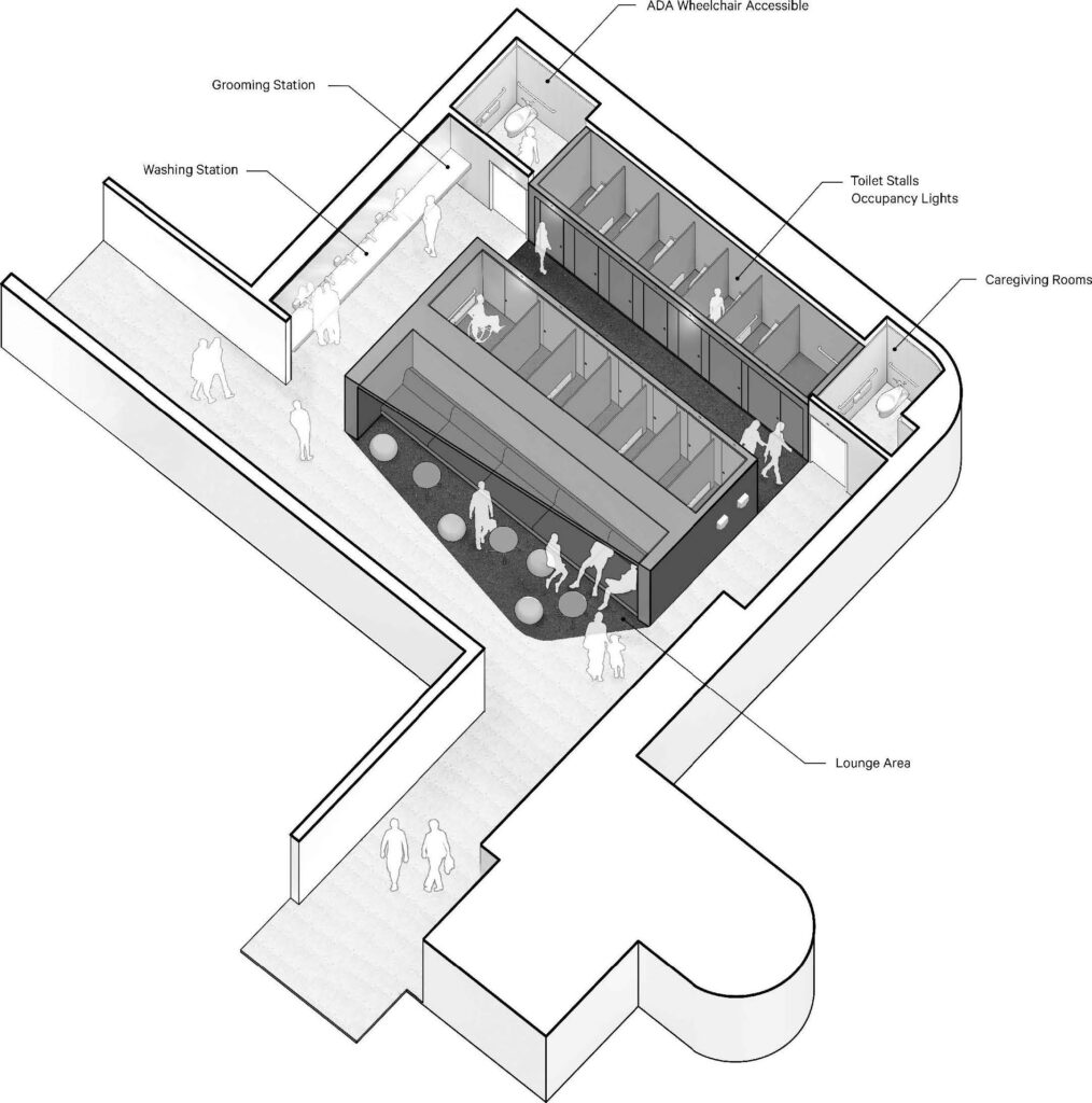
 

Figure 8 Gallaudet multi-user facility, drawing by JSA/MIXdesign, 2017.

End-User Engagement through the Lens of Public Health

Soon after completing the Gallaudet project in 2017, we unveiled the Stalled! multi-user prototype at a series of public lectures and symposia at universities across the United States, the UK and Europe. Each event concluded with Q&A sessions where audience members offered valuable feedback that made us aware that our prototype inadvertently ignored many end users’ needs. A person in a wheelchair in Salt Lake City let us know that he faced overlapping but somewhat different mobility challenges from users of canes, crutches and strollers that might require more nuanced spatial solutions than provided in our designs. At an event in New York City, a Muslim woman politely pointed out that while she was sympathetic with our intention to promote sharing, our scheme could not accommodate women like herself. Certain Muslim women, such as the one giving us feedback, wear modesty garments that cover everything except the face and hands up to the wrists, making washing in the presence of men an impossible task. Meanwhile, audience members in other venues we visited pointed out that our prototype did not take into account the wide variety of practices that take place in public bathrooms but that go unspoken. Examples mentioned included people who administer insulin injections, people (including trans men) who menstruate, people who suffer from shy bladder syndrome and religious people who perform ablutions. How could MIXdesign reconcile our mission to promote mixing in public space in a way that avoided siloing people into reductive categories? How could we accommodate the many varieties of being human inflected by culture, gender and ability? How could we steer clear of one-size-fits-all architectural solutions and come up with flexible prototypes that can be adapted to meet the needs of different demographic communities for different sites and programmatic scenarios?

Taking Stalled! on the road proved to be a wake-up call. We realized that our team was not qualified to address these complex issues on our own. Through a combination of deliberate networking and serendipity, we were able to expand our team to include clinicians, physicians and administrators with expertise in medicine, public health, deaf space, accessibility, neurodiversity and religion. Collectively, they worked with us to refine our research methodology in a way that allowed us to study the needs of wider segments of the population overlooked in typical restrooms.

For example, in 2019, Stalled! enlisted the help of members of the Yale School of Public Health. Antonia Caba, a graduate student working under the supervision of Professor John Pachankis, conducted surveys, interviews and a comprehensive literature review to gain an understanding of the specific cultural, psychological and medical needs of an expanded list of restroom end-user groups. Antonia organized them into loose overlapping categories, including gender (trans and nonbinary, pregnant and breastfeeding people, people who menstruate), disability (people with mobility, sensory and neurodiversity challenges, including the deaf and hard of hearing, the blind and those with low vision and individuals with autism), medical and psychological conditions (bowel and bladder conditions such as shy bladder syndrome), religion (Muslims and Orthodox Jews) and caregivers of children and adults.

We knew from the outset that creating one bathroom with zones dedicated to each user group would be spatially and economically unfeasible. Instead, our expanded team developed an aspect of our methodology (Figure 9) that we now apply to other MIXdesign projects: we conduct a comparative analysis of different user groups that yields a matrix that charts the overlapping and sometimes conflicting needs of noncompliant end users. This data informs our design process, allowing us to generate design recommendations which promote sharing among differently embodied and identified people while also satisfying end users with unique functional or privacy needs.
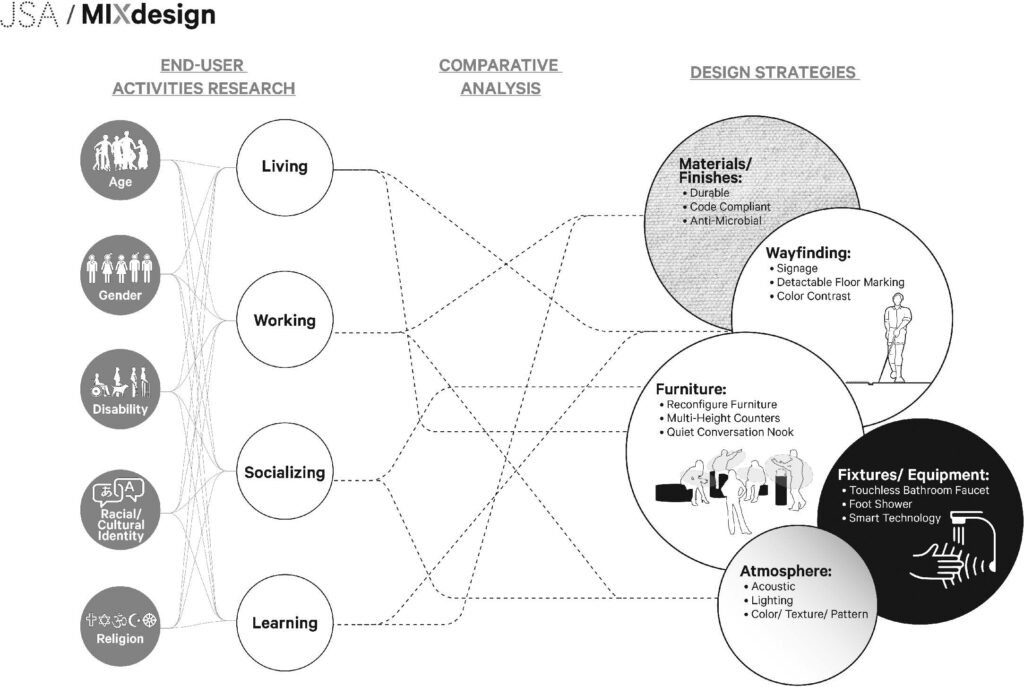
 

Figure 9 Inclusive design methodology, drawing by JSA/MIXdesign, 2017.
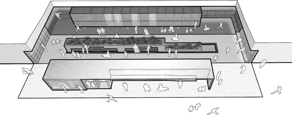
 

Figure 10 Stalled! airport prototype, aerial view, drawing by JSA/MIXdesign, 2017.

We applied this new body of research conducted in collaboration with Yale Public Health to another Stalled! prototype for larger high-traffic spaces, like airports (Figure 10). Working with the footprint of the typical back-to-back sex-segregated restroom as depicted in airport planning manuals, we reconceived of the public restroom as an open, agora-like precinct adjacent to the main concourse animated by three parallel activity zones, dedicated respectively to grooming, washing and eliminating. Slip-resistant sheets of diamond plate, tile and rubber differentiate each of the three activity zones, which are colored a different shade of blue for those with low vision. Immediately adjacent to the concourse, a mirrored wall captures the reflections of multiple users who groom at a multi-level dry counter that serves people of different heights and abilities.

Those who want privacy can retreat into curtained alcoves for breastfeeding, meditation and prayer and administering medical procedures such as insulin injections. Adults, children and people in wheelchairs wash at a communal water wall (Figure 11). Inset floor lights indicate the location of motion-activated faucets that allow water to flow into an inclined splash plane placed at different ergonomic heights; the water is then collected and cleaned in a remediating planter before being recycled. The scent of plants and the ambient sounds of flowing water mask bodily sounds and odors, two factors that inhibit modest people, including those with shy bladders, from using public restrooms.13 13 The back of the space is occupied by rows of toilet stalls, including caregiving stalls that are equipped with adult changing tables and foot showers for ablutions. As users circulate from one station to the next, passing from the outermost grooming station to the innermost toilet wall, they experience a multi-sensory gradient that takes them from public to private, open to closed, dry to wet, smooth to slip resistant, acoustically reverberant to sound absorptive, ambient to spot lighting.
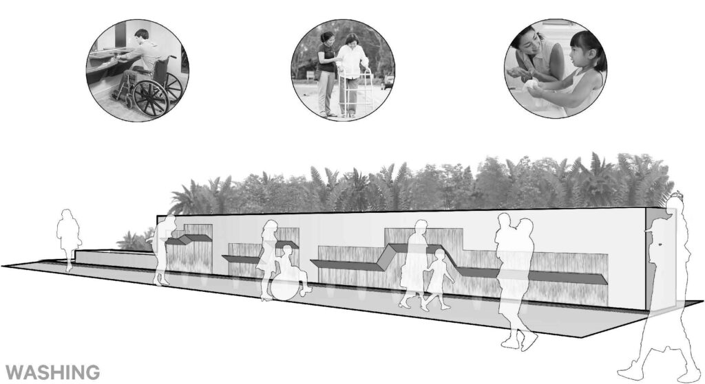
 

Figure 11 Stalled! airport prototype, washing station, drawing by JSA/MIXdesign, 2017.

Designing inclusive bathroom prototypes is one thing; implementing them is another. In 2018 MIXdesign was launched as a consultancy to respond to inquiries from institutions wanting to implement the multi-user prototype we advocated. However, we soon learned that building codes legislating sex-segregated restrooms presented an obstacle to their realization. Building them requires a variance, the outcome of a time-consuming process with unpredictable results that can discourage even the most motivated clients from implementing them. Our team realized that we needed to take legal matters into our own hands. Making the multi-user type viable meant amending the International Plumbing Code (IPC)—the model code that regulates the design and installation of plumbing systems in all types of buildings. Under the leadership of Terry Kogan, we joined forces with the American Institute of Architects, the National Center for Transgender Equality and the law firm of Bryan Cave Leighton Paisner in 2018. Our lobbying efforts were successful: the amended version of the code will appear in the 2021 version of the IPC and will be available for adoption by local, state and federal governments. Stalled! is especially proud of this victory. For us it exemplifies the potential for designers to expand their reach beyond discrete design commissions and form cross-disciplinary alliances that challenge and redefine the overall legal frameworks that shape the design of building and cities.

The inclusive design approach that informed Stalled! is an ongoing work in progress, as is the Stalled! project itself. MIXdesign, in collaboration with our network of experts, is refining the methodology as we apply it to other building types, including university campuses, museums and housing. Conducting cross-disciplinary research that interrogates design standards through a critical lens remains central to our approach, predicated on our conviction that designers can no longer turn a blind eye to the way the seemingly innocent conventions of architecture reproduce and perpetuate heteronormativity, structural racism and ableism. The creation of welcoming public spaces that foster social equity, health and wellbeing depends on first identifying and then overcoming the deep-seated historical and ideological forces that have shaped the design of everyday built environments. Raising awareness of how the protocols of professional practice transmitted through architectural typologies, standards, legislation and building codes produce noncompliant bodies is, in part, a historical project. Moving forward means looking back. History examined through a critical lens can be an instrumental tool in the realization of alternative futures—a testimony that the future can be different than the present, just as the present is different from the past.

Bibliography

Cahill, S. E., W. Distler, C. Lachowetz, A. Meaney, R. Tarallo, and T. Willard. “Meanwhile Backstage: Public Bathrooms and the Interaction Order.” Urban Life 14, no. 1 (1985): 33–58.

Cogdell, Christina. Eugenic Design: Streamlining America in the 1930s. Philadelphia, PA: University of Pennsylvania Press, 2004.

Douglas, Mary. Purity and Danger: An Analysis of Concepts of Pollution and Taboo. New York: Routledge, 1966.

Edelman, Lee. “Men’s Room.” STUD: Architectures of Masculinity. Edited by Joel Sanders. Princeton: Princeton Architectural Press, 1996.

Elizabeth, Grosz. Volatile Bodies: Toward a Corporeal Feminism. Bloomington, IN: Indiana University Press, 1994.

Kogan, Terry. “Sex-Separation in Public Restrooms: Law Architecture, and Gender.” Michigan Journal of Law 14, no. 1 (2007): 1–58.

Kosso, Cynthia, and Anne Scott, eds. The Nature and Function of Water, Baths, Bathing and Hygiene from Antiquity through the Renaissance. Boston, MA: Brill, 2009.

Kristeva, Julia. Powers of Horror: An Essay on Abjection. New York: Columbia University Press, 1982.

Molesworth, Helen. “Bathrooms and Kitchens: Cleaning House with Duchamp.” In Plumbing: Sounding Modern Architecture, edited by Nadair Lahji and D.S. Friedman. Princeton: Princeton Architectural Press, 1997

Development and Validation of the Shy Bladder Scale. Cognitive Behaviour Therapy 41, no. 3: 251–60.

Serlin, David. “Pissing without Pity.” In Toilet: Public Restrooms and the Politics of Sharing. New York: New York University Press, 2020.

Trump administration impacting the rights of trans and LGBT people. https://transequality.org/the-discrimination-administration.

U.S. Transgender Survey, prepared by National Center of Transgender Equality, 2015, pp. 14-15.

Notes

  1. There are a number of scholarly works examining the impacts of eugenics. See, for example: Christina Cogdell, Eugenic Design: Streamlining America in the 1930s (Philadelphia, PA: University of Pennsylvania Press, 2004).
  2. However, while this essay presents this process as a linear narrative, the design process is never so logical and straightforward. Each phase of the project involves conducting parallel and overlapping tasks that sometimes require us to circle back and conduct additional research or reconsider assumptions we had made earlier.
  3. According to the National Center for Transgender Equality, there are over 70 documented actions taken by the Trump administration impacting the rights of trans and LGBTQ people. https://transequality.org/the-discrimination-administration.
  4. Terry Kogan, “Sex-Separation in Public Restrooms: Law Architecture, and Gender,” Michigan Journal of Law 14, no. 1 (2007): 1–58.
  5. David Serlin, “Pissing without Pity,” in Toilet: Public Restrooms and the Politics of Sharing (New York University Press, 2020), https://doi.org/10.18574/9780814759646-016.
  6. U.S. Transgender Survey, prepared by National Center of Transgender Equality, 2015, 14/15.
  7. Cynthia Kosso and Anne Scott, eds., The Nature and Function of Water, Baths, Bathing and Hygiene from Antiquity through the Renaissance (Leiden, Netherlands: Brill, 2009).
  8. Julia Kristeva, Powers of Horror: An Essay on Abjection (Nota, 1982); Mary Douglas, Purity and Danger: An Analysis of Concepts of Pollution and Taboo (Routledge, 1966); Elizabeth Grosz, Volatile Bodies: Toward a Corporeal Feminism (Indiana University Press, 1994).
  9. Helen Molesworth, “Bathrooms and Kitchens: Cleaning House with Duchamp,” in Plumbing: Sounding Modern Architecture, eds. Nadair Lahji and D. S. Friedman (Princeton: Princeton Architectural Press, 1997).
  10. Kogan, “Sex-Separation in Public Restrooms.”
  11. Lee Edelman, “Men’s Room,” in STUD: Architectures of Masculinity, ed. Joel Sanders (Princeton: Princeton Architectural Press, 1996).
  12. S. E. Cahill, W. Distler, C. Lachowetz, A. Meaney, R. Tarallo, and T. Willard, “Meanwhile Backstage: Public Bathrooms and the Interaction Order,” Urban Life 14, no. 1 (1985): 33–58.
  13. Paruresis (shy bladder syndrome) is categorized as a social phobia rather than a functional disorder. Symptoms can include fear of others hearing or smelling urination. See B. Deacon, J. Lickel, J. Abramowitz, and P. McGrath, “Development and Validation of the Shy Bladder Scale,” Cognitive Behaviour Therapy 41, no. 3 (2012): 251–60.

Look, Linger, and Touch Something

September 6, 2023

Published in Spike Art Magazine, Issue 75 (Spring 2023) pp. 108-115

Diana Fuss In 2011, in conjunction with an exhibition at the Hessel Museum, we wrote a cultural history of the museum bench. Here we are, twelve years later, again thinking about benches, this time to address the pressing question—both practical and ethical—of diversity and accessibility. We’ve raised the benchmark you could say.

Joel Sanders In that essay, we traced the evolution of an overlooked component of gallery design, the museum bench, from the 16th century to today. We were both struck by how museum design, considered in relationship to the artwork on display, perpetuates the deep-seated anxieties of Western art – and, ultimately, of Western culture – about the corporeal body.

DF We were also curious about why, in museum studies, there was so little work on or interest in the museum bench. As we dove into the archive and began to trace its history, we discovered that even the architecture and design manuals devoted to museum galleries chose to overlook the furniture, in favor of design elements like picture frames, wall colors, and lighting fixtures. It didn’t take us long to realize that the indifference to and disdain for the utilitarian bench had everything to do with the inconvenient demands of museumgoers’ bodies – physical bodies that became tired, overheated, bored, hungry, loud, distracted, even horny. Over time, the presence of museum seating became an uncomfortable reminder that acts of spectatorship, far from being disembodied, are located in real bodies, with distinct needs and differing abilities. We found many reasons for why the museum bench became an object of derision, among them its subversion of attention, its repudiation of rationalism, and its rivalry with art. Now, what stands out to me the most is the way the bench became a prime seat of cultural discomfort with unruly bodies. More than any other factor, this fear of the masses, the maddening crowd in all its messy materiality, most directly challenged the notion of the art museum as a place for the disembodied, aesthetic contemplation of art.

JS I agree. The first palace museums, like the Uffizi and the Louvre, used two elements – picture frames and freestanding chairs – to “construct” the ideal humanist spectator, a disembodied eye that visually communes with paintings. In keeping with perspectival theory that emerged during the Renaissance, spectatorship was considered an out-of-body, ocular-centric experience. The historical research we conducted revealed the extent to which the story of the overlooked museum bench is a story of class and privilege. When the National Gallery in London opened in 1838 to educate citizens of all classes by exposing them to great works of art, they confronted a challenge not so different that which many museums face today: namely, crowd control. Wanting to protect and conserve priceless masterpieces, designers invented tactics that would transform the unruly public into respectable, well-behaved citizens. For the first time, guardrails forced viewers to circulate around the perimeter of the gallery at a safe distance from works of art, and freestanding chairs that obstructed traffic flow were removed and replaced by fixed (often round) couches marooned in the center of the gallery.

Fast-forward to the emergence of the white cube in the 20th century. Both Clement Greenberg and Michael Fried describe viewing abstract pictures as an instantaneous optical experience. Again, architecture was enlisted to transform the viewer into an obedient, disembodied eye. The track light, placed out of sight on the ceiling, replaced the obtrusive guard rail, distributing a band of light around the gallery wall and the perimeter of the floor that demarcated a circulation zone of looking but not touching. In the white cube, sofa islands were replaced by benches whose minimalist design – a hard, horizontal plane supported by skinny legs – was intended to be visually inconspicuous, so as not to compete with the works of art on display. Undermining the notion of a disembodied eye, the museum bench was an awkward reminder that spectatorship is, in truth, grounded in the multisensory experiences of actual human bodies – bodies subject not only to fatigue or distraction, but also, on occasion, to the temptation to touch or damage vulnerable works of art.

DF  Since we collaborated on this essay twelve years ago, we have both pursued our mutual interest in multisensory experience, albeit in different ways. I’ve been thinking more about classrooms, specifically the need for embodied, sensory, flexible spaces that can accommodate today’s new active learning pedagogies and diverse student populations. Five years ago, you established MIXdesign, a think tank and inclusive design studio that works with institutional clients, including museums, to make their facilities accessible and welcoming for people of different ages, genders, races, religions, and disabilities. I’d like to focus on your MIXdesign work, if I may. How has your thinking about museum design evolved since launching MIXdesign? And is there anything you wish we had done differently in our earlier cultural history of the museum bench?

JS Thinking back, we wanted to put the body back into theories of spectatorship, as it were, and the bench was the historical figure for this re-embodiment. While we addressed questions of bodily exhaustion, discomfort, inattention, and even appetites, we didn’t attend enough to the question of museumgoers’ diverse social identities beyond class, a subject not yet fully on our radars, nor those of museums. Today, we both think about diversity all the time, but I wish we had been more forward-thinking about this issue.

DF Me too. It would have been helpful to think not strictly in terms of “the body,” but rather in terms of “bodies.” At the time we were putting this essay together, some great work was being done by scholars like Bridget Cook and Mabel O. Wilson, who were looking at museum and exhibition design through the lens of race, as well as Tobin Siebers and Rosemarie Garland-Thomson, who were focusing on disability. Now, museums are pursuing a variety of measures to further diversity, recruiting minority curators, for example, and mounting exhibitions that showcase underrepresented artists.

JS Some museums are also sponsoring American Sign Language (ASL) tours for deaf people, tactile tours for blind people, and sensory-friendly hours for autistic people.

DF The American Alliance of Museums recently put out an inclusive design statement that officially embraces diversity, equity, accessibility, and inclusion (DEAI). It’s not clear to me though how quickly institutions are adapting, particularly when it comes to things like the design, placement, and location of museum furniture.

JS Museums are gradually becoming aware of the problem, though they are only just beginning to explore the spatial consequences of DEAI for non-normative users. We need more creative design initiatives in the United States that go beyond ADA (Americans with Disabilities Act) compliance.

DF Can you say more about an initiative you’re involved in currently? I know you are now conducting MIXmuseum, a research and design project in partnership with the Queens Museum.

JS Our project treats the Queens Museum as a case study to investigate a challenge faced by many art museums that underwent renovations and expansions in the early-to-mid-2000s. Aiming to make their buildings more inviting, these museums hired architects to replace traditional, opaque facades with glazed-window walls that lead to spectacular atriums. But post-occupancy research shows that these spaces are not in fact meeting the needs of many of those visitors that museums hoped to attract. For this reason, our focus, with the principle of participatory design in mind, has shifted from galleries to public-entry sequences: arriving at the front door from parking or public transportation; getting orientated in the reception area; waiting, resting, and participating in programs in the atrium; and taking care of bodily needs in the restrooms.

DF Can you say more about participatory design? It seems essential to this research.

JS The disability rights motto “Nothing About Us Without Us” is a touchstone for our study. Inclusive design depends on the active participation of users who can provide valuable insights from their lived experiences of designed environments. We’ve been collaborating with colleagues from the Yale School of Public Health to develop engagement tools – surveys, interviews, workshops – that allow us to better understand the intersecting and sometimes conflicting needs of both staff members and visitors at the Queens Museum. We have also recruited an access cohort composed of twenty-five members who together represent a cross section of the museum’s diverse audience, including native Spanish speakers, trans and nonbinary folk, older adults, parents with young children, and users of wheelchairs, scooters, and walkers. The data we’ve analyzed so far has revealed a couple things we expected, including the presence of restricted access (negotiating steps and awkward ramps) and difficult wayfinding (navigating destinations within the building). But it has also revealed additional problems, including sensory overstimulation (induced by glare and loud noises) and an all-around unfriendly atmosphere (created mainly by a clinical, white interior devoid of color, tactile material, or any type of multicultural imagery). The most frequent complaint? Poor bench seating!

DF Naturally, I’m curious about the seating. We ended our essay on the museum bench by arguing that museum furniture needs to be viewed as more than a necessary evil. Long treated as an aesthetic headache, we asked: Why not approach it as an aesthetic opportunity? On that note, can you offer a sneak peek of a few specific access design recommendations generated by your study?

JS We have lots of ideas, beginning with the reception desk, which we’re reconceiving as a multi-purpose area that integrates visitor orientation and seating. Visitors obtain multilingual information at the reception desk, with a multi-height, overhanging counter that provides sight-lines and ranges of motion, along with leg room for children, people of small stature, and wheelchair users. We recommend an “access shelf” that displays accessibility equipment like wheelchairs, assistive listening devices, fidget toys, and noise-canceling headphones, as well as interactive digital touchscreens and large-font print material for wayfinding in braille, ASL, and non-English languages. Visitors can also take a break and recharge their minds, bodies, and electronic devices at a built-in lounge that extends from the desk area, where multi-height area seating can accommodate people of different sizes and abilities, while slots allow people who use wheelchairs to sit side by side with those who don’t.

The antiseptic atrium poses another challenge. We recommend portable, modular furniture, such as benches, acoustic wall dividers, and ramps, that can be easily reconfigured to subdivide the atrium into smaller “micro-climates” for school groups and events. The kit includes lightweight, multi-height seating options like ottomans, double-sided benches with back support, and footrests that can provide places to relax for people of different ages, heights, weights, and abilities. We’ll also be introducing multisensory materials to reflect more multicultural identities. We imagine textured and colorful seating, for example, clad in textile patterns created by local crafts artists.

DF And that other kind of seating – toilets?

JS Here, we envision retrofitting the existing, sex-segregated bathrooms and treating them as one larger space, with communal washing stations and private toilet stalls. Two comfort rooms, each with a mirror, sink, toilet, and baby-changing table, offer privacy for shy people, as well as caregivers and religiously observant Jews and Muslims. Integrated seating is essential, while transparent slots in the mirror behind the sink afford views into the adjacent lounge. These are just a few recommendations, but they should offer a glimpse of the kind of scalable solutions that could be adapted by other museums.

DF You’ve developed these proposals in response to the Queens Museum’s visitor demographics, but it seems to me that they have the potential to change everyone’s experience in almost any museum.

JS Exactly. In collaboration with the Queens Museum and the Architectural League of New York, we’ll soon be publishing the outcome of our study and making it free to the public online – an open access of information and ideas, if you will. In imagining more equitable museum spaces, we ourselves have been inspired by the insight and input of community members, stakeholders, visitors, and employees, as well as by artists who, since the 1960s, have used sound, video, and performance to create artworks that expand our sensory horizons. The goal is to work with museums to make them more accessible to people who have previously been excluded. One important part of that involves transcending the ocular-centric legacy of museum design, which we addressed in our museum bench essay, and reimagining museums as multisensory environments – places that welcome each one of us, no matter our identities or embodiments, to encounter the world of art from multiple perspectives. Designing through the lens of diversity, equity, accessibility, and inclusion has proven to be a real catalyst for producing creative design resolutions to corporeal challenges, even – and perhaps especially – the seemingly simple act of sitting on a museum bench.

DF I don’t think either of us realized that the museum bench might actually be a key to resolving so many of the issues that alternately confound and inspire institutional design work today. I like to think the lowly bench, at long last, is having its moment.


JOEL SANDERS is the founder of JSA/MIXdesign, an architectural studio and inclusive design consultancy in New York, as well as a Professor at Yale School of Architecture and Yale School of Public Health. He is the author of three books, and his projects have been featured in numerous international exhibitions and the permanent collections of several American museums.


DIANA FUSS is the Louis W. Fairchild Class of ’24 Professor of English at Princeton University. She is the author of numerous books, including Dying Modern: A Meditation on Elegy (2013) and The Sense of an Interior: Four Writers and the Rooms that Shaped Them (2004).

Stalled! Transforming Public Restrooms

September 24, 2019

At different moments in American history the public bathroom has been a crucible that has registered social anxieties triggered by the threat of a series of marginalized groups entering into mainstream society. Historical milestones include debates sparked by the introduction of the “ladies” room to accommodate women entering the workplace in the early 20th century, the fight to abolish segregated “colored” bathrooms by the Civil Rights Movement during the 1950s and 60s, the fear of contamination posed by gay men using public lavatories during the AIDS crisis in the 1980s and the pressure to make bathrooms accessible to people with disabilities tied to the passing of the American with Disabilities  Act (ADA) in 1990.  In each instance, the public restroom, by virtue of it being a physical space, transforms an abstract concern into a tangible peril, having the power to conjure nightmarish scenarios that compelled “normal” citizens to physically interact with “abnormal” people that society has preferred to render invisible.

In the United States, public restrooms are again a contested site, this time sparked by the specter of allowing a new constituency—transgender individuals—access to the public restroom belonging to the gender with which they identify. A long-simmering moral panic over the presence of transgender people in sex-segregated public toilets began escalating in the spring of 2015, as an unprecedented wave of mass culture visibility for trans issues. It intersected with recent changes in the federal government’s interpretation of existing civil rights protections against sex-based discrimination. Two high-profile examples have been the Campaign for Houston to repeal HERO, an equal rights ordinance, and North Carolina’s House Bill 2. They resulted in the boycott of the state by numerous corporations and organizations. At the time of this writing, more than two dozen similar bills attempting to restrict gender-appropriate public toilet access for transgender people have been introduced in statehouses across the United States, and the Trump administration has retreated from transgender-supportive interpretations of existing laws put forth by the Obama administration​.

Both sides of the debate pose this issue as one of safety. Advocates cite high rates of violence faced by trans people, and in particular trans women of color. Naysayers claim transgender women pose a threat to cis-gender women, portraying trans women as predatory men masquerading in dresses to stalk sexual prey in the ladies’ room. Lurking beneath this unsubstantiated fear are longstanding societal anxieties about human embodiment that bathrooms have historically harbored: they include abjection, misogyny, homophobia, and disability. Yet a new, and perhaps even deeper threat provoked by society’s newfound awareness of transgender people is the notion of gender ambiguity: trans people call into question the presumption that anatomy is destiny, demonstrating that there are multiple ways of expressing one’s gender identity independently from one’s biological sex. This increasingly calls into question the way in which bathroom design perpetuates-through spatial segregation- an outdates binary conception of sex (a conception that besides posing a problem for trans people, also excludes intersex people, and those who identify as non-binary or genderqueer.

Stalled!, an interdisciplinary design research project spearheaded by architecture professor Joel Sanders, gender studies professor Susan Stryker, and law professor Terry Kogan aims to shift the terms of the debate in three fundamental ways. First, while all-gender restrooms have become a hot button issue that has received considerable media attention, few cover it from an architectural perspective. We need to regard public restrooms as a social justice issue with design consequences that can be solved with innovative architectural solutions. Second, we can no longer accept gender segregated restrooms as a given that answers to the ostensibly objective needs of privacy based on anatomical difference. History teaches us that the first sex segregated bathrooms were instituted in the 1880s in response to women entering the workplace. A product of prurient Victorian values, “ladies rooms” were invented as havens to protect women whose mentally and physically vulnerable bodies threatened to corrupt men. Third, we need to expand our purview to create inclusive restrooms that not only meet the needs of the trans community, but encompass the needs of all embodied subjects of different ages, genders and abilities.

There are two prevailing design approaches to gender neutral bathrooms—the single unit and multi-stall solution. The single unit solution is the generally accepted code-compliant solution that retains sex segregated bathrooms and supplements them with a single-occupancy room re-labeled/designated as Gender Neutral. However, this single-occupancy solution spatially isolates and excludes: it stigmatizes non-conforming individuals, not only trans but also the disabled, from mixing with other people.

Respectively, we advocate a desegregated multi-stall solution that has received support from many trans activists. This alternative treats the public restroom as one single open space equipped with European style, fully enclosed floor-to-ceiling doors that ensure visual privacy. This solution has a number of advantages. No longer will gender non-conforming people who don’t fit the binary have to choose between two unacceptable spatial options that don’t align with their identities. By consolidating a greater number of people in one rather than two rooms, there are more eyes to monitor, reducing risk. Most important, multi-stall not only meets the needs of the trans community, but also accommodate the needs of a wider range of differently embodied subjects of varying ages, genders, and disabilities. For example, now a father can accompany his young daughter, or a woman can take her elderly male friend to the restroom.

Just as we ended the racial segregation of public toilets in the past, and expanded access for a wide range of physical abilities, so too can we design truly inclusive public restrooms that serve diversity and justice, safety and sanitation. However, implementing inclusive desegregated bathrooms is not without challenges. To begin with, it requires changing legislation and building codes. Desegregated restrooms require a complicated variance. Hence, Stalled! includes an initiative to amend the International Plumbing Code (“IPC”), the model code that governs most construction in the United States, to allow for multi-user, all-gender restrooms in new and existing buildings. Next, it requires changing deeply ingrained social attitudes about spatial practices related to three activities- grooming, washing and eliminating-that people consider natural, universal and inevitable. We would need to  recognize bathrooms as historically contingent sites of social exchange where social, psychological, technological and ecological forces converge.

While important in their own right, bathrooms are a point of departure to generate a larger conversation about the relationship between environmental design, the human body and social equity. The controversies surrounding transgender bathrooms is just one example of how the civil liberties of non-compliant bodies—women, blacks, Muslims, immigrants and the LGBTQ community to name a few— are imperiled both in this country and around the world by denying people access to public and private space. In other words, these are political issues with architectural ramifications. Architects and designers must step up to the plate and explore the design consequences of these urgent social justice issues. First, we need to become aware of our own complicity by not turning a blind eye to the way the seemingly innocent conventions of architecture reproduce problematic cultural assumptions about “normal” bodies. Then designers, working in collaboration with activists, lawyers, code experts, engineers and graphic designers need to form coalitions to develop a new design approach that enables a broad range of differently embodied people of different ages, genders, religions and disabilities to productively interact with one another in public and private space. In the process of discovering creative design solutions that match the needs of diverse human bodies, we can change social awareness: accessible public spaces that foster mixing will breed tolerance and respect for human dignity and difference.

Airport Restroom Case Study

Stalled! is developing restroom prototypes that can be implemented in a variety of generic sites, from smaller footprints in institutional buildings to high volume facilities in airport concourses. We chose an airport as a case study because it is a high volume, mixed-use public space where a diverse constituency spends extended periods of time, catering to their mental and physical needs while they wait—checking social media, eating and going to the bathroom.

Our scheme for the airport restroom takes as its point of departure the standard dimensions of a typical gender-segregated airport restroom. Our goal was to explore different ways that a wide range of embodied subjects could mix together in public space, based on the understanding that the seemingly commonplace and universal activities that we perform in restrooms are shaped by the convergence of biological, cultural and psychological factors.

Diversity design methodology: Our design methodology involves researching the design consequences of the specific needs of user groups categorized by age, gender, religion and disability, and then finding creative solutions that could be shared between them. Three factors guided our design decisions. 1) Creating a space that would promote physical and psychological well-being to counteract the subjective feelings about abjection, shame, privacy and propriety that bathrooms evoke in users. 2) Integrating interactive fixtures and technologies that conserve water and are easy to handle for those with manual disabilities. 3) Devising way-finding that uses color, texture, and dramatic lighting in lieu of signage as devices to assist people with physical and sensory disabilities to navigate through public space.
Activity zones: Treating the toilet stall as a privacy unit allows us to eliminate the barrier that typically divides adjacent men’s and women’s rooms as well as the wall that separates them from the concourse and instead reconceive of the public restroom as a semi-open agora-like precinct that is animated by three parallel activity zones, each dedicated to grooming, washing, and eliminating.

Slip-resistant sheets of diamond plate, tile and rubber differentiate each of the three activity zones painted a different shade of blue for the visually impaired. After debating the merits of different color options, we finally chose blue because research indicates that it is soothing, associated with water, health and hygiene, and a complementary background color for deaf signing because it contrasts with skin tones.

Grooming station: Immediately adjacent to the concourse, the grooming station features a smart mirror that disseminates information (flight arrival and departure times, weather, and retail) while they groom at a multi-level counter that serves people of different heights and abilities. Those who want privacy can retreat into curtained alcoves for breastfeeding, administering medical procedures such insulin injections, meditation,and prayer.
Washing station: The communal washing station meets the needs of adults, children, people in wheel chairs,and religious people who use public restrooms to perform ritual ablutions for cleansing face, hands, arms, and feet. Inset floor lights indicate the location of motion-activated faucets inset into the wall that allows water to flow into an inclined splash plane placed at different ergonomic heights that is then collected and cleaned in a re-mediating planter before being recycled. The scent of plants and the ambient sounds of flowing water masks bodily sounds and odors.
Elimination station: Located at the back of the facility, the elimination station consolidates rows of bathroom stalls that offer acoustic and visual privacy. Unoccupied stalls are indicated by recessed floor lights; when entered, they turn off and the now occupied stall glows from within. From the inside of each stall, users can surveil their surrounding by looking through a band of blue one-way mirror located at seated eye-level. Stalls contain low flush composting toilets that treat human waste through aerobic decomposition.
Section: As users circulate from one station to the next, passing from the outermost grooming station to the innermost toilet wall, they experience a multi-sensory gradient that takes them from public to private, open to closed, smooth to course, dry to wet, acoustically reverberant to sound absorptive, ambient to spot lighting.

The Future of Cross-Disciplinary Practice

September 7, 2018

Published in Shaping the American Interior: Structures, Contexts, and Practices; Routledge: p. 195-204

The design professions are in transition. The era of Starchitecture is drawing to a close as a new generation of designers recognize that they need to address urgent environmental, technological and social justice issues that have spatial consequences. These include climate change, war and migrations, making accessible and safe public spaces for diverse communities and considering the transformative impact of digital technologies on the spaces of our everyday lives.

But the nature of professional practice driven by the demands of consumer capitalism frustrates this goal. Star architecture rewards eye-catching form over social responsibility, encouraging name brand architects and interior designers to craft signature photogenic trophy buildings and interiors that can be disseminated in the mass media. This mentality represents the last gasp of the now discredited image of the heroic Modern architect, exemplified by Howard Roark as depicted in Ayn Rand’s Fountainhead, an invincible white male who single-handedly can save humanity through design. Modernism, for all of its arrogance and heroic delusions, at least rooted itself in utopian social ideals.

The challenges posed by contemporary global culture are far too complex, wide-ranging and interconnected to be solved by a single author representing one design field alone. Instead they require cross-disciplinary problem solvers from allied disciplines – architects, interior designers, and landscape architects – to work together to craft a new way of thinking and working, an integrated conception of environmental design that regards interiors, buildings, and landscapes as linked interactive systems.

Interdisciplinary collaboration is easier to achieve in theory than in practice. The first hurdle is to dismantle the silos that divide these three overlapping fields into separate professions each governed by their own systems of education, training, licensing and codes of professional conduct. But to do that we first must acknowledge the deep-rooted and often problematic cultural and ideological values and prejudices that led to this disciplinary segregation in the first place. In the same way that individuals work with therapists to outgrow engrained patterns of behavior received from the past, the design professions are in need of counselors who can help them see and ultimately transcend the inherited cultural baggage that inhibits cross-disciplinary alliances.

Hence the value of design history books like Shaping the American Interior: Structures, Contexts, and Practices. Rather than recount the usual story of lone male geniuses who craft signature masterworks, this book departs from convention and shifts its emphasis from practitioners to practices, looking at how the designed environment is shaped by networks of individuals whose ways of working are dictated and shaped by the structure of professional practice.

While I am not a design historian, as an architect and a professor I have grappled with some of these questions, teaching history seminars and writing articles like this one that look at the way history can shed light on issues confronting contemporary practice. These forays into history and theory came from my own experiences as a designer wanting at different times in my career to bridge three fields – architecture, interiors, and landscape – that have been professionally segregated since the late nineteenth century. Why was I never taught to think about how the layout of furniture and the choice of fabrics and upholstery influenced the way people occupy and interact with each other in a room? Why did my education leave me unequipped to expand my materials palette to include living materials – trees and vegetation – as space-defining elements? Why was I trained to conceive of the building envelope as the limit where architecture ends rather than as a porous membrane that facilitates the transition between interiors and landscape, both precincts understood as intercommunicating designed spaces that foster social interaction?

Considering these questions from a historical and social perspective, has led me to conclude that the seemingly straightforward differences in design approach and professional conduct between architecture, interiors and landscape stem from deep-seated cultural values often rooted in class and gender. Over the past 20 years, I have written papers that treated the relationship between architecture and interiors and architecture and landscape as independent subjects. In this essay I will attempt a synthetic overview that explores the affinities and differences between them. After examining the issue of professional segregation from a historical context, I will conclude with proposals about how we might go about overcoming the obstacles that divided the professions in the past with the goal of forging productive associations in the future.

STUD

My longstanding interest in uncovering the foundations of disciplinary segregation began in 1996 when I edited Stud: Architectures of Masculinity, a book that invited a group of architects, critics, and artists to explore the role architecture plays in the performance of male identity.[1] Stud borrowed the notion of gender as “performance” from queer theorists who argue that human identity in general, and gender identity in particular, are not inborn biological traits but rather culturally constructed, learned modes of behavior. Theorists like Judith Butler and Jack Halberstam, then known as Judith, frequently referred to drag queens and drag kings whose exaggerated gestures, make-up, and costumes expose how gender is not innate but performed.[2] But the performance of gender identity depends, at least in part, on space: impersonation relies not only on the materials that clothe the body but also upon the designed environment that frames it.

First, if architects tend to consider buildings as photogenic objects, the notion of “performance” encouraged me to shift my attention to the interplay between human bodies and space and to embrace a conception of the built environment as a “stage” that enables people, like actors, to perform various roles. Second, Butler’s analysis of the way drag performers rely on costume to construct identity led me discover the affinities between clothing and cladding – the ephemeral elements like wallpaper, paint, fabrics, curtains upholstery, and furniture – that interior designers use to dress the interiors designed by architects: both are culturally coded applied surfaces that we use to fashion identity.

CURTAIN WARS

Discovering the crucial yet overlooked relationship between clothing, cladding, and human identity while editing Stud sparked my interest in architecture’s devalued sister discipline – interior design. In 2002, I wrote an essay, “Curtain Wars: Architects, Decorators and the 20th Century Interior,” that explored how the conflicts that pit architects against decorators, “wars” that are waged over something as seemingly innocuous as curtains, are bolstered and sustained by broad cultural stereotypes and anxieties about the nature of gender transmitted through a variety of “high” and “low” cultural discourses from architectural theory to Hollywood films.[3]

“Curtain Wars” explored how problematic assumptions about gender and class shaped both design approaches and professional identities. Ever since the emergence of the interior decorator as a design professional in the mid-nineteenth century, interior decoration has been dismissed as a superficial pastime associated with economically privileged upper and later middle classes. By the
twentieth century, interiors, a field practiced by women and gay men, became tainted by its association with femininity and homosexuality. It was thought that architects, typically men, worked conceptually, organizing space by manipulating durable materials and elements (structure and walls), while decorators, typically women and gay men, worked intuitively, adorning rooms with ephemeral materials (fabrics and upholstery) linked with fashion and domesticity. In contrast to architects who think in abstract terms to solve practical programmatic and technical problems, interior designers create spaces that cater to corporeal needs, the material body considered a female principle, as opposed to immaterial male intellect.

GROUNDWORK

Ten years after completing “Curtain Wars,” my academic interests converged with my professional practice, leading me to consider the obstacles that kept another one of architecture’s allied disciplines at a distance – landscape. The emergence of Green design at the turn of the millennium put pressure on architects to think in a new way. My studio, JSA, received commissions to design residential and institutional projects that encouraged and sometimes required architects to incorporate what at that time was a new set of LEED certified green building standards that, while focused on buildings, also included ecological landscape techniques as well.

At the same time, I became interested in the work of progressive ecologists who underscored how climate change required us to recognize that nature and civilization, although not the same, have always been intertwined and are becoming more so. There is not a square inch of the planet that does not in some way bear the imprint of humans. Landscape and culture intermix in various combinations; while constructed elements are more common in urban areas and natural elements predominate in rural zones, organic and synthetic operate as a gradient of differing intensities that forms a continuum across the surface of the earth.

If the design disciples were to pursue the design consequences of this interconnected conception of humans and nature, then they needed to integrate their efforts. However, sustainable design, although driven by commendable goals, stymied this goal. Taking for granted the long-standing professional division of labor between architects and landscape architects, it was largely driven by a product-oriented mentality that evaluated materials and techniques on the basis of their performance and efficiency while rarely taking into consideration issues of form and human use. How could the two fields join forces to forge an innovative landscape/architecture design vocabulary that could tap into the formal and programmatic potential of sustainable design principles?

Professional frustrations again let me to design history. I soon realized that sustainable design recapitulated the professional segregation of landscape and architecture that dates back to the nineteenth century. In the introductory essay to Groundwork “Human/Nature: Wilderness and the Landscape/Architecture Divide,” I argued that this problematic division of architecture and landscape into independent disciplines in the United States has ideological underpinnings that can be traced to a deep-rooted Western polarity that opposes humans and nature and as a consequence buildings and landscapes. [4]

I soon discovered many parallels between the troubled relationship between architecture and interiors and architecture and landscape. Architects again enlisted problematic assumptions about the nature of class and gender to marginalize landscape and to justify the notion that buildings and nature were inherently and qualitatively different from one another. Like interiors, landscape was a discipline discredited for its association with women and the domestic realm. In the mid-nineteenth century, gardening had become a pastime reserved for upper class women and by the midtwentieth century a hobby for middle class housewives, publicized in popular magazines like House and Garden, whose title and content made explicit the affinities between interiors and landscape. And while landscape, like interiors was embraced by the mainstream media, it too was largely overlooked by the academy. Up until recently there has been a conspicuous absence of serious scholarly books and exhibitions devoted to landscape as compared to architecture, a phenomena that both reflects and reinforces landscape’s secondary status.

Moreover, landscape design methodologies, like interiors, are shaped by problematic assumptions about the gendered body. The landscape/architecture divide, mirrors the long-standing split between the spirit and the flesh, the Western binary that opposes immaterial intellect, considered a male prerogative, with the material corporeal body, deemed a female principle that since antiquity has been linked with Mother Earth. In addition, the design disciplines have accepted a Western bias espoused by philosophers and art critics including Aristotle, St. Augustine, Goethe, and Clement Greenberg, who all categorize the human senses in a hierarchy, differentiating between the immaterial higher senses – sight and sound – and lower senses – touch, taste, and smell. Modern architects like Le Corbusier famously validated this ocular-centric perspective. They privileged the visual rather than the multi-sensory dimension of architecture in contrast to interiors and landscape, two professions that work with soft ephemeral elements – fabrics and vegetation – to create indoor and outdoor spaces that engage not only sight but the lower senses, touch and smell.

The long-standing personification of nature as woman has also perpetuated the human/nature, landscape/architecture divide. Until the nineteenth century, the design disciplines mirrored a conception of nature inherited from the Old Testament that conceived of nature as a wily and temperamental female that needed to be tamed by men. But the rise of industrialization in the nineteenth century ushered in a new conception of nature as women. A first generation of environmentalist thinkers and activists like Henry David Thoreau, Charles Muir, and Theodore Roosevelt active during the second half of the nineteenth century were confronted with an intimidating prospect not unlike that which we face today – the disappearance of Wilderness. The vanishing wilderness paralleled imperiled white male masculinity now threatened by a range of emerging forces like technology, immigration, and women’ rights. But for men like Theodore Roosevelt, Wilderness, the home of the frontiersmen and the cowboy, represented a haven that sustained “vigorous manliness,” a refuge where robust individuals could resist the emasculating and domesticating forces of urban culture. If Nature was traditionally conceived of as an unruly woman that needed to be subdued and cultivated through the labor of men, Wilderness thinking now cast Nature as a virgin in desperate need of male stewardship that needed to be conserved and protected from the ravages of industrial civilization.[5]

Not only did Wilderness thinking give birth to the American environmentalist movement, but it also shaped the evolution of landscape and architecture in America from the nineteenth century until today: its dualistic conception of people and nature, bolstered by problematic gendered stereotypes, only reinforced the age-old Western conception of the building as a man-made artifact qualitatively different from its ostensibly natural surroundings. In turn, this way of thinking impacted professional conduct, reflected in the professional segregation of architects and landscape architects into parallel professional organizations: in 1899, at the height of the Wilderness movement, a new professional academy, the American Society of Landscape Architects (ASLA) was established.

Wilderness core values not only resulted in dual design professions but it also shaped design approaches: by positing that the human is entirely outside the natural, Wilderness presents a fundamental paradox: how to reconcile the ideal of untouched nature with the imprint of human design? The result is a deep and persistent suspicion of designed nature that still endures today.

BREAKING NEW GROUND

Since I wrote “Curtains Wars,” the status of interior design has risen. No longer relegated to periodicals like House and Garden and House Beautiful geared to a largely female and gay readership, home improvement has expanded its reach. Internet and cable TV channels cover home design and appeal to a broader, although still principally white, demographic.

Interior design’s reputation within the architectural community has improved as well. Fifteen years ago, most self-respecting architects still subscribed to Modern Architecture’s disdain for interior design, seemingly oblivious to the contradiction that some of the great designers of furniture and interiors were men like Le Corbusier, Mies van de Rohe, Alvaar Aalto and Eero Saarinen. In contrast, today Stararchitects of both sexes, like Rem Koolhaas and the late Zaha Hadid, have no qualms designing interiors, furniture, and even clothing, often for fashion brands like Prada and Chanel. And unlike their Modernist predecessors who repudiated ornamented buildings in favor of stripped-down structures that employed materials associated with male authenticity like stone, wood, steel and glass, today celebrated Pritzker Prize winning architects like Peter Zumthor and Jean Nouvel create diaphanous veil-like facades of patterned glass and perforated metal that recall seductive female garments.

Clearly these significant professional inroads stem from recent changes in cultural attitudes about sex and gender. Thanks to the efforts of feminist, gay, and, more recently, transgender activists, mainstream society is gradually adopting more expansive models of human identity that has impacted design over the past 15 years. At the turn of the millennium, innovative magazines like Wallpaper* emerged that combined fashion, design, and architecture to a mixed audience that included a new breed of self-proclaimed “Metrosexuals.” Today mainstream newspapers, like the New York Times T Magazine publish an eclectic mix of fashion, design, and architecture that represents the pervasive influence of a young generation of hipsters and genderqueers who freely cross design genres and gender codes in their quest to express fluid multiple identities.

Likewise, the status of landscape has risen in recent years. Sustainable design has impacted the work of an international roster of progressive architects and landscape architects like Snohetta, Weiss Manfredi, and West who all blur the lines between buildings and sites. Progressive city agencies across the country are investing in public infrastructural projects for sustainable urban parks like the Highline, NYC and Millennium Park, Chicago. The visibility and acclaim given to these projects and to their authors like James Corner and Adriaan Geuze, are attracting a new generation of students who are enrolling in landscape programs. Meanwhile, old-school gendered stereotypes that shaped the image of landscape are shifting as well. The success of large-scale infrastructural projects designed by male practitioners convincingly demonstrates that landscape need no longer be regarded as an exclusively feminine domain confined to the domestic realm.

THE FUTURE: CROSS-DISCIPLINARY COLLABORATION

But despite significant improvements in the status of interiors and landscape over the past 15 years, made possible by changing attitudes in the culture at large, we still have a long way to go. Here are a few recommendations that might instigate a new way of thinking and working.

Design scholars and historians can help us overcome the constraining cultural ideologies that hold us back. Understanding the history of practice from a cultural perspective will allow us to overcome engrained cultural conceptions, often rooted in suspect notions about the gendered body that continue to shape design approaches and professional conduct.

With the help of design history, we can repudiate the problematic ideologies that brought into being binary thinking and establish an alternative design methodology based on interdisciplinary cooperation. No longer will architects prioritize buildings, relegating the design of interior and exterior as an afterthought that will be addressed, if at all, later in the design process. Instead, as soon as we put pen to paper or keyboard to monitor, we need to assemble teams of like-minded architects, interior designers and landscape architects to collaborate on projects that from their very inception employ sustainable design principles to generate designs that weave together people, interiors, buildings, and landscapes. Ultimately, teams will need to expand to include not only design professionals, but also engineers, ecologists, and computation experts. The challenge is to train confident practitioners who welcome the prospect of dissolving the already unstable boundaries between inside and outside, organic and synthetic, humans and nature, while at the same time respecting the kind of in-depth knowledge and expertise that can only be acquired from specialization. We need to cultivate a new frame of mind that merges integrated thinking with expert knowledge based on the recognition that the world’s problems are too complicated and interconnected for one kind of professional to solve alone.

Training open-minded designers that value both interdisciplinary exchange and specialization inevitably requires revamping the existing structure of design education that, mirroring the structure of the design professions, educates students in separate programs, that inevitably shape the thinking, values, design approaches, and skill sets of the students they educate. Design education and professional licensing are inter-connected, linked by accreditation boards that approve schools that can demonstrate that they adequately prepare students with the required skills necessary to become licensed professionals when they graduate. For example, only graduates of architectural programs accredited by the National Architecture Accrediting Board (NAAB) are qualified to apply for a license that will allow them to practice architecture in 37 states.

Curriculums are the bridge that links the academy and practice. For example, to obtain NAAB accreditation, programs must demonstrate that they offer curriculums that cover a range of required subjects in design, history/theory, technology and professional practice. Consequently, curriculums tend to be relatively uniform, leaving little room for substantial variation. We can begin reforming design education by formulating a revised NAAB-compliant prototypical design curriculum that will expose architecture students to the principles, values, and skills of two allied fields – interior design and landscape – that intersects with their own. For example, now architecture curriculums require students to take courses that acquaint them with the rudiments of technical subjects like mechanical systems, structures, and acoustics, subjects that will prepare them to work with licensed consultants representing these fields when they enter the profession. In a similar vein, why not expand architecture curriculums to include courses that treat the basics of furniture, fabric, and plant specification?

While revising architecture curriculums is a modest first step, the best way forward would be to imagine the consolidation of separate design departments into a single degree-granting program
with areas of specialization. For example, in the first three years of a five-year program, students could follow a core curriculum that acquaints them with the fundamental principles needed to think across a range of indoor and outdoor sites and scales. Then, in the final two years, they could elect to pursue majors in inclusive subjects that span disciplines like hardscape, softscape, building envelopes, sustainability, and ergonomics that would allow them to graduate with specialized degrees.

In both short-term and long-term scenarios, pedagogy will not only equip students with a broader set of skills not taught in most architectural schools but will encourage synthetic interdisciplinary thinking that will make them aware of the value of introducing interiors and landscape issues from the very inception of a project.

The existing structure of practice in which each field is organized under independent professional organizations – American Institute of Architects (AIA), American Society Interior Designers (ASID), and the American Society of Landscape Architects (ASLA) – each governed by different standards of professional protocols, needs to change as well. A modest first step would be for each organization to rewrite and to coordinate the boiler-plate legal documents that define the scope of services that each offers to clients. While we tend to take these purportedly objective descriptive documents for granted, these texts prescribe professional working relationships between client, architect, and consultants, including interiors and landscape, based on unchallenged assumptions about the nature of the design disciplines and the people who practice them.

In complex architectural projects that involve the participation of representatives from interiors and architecture, the respective division of labor that governs how the three parties will work together is outlined in three separate contracts that are written in a way that prescribes a hierarchical relationship between them. Consultants are typically retained either by the client or in many cases directly by the architect who then becomes legally and financially responsible for overseeing their work. In a typical project, the architect is the project leader, overseeing the course of the design process. During the first phase of the project, Schematic Design, the architect generally establishes the design direction. Only later in the process, typically in the second and third phases, Design Development and Construction Documents, are the interiors and landscape consultants brought in to elaborate or embellish the design concept already generated by the architect.

In the spirit of efficiency, contracts parse the work between architect and consultants into discrete tasks to avoid redundancy and ultimately save the client time and money. In the end, contracts dictate a rigid linear design process that ignores the inherently blurred boundaries between disciplines. For example, at first glance the line between building shell, freestanding furniture, and vegetation is clear. But who, architect or decorator, should be responsible for picking wall colors, tiles, and finishes? Who, architect or landscape architect, should design the outdoor hardscape elements like terraces and paths that define the perimeter of buildings and articulate the threshold between inside and outside? Moving forward we need to draft more flexible and inclusive contracts that promote collaboration. They should allow for all three parties at the beginning of a project to brainstorm design concepts. And as the project unfolds, contracts need to differentiate roles and responsibilities in a way that acknowledges that there is inevitably a certain measure of productive redundancy between the overlapping tasks that need to be shared between disciplines.

Contracts are not the only professional documents that need revamping. Tenders and RFQs (Request for Qualifications) and RFPs (Requests for Proposals) issued by clients looking to hire qualified designers also presume a hierarchical division of labor between design professionals. They are typically addressed to the architect, who is responsible for submitting the proposal that must include an assembled team of consultants that may or may not include, interiors and landscape. Even design awards programs and project credits in design publications presume disciplinary segregation: awards submissions are typically divided into rigid disciplinary categories and publications – both analog and on-line – typically credit the lead designer, generally the architect, listing the supporting consultants if at all, in the fine print.

EMBODIMENT

Cross-disciplinary alliances ultimately depend on reworking the intricate procedures and protocols, from curriculums to contracts, which underpin the interconnected relationship between design education and the design professions. However, this ambitious project depends on a form of consciousness-raising that requires us to look at how the past informs the present. The contribution of design history is essential. A new generation of scholars needs to think across design fields to map the interwoven histories of professionalization that have come to dictate the design approaches and working relationships that have yielded the arbitrary division of labor between architects, interior designers, and landscape that we have inherited to this day. These engrained habits have prevented us from seeing that, in the end, all three fields are but a single enterprise dedicated to a common goal, the design of spaces where embodied humans can perform a variety of roles as they interact with one another in public and private space.

We rarely address this shared imperative. The names assigned to the design disciplines – architecture, interiors, landscape – are telling: they attest to the way we define them and differentiate them from one another in terms of the sites upon which they operate, be it a building, a room, or a park. More often than not, the representations that designers make and that scholars and curators reference are evidence of our indifference to the body. Human beings are either conspicuously absent from or mindlessly photoshopped into drawings, photographs, and renderings. Another even more telling symptom of this problem is that we continue to ignore what critiques of representation have been telling us for years, that images tend to see the world from the narrow perspective of a privileged few. We must not take for granted the structure of Western spectatorship that, by default, presumes the default point of view of a Western heterosexual white male, the implied but invisible occupant of the space being depicted whose body lies outside the picture frame.

Design handbooks, like the popular Time-Saver Standard series are among the rare exceptions when designers directly address the requirements of human bodies. These three manuals, Time- Saver Standards for Architecture, Time-Saver Standards for Interior Design and Time-Saver Standards for Landscape, although aimed at different audiences, nevertheless all depict men, and sometimes women, as eviscerated diagrams. These two-dimensional line drawings reduce the corporeal body in all of its diversity into a universal abstraction that illustrates the “normal” body, whose standardized dimensions determine the ergonomic measurements established in building codes that designers incorporate into their projects. Scholars from Disability Studies like Douglas Baynton have persuasively demonstrated that this conception of the “standard” body is historically contingent, a problematic product of nineteenth century science and medicine, whose supposedly objective findings were and continue to be used to uphold the oppression of those considered deviant.[6] Rejecting the convention of the “normal” body as ideologically bankrupt will allow designers to turn their attention to addressing the needs of a wide range of non-conforming bodies marked by race, gender, and disability.

In the end, design histories like this one will allow us to recognize that the triad architecture, interiors and landscape are in fact continuous practices whose common denominator is the corporeal experience of differently embodied people in the world. This recognition will allow us to refocus our energies. No longer will we create projects differentiated by scale and location (building, interior, exterior) treated as isolated commodities that can be consumed in two-dimensional images. Instead, adopting a new mentality will free us to conceive of environmental design as a single practice spearheaded by teams of individuals with different levels of expertise but all dedicated to a common goal, the creation of a gradient of indoor–outdoor spaces that combine living and non-living materials where a diverse range of differently embodied humans of different ages, races, classes, and genders can productively interact.

NOTES

[1] Joel Sanders, STUD: Architectures of Masculinity (Princeton: Princeton Architectural Press, 1996).
[2] Judith Halberstam, Female Masculinity (Durham: Duke University Press, 1998); Judith Butler, Gender Trouble: Feminism and the Subversion of Identity (New York: Routledge, 2010).
[3] Joel Sanders, “Curtain Wars,” Harvard Design Magazine No. 16 (2002).
[4] Joel Sanders, Groundwork: Between Landscape and Architecture (New York: The Monacelli Press, 2011).
[5] William Cronon, “The Trouble With Wilderness; or Getting Back to the Wrong Nature,” in Uncommon Ground: Toward Reinventing Nature (New York: W. W. Norton, 1965).
[6] Douglas Baynton, “Disability and the Justification of Inequality in American History,” in The Disability Studies Reader (New York: Routledge, 2013).

Human/Nature: Wilderness and the Landscape/Architecture Divide

September 7, 2018

Published in Flow: Interior, Landscape, and Architecture in the Era of Liquid Modernity; Bloomsbury: p. 6-17 [1]

The global environmental crisis underscores the imperative for design professionals— architects and landscape architects—to join forces to create integrated designs that address ecological issues; however, long-standing disciplinary divisions frustrate this crucial endeavor. Architecture and landscape architecture have been professionally segregated since at least the late nineteenth century. They are constituted as independent fields, each with its own curriculum and licensing procedure. The challenge of developing a new model of practice—one that is both formally and programmatically sophisticated and environmentally responsible—requires that designers examine how this impasse ever arose. Although my remarks largely focus on what I refer to as the landscape/architecture divide in the United States from the nineteenth century until today, I would suggest they are relevant to this volume with its focus on the relationship between interior and landscape. As I have argued elsewhere, architecture and interiors are interdependent disciplines.[2] The building envelope, understood in conjunction with the interiors they shelter, articulate the
seams where inside and outside meet, and, as a consequence, they shape the way humans interact with one another and the designed environment.

The landscape/architecture schism can be traced back to antiquity and to another deep-seated yet suspect Western polarity: the opposition between humans and nature and thus between buildings and landscapes. One version of the human/nature dualism finds its home in an influential body of thought that arose in nineteenth-century America, the concept of wilderness. The idea of wilderness is so engrained in the American conscience—through literature, philosophy, and even notions of gender and sexuality—that it has effectively shaped the design approaches and even the codes of professional conduct that, in many ways, still define the relationship between  architecture and landscape practice.

Scholars have traced the intellectual origins of American environmentalism to Henry David Thoreau and John Muir, American writers active in the second half of the nineteenth century who advanced the concept of wilderness. Indebted to eighteenth century Enlightenment thinkers like Jean-Jacques Rousseau and Romantics like William Wordsworth, this generation of writers celebrated the ethical and spiritual benefits of living a life in unspoiled nature, uncontaminated by America’s burgeoning urban industrial civilization (Nash 1967).

This account of the relationship between humans and nature marks a pronounced reversal in American thinking about landscape. Until the second half of the nineteenth century, the settlement of the American frontier was predicated on the Judeo-Christian belief that it was the responsibility of humankind to cultivate the wilderness, which was traditionally perceived to be a desolate place located on the margins of civilization and associated with terror and bewilderment.

This conception of wilderness not only perpetuated the age-old human/nature divide but also engrained ideas about the nature of gender. Relying on the longstanding personification of nature as a woman, feminist critics like Carolyn Merchant have shown that the rhetoric underlying the expansion and settlement of the American continent was founded on biblical accounts of the expulsion from Eden, the fall brought about by a woman. Wilderness was depicted as an unruly female to be subdued and ultimately cultivated through the labor of men, whose goal was to recover the paradise lost on earth. For feminists, this biblical injunction was reinforced by yet another gendered Western dualism that opposed material and immaterial, mind and body: rationalist thinking, considered a male prerogative, made possible the Scientific Revolution and a corresponding conception of Mother Earth as a passive body subjected to male domination through technology—a worldview that many eco-feminists argue persists today.[3]

Image 1.1: Theodore Roosevelt and John Muir on Glacier Point, Yosemite Valley 1903. Library of Congress, Prints and Photographs Division LCUSZ628672.

By the mid-nineteenth century the American frontier had been settled. This impending loss of the majestic scenery of the American continent threatened America’s national identity. Fueled by a surge in cultural nationalism and nostalgia for the rapidly vanishing frontier, early environmental activism represented a remarkable shift in wilderness thinking: the spiritual grounding of the young nation had come to depend on the preservation of the natural landscape. As Thoreau wrote, “In wildness is the preservation of the world” (Cronon 1996: 69).

By the turn of the twentieth century, the vanishing wilderness also paralleled the imperiled male masculinity. Associated with yet another authentically American trait—rugged individualism—wilderness was regarded as a source of masculine vigor and vitality. The home of the frontiersmen and the cowboy, wilderness represented a safe haven, a refuge where men could resist the emasculating, domesticating forces of urban culture. Theodore Roosevelt famously championed the establishment of America’s first national parks because they countered “flabbiness and slothful ease” and promoted that “vigorous manliness for the lack of which in a nation, as in the individual, the possession of no other qualities can possibility atone” (Nash 1967: 150) (Figure 1.1).

Not only did wilderness form the foundation of American environmentalist thinking, but it also exerted a direct and profound influence on the subsequent development of two overlapping but increasingly diverging fields, architecture and landscape architecture. The dualistic conception of humanity and nature only reinforced the long-standing Western conception of buildings as constructed artifacts qualitatively different from their ostensibly natural surroundings. If buildings were different from landscapes, then a new type of landscape professional was required to fill the gap and complement the work of architects.

In 1899, a diverse group of gardeners, horticulturalists, and designers, under the leadership of Fredrick Law Olmsted, Jr., established a professional academy, the American Society of Landscape Architects (ASLA). Over the years, wilderness core values have resurfaced in various guises, connecting the work of a first generation of nineteenth-century American landscape architects led by Olmsted, who were directly influenced by their wilderness peers, to three generations of twentieth-century Modernist critics and landscape designers, including Henry Russell Hitchcock, Garrett Eckbo, Charles Rose, and Ian McHarg.

Yet another undercurrent of wilderness thinking connects this lineage of landscape practitioners. By positing that the human is entirely outside the natural, wilderness presents a fundamental paradox. The historian William Cronon writes, “If we allow ourselves to believe that nature, to be true, must also be wild, then our very presence in nature represents its fall. The place where we are is the place where nature is not” (Cronon 1996: 80–1) (Figure 1.2). Wilderness, then, presents designers with a particularly thorny dilemma: how to reconcile the ideal of untouched nature with the imprint of humans and human design. The guilty conscience fostered by this conundrum has haunted American landscape architects, and the dilemma was compounded by the negative connotations of designed nature: decoration, domesticity, and femininity. The result was a deep and persistent suspicion of designed nature that still endures.

Image 1.2:Emanuel Gottlieb Leutze, Westward the Course of the Empire Takes Its Way, mural study, U.S. Capitol, 1861. Smithsonian American Art Museum, Washington, D.C. / Art Resource, NY.

The pioneering work of Frederick Law Olmsted betrays the paradoxes at the heart of wilderness thinking. Unlike Muir, who turned his back on cities to find redemption in the pristine American landscape, Olmsted fully embraced making nature accessible to urban citizens. Olmsted sought to legitimate the emerging profession by differentiating it from gardening, insisting that it was an art and not a trade. In a letter, he wrote that he had personally elevated landscape architecture from “the rank of a trade, even of a handicraft, to that of a profession—an Art, an Art of Design” (Treib 1993: 19).

Nevertheless, Olmsted’s conception of landscape architecture as design proved inconsistent with the guiding premise of his aesthetic philosophy: communion with nature depended on exposing people to a simulacrum of natural scenery unspoiled by evidence of human intervention (Figure 1.3a and 1.3b). Upholding the notion of a nature/culture polarity, Olmsted conceived of Central Park as a natural oasis inscribed within the dense New York metropolis, one that could offer the weary urbanite refuge from the industrial city through the rejuvenating effects of the visual contemplation of nature. In a passage that exemplifies yet another long-standing Western duality, the mind/body split, he writes, “As what is well designed to nourish the body and enliven the spirits through the stomach makes a dinner a dinner, so what is well designed to recreate the mind from urban oppressions through the eye, makes the Park the Park” (McKibben 2008: 125). For Olmsted, Central Park was not a place for active recreation, as it is today, but a place for visual observation. In later projects, like Prospect Park and the Boston Riverway, he again grappled with the ostensible incompatibility between nature and metropolitan design. Although they were massive infrastructural projects requiring advanced technology, engineering, and design, Olmsted disguised their constructed character by using a pastoral vocabulary that viewers assumed to be natural.


Image 1.3a and 1.3b: Frederick Law Olmstead, Riverway, Boston, Massachusetts, view during and after construction, 1892 and 1920. Courtesy of the National Park Service, Frederick Law Olmsted, National Historic Site.

At the outset of the twentieth century, Olmsted was the acknowledged leader of a growing new profession. Only thirty years later, however, a new generation of landscape architects had lost its way, its efforts stymied by the supposed incompatibility of nature and design. The catalogue for Contemporary Landscape Architecture and Its Sources, an exhibition curated by Hitchcock at what was then called the San Francisco Museum of Art in 1937, underscored the crisis surrounding the profession’s inability to devise a compelling new Modernist landscape vocabulary. The San Francisco curators narrowly defined the problem of the modern landscape as belonging to residential garden design. In the process, Hitchcock grafted principles from architecture onto landscape architecture. Transferring modern architecture’s famed prohibition against ornament to its sister discipline, he advocated that landscape designers renounce their propensity for decorative ornamental planting and instead concentrate on functional concerns. Conflating two design professionals—the interior decorator and the gardener—who he saw as threatening the integrity of buildings by adorning them with ephemeral materials, Hitchcock cautioned against the use of flowers, writing that flower beds “serve primarily a decorative purpose, like curtains or upholstery indoors, subordinate to the useful general purpose of the terrace” (Hitchcock 1937: 19).

This identification of both interior design and garden design with decoration clearly tapped into deep-rooted disciplinary assumptions tinged by gender prejudices. In a similar vein to the criticisms made by male architects about interior decoration, gender prejudices also shaped cultural perceptions of landscape, a practice that also relies on the most ephemeral of materials—trees, plants, and flowers—to adorn the stable constructions of architects. Unlike architecture, a cerebral enterprise apprehended intellectually, gardens, like tactile interiors, elicited visceral pleasures stimulated by the textures, colors, and scents of material Mother Nature. If, in a strict Modernist view, all of landscape, whether cultivated or untamed, was considered an accessory to architecture, then gardens were even more inconsequential. As they repudiated ornament based on its association with feminine adornment, Modernists like Hitchcock also condemned decorative plantings, which they equated with womanly fashion, artifice, and deception. While International Style architects focused on pressing social issues, landscape designers, like interior designers, devoted their attention to the inconsequential and devalued domain of the female homemaker. In short, the discipline of landscape could redeem itself only by transcending its own tainted history as a superficial pastime affiliated with women. These prejudices would soon be reiterated by subsequent generations of landscape professionals.

Ironically, Hitchcock’s exhibition upheld the preeminence of architecture by arguing that landscape designers should extend architectural principles from indoors to outdoors: “Gardening on roof terraces and in close conjunction with houses is not so much a separate art as a sort of outdoor architecture” (Hitchcock 1937: 15). Imposing another key tenet of modern architecture on landscape—functionalism—he contended that designers must treat garden terraces as literal extensions of the interior, as “rooms that promote exterior functional activities” (Hitchcock 1937: 15). He maintained that outdoor spaces immediately adjacent to the house should be treated architecturally, but those farther away from the building should be left intact. This approach was exemplified in such prewar domestic masterpieces as the Villa Savoye and the postwar Farnsworth House, both of which conjure up the image of the isolated building set in a pastoral setting. They were both conceived as suspended objects that, through the new technologies of the curtain wall and the steel frame, leave nature deceptively unspoiled.

Architecture has appropriated a responsibility once shared with landscape design—the framed view. While buildings in the West have largely been conceived of objects independent from the landscape, architects working in concert with gardeners have employed devices—like French doors leading to porches aligned with trees and hedges—that articulate a smooth transition between inside and outside. But now divorced from the ground plane, the elevated house allows detached spectators confined within the interior to observe carefully composed views of an ostensibly pristine landscape (Hitchcock 1937: 15, 18).

It was the responsibility of a next generation of American landscape architects—Garrett Eckbo and James Rose—to find a way to reconcile the designed landscape with the nature/culture mentality underpinning modern architecture. Preoccupied with the burden of generating a viable direction for Modernist landscape, they seemed stymied by a professional inferiority complex. They shared the conviction that their discipline’s legacy of creating pretty pictures composed with ornamental plantings must be overturned by embracing modern architecture’s core values.

These two landscape architects practiced in California. Allying themselves with a loosely defined California school of Modernist landscape designers like Thomas Church and Lawrence Halprin, they sought an alternative to the Modernist paradigm of the isolated machine in the garden. Instead, they endeavored to take advantage of the West Coast’s gentle climate and relaxed lifestyle to marry architecture and landscape in a way that facilitated indoor-outdoor living (Figure 1.4). But these practitioners had few role models in their own field. Instead the works of architects like Frank Lloyd Wright, Rudolph Schindler, and Richard Neutra, as well as the Case Study architects, represented a departure from the prevailing conception of architecture as a self-contained object building with nature as a foil.

Image 1.4: Thomas Church, Donnell Garden, Sonoma, California, 1948. Photo by Charles A. Birnbaum, The Cultural Landscape Foundation.

These resourceful designers looked outside their discipline to fine art. They absorbed the influence of maverick early European landscape designers, including Gabriel Guevrekian and Pierre-Emile Legrain, and like contemporaries Roberto Burle Marx and Isamu Noguchi, they were indebted to Cubism and Surrealism. The outcome was a series of modest residential designs that borrowed bold abstract forms and motifs from a variety of modern art sources, including Theo Van Doesburg, Joan Miró, and Jean Arp.

But this fertile period of small-scale experimentation was short-lived. Eckbo and Rose, like many of their postwar peers, gradually withdrew from taking on the residential commissions that were the bread and butter of many noted American landscape designers: Charles Platt, Warren Manning, and Ruth Dean at the turn of the century and Thomas Church in the 1950s. Small-scale residential projects came to be regarded as the domain of the amateur female homemaker, due in part to the emergence of mass-market publications like House Beautiful (Harris 2002: 180–
205). Eckbo and Rose shifted their focus to large-scale commissions like university campuses, corporate office parks, and suburban subdivisions, joining the ranks of a generation of corporate landscape firms that would dominate the profession for years to come. By the 1970s, the ASLA awards reflected this shift: only five of two hundred awards went to residences.

Another postwar practitioner, Ian McHarg, partnered with state and federal agencies to tackle the infrastructural challenges of formulating ecologically minded master plans that could transform entire metropolitan regions. He outlined his ecological approach in Design with Nature. For McHarg, writing in 1969, Olmsted’s worst predictions had been realized—rapacious capitalism aided by remarkable technological advances had tipped the precarious balance between nature and civilization, resulting in environmental casualties in America’s polluted, slum-ridden cities. McHarg compared city dwellers to “patients in mental hospitals” consigned to live in “God’s Junkyard” (McHarg [1969] 1995: 20, 23).

McHarg also wrestled with the issue of reconciling nature and design, although he pursued a different course from Olmsted, who smoothed over the paradox of constructing nature by concealing art, engineering, and infrastructure with a design vocabulary that appears to be natural. Likewise, McHarg departed from Modernists like Tunnard, Steele, Church, Eckbo, and Rose, who strived to wed functionalist precepts to abstract form making derived from the fine arts. Instead, McHarg turned to the natural sciences. Not really interested in new materials or technologies, he nevertheless shared the preoccupations of contemporaries like Buckminster Fuller and Frei Otto, who, following in the footsteps of nineteenth-century designers like Viollet-le-Duc, Ernst Haeckel, and René Binet, were interested in the underlying laws of form generation in nature.

Natural scientists were for McHarg what engineers were for Le Corbusier. In a quasi-functionalist argument reminiscent of Le Corbusier’s Towards a New Architecture, he advised designers to study and emulate the morphology of plants and animals, not human works of engineering (McHarg [1969] 1995: 170). By identifying the natural sciences as a bridge between the constructed and the natural, McHarg made a more convincing claim for the integration of science and design than his functionalism-inspired predecessors. No longer specific to architecture, science became the legitimate purview of the landscape architect, who was now capable of generating seemingly inevitable designs grounded in the logic of science that integrated the built and the natural without resorting to art.

McHarg pioneered an ecological methodology that encouraged designers to consider a range of interconnected environmental factors—climate, water, flora, and fauna. Nevertheless, his comprehensive regional proposals, generated through a process-oriented approach grounded in the supposedly objective logic of the natural sciences, largely evaded design. His master plans were too large, conceptual, and abstract to engage issues of form, space, materials, and the human body in the way traditional garden designs once did. While McHarg’s design approach coincided with and reflected the process-oriented, ecological values that dominated the late 1960s and the 1970s, his philosophy nevertheless betrays the same struggle to come to terms with the supposed incompatibility of nature and design that preoccupied two generations of American landscape designers before him. McHarg revisited many wilderness-inflected themes inherited from his predecessors: a dualist way of thinking that views nature as a vulnerable feminine entity that must be protected from the predatory interests of humans, including architects; a professional bias against designed nature, decoration, and feminine artifice; and a preference for large-scale problem solving based on a deterministic design approach justified by science.

One of the consequences of this way of thinking is a mistrust of the designed environment, a legacy that continues to haunt many design professionals. The legacy of wilderness core values inhibits alliances not only between architects and landscape architects but also between interior and landscape designers. Its dualistic worldview conceives of interiors, like architecture, as a human endeavor, an art that intrinsically exists in opposition to the natural. Moreover, engrained disciplinary biases further undermine the marriage of interiors and landscape. In the same way that interiors are literally subsumed within the building shell that separates inside from outside, interior design is considered a subordinate branch of architecture. Interiors and landscapes, two fields devalued because of their pejorative association with femininity, domesticity, and decoration, must be controlled and regulated by the master discipline, architecture. In short, architects and the buildings they make both literally and figuratively impede the marriage of two fields: architecture, like a stern but wellmeaning parent, forbids the union of its potentially unruly offsprings, interiors and the brash interloper, landscape.

The residue of wilderness thinking—in particular, its dualistic disciplinary worldview and its preference for science over aesthetics—also has environmental consequences, strongly shaping the parameters of green design today. In the first two decades of the twenty-first century, two types of design professionals—architects and landscape architects—and two sectors of the construction industry—builders and landscapers—have developed parallel strategies for making buildings and landscapes more sustainable. Products and materials are generally designed to replicate the environmentally irresponsible ones they replace: solar panels are attached to sloped or flat roofs, renewable materials clad the interior and exterior of conventional buildings, and organic fertilizers and indigenous plantings are eco-friendlier ways of improving the acres of traditional lawns and shrubs that adorn buildings conceived as isolated objects.

In short, green design fosters a product-oriented mentality that generally evaluates materials and techniques on the basis of performance and efficiency, rarely taking into consideration issues of form and program. Moreover, by taking disciplinary divisions for granted, sustainable design unwittingly reinforces one root of the problem: the dualistic paradigm of the building as a discrete object spatially, socially, and ecologically divorced from its site. As a consequence, this American ideal—itself derived from wilderness thinking—inhibits designers and manufacturers from treating buildings and landscapes holistically as reciprocal systems that together impact the environment.

Might it be possible to jettison these outmoded and environmentally irresponsible prejudices and instead reimagine buildings, interiors, and landscapes as mutually interactive entities? Relinquishing wilderness values will allow designers to adopt the more complicated viewpoint advanced by progressive scholars and scientists: a recognition that nature and civilization, although not the same, have always been intertwined and are becoming more so. Climate change reveals that there is not a square inch of the planet that does not in some way bear the imprint of humans.

It is important to adopt a more complex understanding of the relationship between nature, science, and technology. Common ground must be sought between technophobia and technophilia. Environmental problems can be resolved only by considering nature as both a scientific and a cultural phenomenon. Realigning deeprooted preconceptions and conceiving of culture and nature, and, as a consequence, buildings, interiors, and landscapes, as deeply interconnected entities will allow designers to usher in a new model of integrated practice, a way of working that reunites three fields of inquiry that should never have been divided.

This new mentality will allow representatives of three disciplines now accorded equal status to forge productive continuities between interior and exterior. Designers are encouraged to pay attention to the interface—the seam, or overlap, where indoors and outdoors meet. A critical awareness of the fluid connection between natural and synthetic, as well as between exterior and interior space, motivates designers to think about scale, form, and materials in entirely new ways: materials become the connective tissue that enacts the passage between interior, building envelope, and landscape. The scale of the human body becomes the crucial common denominator that bridges the intimate scale of interiors with the expansive scale of the outdoors. Considering the spatial and material junctures that link inside and outside through the lens of ergonomics, these can generate new ways of thinking not only about form but also about program, positioning human activities, both inside and outside, in a way that coincides with twenty-first-century notions of what it means to live with nature.

Footnotes
[1] This chapter is an abridged version of an essay included in the book Groundwork: Between Landscape and Architecture by Diana Balmori and Joel Sanders (2011).
[2] In “Curtain Wars: Architecture, Decorating and the Twentieth-Century Interior” (Sanders 2002),
I argued that deep-seated cultural prejudices resulted in the problematic professional split
between two inseparable fields, architecture and interiors. This essay extends this way of thinking
to account for yet another arbitrary professional divide between architecture and landscape. In
my view, “architecture” refers to both the hard and soft surfaces that clad both the interior and
exterior of buildings and that together enable the performance of human identity.
[3] For two influential feminist accounts of the intertwined relationship between nature, science,
capitalism, and gender, see Carolyn Merchant, The Death of Nature: Women, Ecology and the
Scientific Revolution (1980), and Val Plumwood, Feminism and the Mastery of Nature (1993).

Stalled: Gender-Neutral Public Bathrooms (with Susan Stryker)

October 13, 2016

Joel Sanders and Susan Stryker

Published in the South Atlantic Quarterly, Duke University Press (115:4)


A long-simmering moral panic over the presence of transgender people in sex-segregated public toilets has reached an acute state since the spring of 2015, as an unprecedented wave of mass culture visibility for trans* issues has intersected with recent court decisions guaranteeing trans* people access to gender-appropriate toilets. When we drafted this article in March 2016, only one state, South Dakota, had passed (but subsequently vetoed) a bill attempting to restrict gender-appropriate public toilet access for transgender people, although more than two dozen such bills had been introduced nationwide. 1 Since then, North Carolina passed HB2, its notorious “bathroom bill”; the Obama administration issued new directives on genderappropriate access to toilets and locker rooms in public schools nationwide; twenty-one states have sued the federal government to block implementation of those directives, and the seemingly obscure issue of transgender public toilet access seems headed to the Supreme Court. 2

The current backlash against trans* people using public toilets that match their gender identity reflects a longer history of public toilets, which themselves date to early eighteenth-century Paris 3, and registers social anxieties triggered by the threat of various marginalized groups entering into normative society. Previous debates were sparked by the introduction of the women’s room to accommodate female participation in the paid workforce, the fight to abolish “colored” bathrooms by the civil rights movement, the furor over “unisex” toilets that helped derail passage of the Equal Rights Amendment, the fear of contamination posed by gay men using public lavatories during the AIDS crisis, and pressure to make bathrooms accessible to the disabled. In each instance, the public restroom stages the transformation of an abstract concern into a tangible threat, by virtue of it being a physical space in which so-called normal citizens are brought into intimate physical proximity with precisely those presumably nonnormal people whose expulsion from or invisibilization within the body politic underpins and enables our society’s norms of embodied personhood.


Houston Case Study

The November 2015 defeat of the Houston Equal Rights Ordinance (HERO) offers a compelling recent case study regarding the manner in which transgender presence in public toilets has become a flashpoint for broader social anxieties about shifting norms of gender and sexuality. When Houston’s openly lesbian mayor Annise Parker proposed a nondiscrimination bill that would protect all Houston citizens no matter their race, religion, age, sex, gender, or disability, it seemed that the wide range of antidiscrimination provisions would offer protection to even the most marginalized groups that fell under the ordinance’s umbrella. Opponents, led by the group Campaign for Houston, defeated the bill, however, by targeting one constituency, transgender women, and one space, the public toilet. The opponents’ misguided rallying cry of “No men in women’s bathrooms!” and the diatribe that accompanied it on the Campaign for Houston’s 4 website, perpetuated stereotypes of transgender women as sexually perverse men. It took aim at “gender-confused men, who—under this ordinance—can call themselves ‘women’ on a whim and use women’s restrooms whenever they wish” to prey on “wives, mothers and daughters.” Through targeting trans* women in particular, Campaign for Houston took aim at what it considered the ordinance’s real purpose, which was to make “sexual orientation” and “gender identification” two new protected classes.

A similar controversy, waged on similar ground, had erupted in Canada in February 2015 when Senator David Plett authored an amendment to gut the trans-inclusive provisions of the Canadian Human Rights Act. Dubbed the “bathroom bill,” it also cited safety as the justification for prohibiting transgender people from using public restrooms, claiming that it would harbor “pedophiles” and make “abused women” uncomfortable by exposing them to transgender individuals who had biologically male characteristics. The transmisogyny and sex negativity evident in these campaigns speak to a fundamental anxiety about gender ambiguity that is perhaps most in evidence in public discussions of sex-segregated public toilets, given our cultural beliefs about the anchoring of social gender in our genitals and secondary sex characteristics. It underscores our society’s refusal to acknowledge the instability of gender itself as a social system for classifying and administering human lives according to a purportedly natural sex dichotomy. While misplacing the source of these anxieties, Campaign for Houston 5 explicitly acknowledged the threat, seeing the bathroom ordinance as “deceptive tactics” to “re-structure society to fit a societal vision” that was an “attack on the traditional family.” In the end, Campaign for Houston deemed the bathroom a battleground worth fighting for based on the same problematic logic used by those who previously fought for sex-segregated bathrooms in the past, considering it a space that upholds the status quo by maintaining gender binaries accomplished through the spatial segregation of the sexes, justified by anatomical difference.

However, instead of fostering a productive dialogue that would have encouraged Houstonians to confront the underlying social anxieties triggered by gender-appropriate public toilet access for trans people, both sides of the debate framed the issue in a reductive way, posing it as a question of safety and privacy. Opponents asserted that transgender women threatened the safety of cisgender women and children, while proponents saw proper access as a way of protecting transgender people from harassment and assaults. Strikingly, both sides believed that their concerns over the ostensibly objective problem of public safety could be adequately addressed through an architectural solution—making the built environment of the restroom facilitate a particular vision of a desired body politic.


Reframing the Issue

In what follows, we reframe the assumptions that undergird the necessity of sex-segregated public toilets and advocate for gender-neutral facilities instead. Our assessment of the situation does not diminish the very real and legitimate dangers that have been measured in reliable studies documenting the incidents of discomfort, harassment, and assaults experienced by transgender people, as well as cisgender women, children, and even men in public bathrooms. Instead, our objective is to shift the terms of the argument, recognizing that safety is one symptom of a larger dilemma posed when groups that mainstream society considers abnormal or deviant clamor for nonprejudicial access to public space. The future of gender-neutral bathroom design depends on reframing the argument, getting beyond problematic ideological misconceptions and prejudices that still haunt our thinking. If Campaign for Houston exemplifies how our society continues to pathologize gender variance, then we need to craft a new kind of public bathroom— and ultimately a new model of public space—that allows people to become aware of and accept multiple forms of gender expression by allowing them to freely mix with one another. However, accomplishing this goal requires adopting a new way of thinking that shifts the argument from gender neutrality to gender diversity and, ultimately, to human diversity.

Since the 1960s, social justice efforts have sparked national conversations focused on addressing the urgent needs of particular marginalized communities, including women, people of color, and queers. At a moment when transgender people have entered the media spotlight and public discourse to an unprecedented degree, transgender experience offers a new lens for addressing the persistent problems of embodied difference that have long plagued the space of the public toilet. But our work casts a wider net— while coming up with a public toilet design that responds to transgender needs is an important undertaking, we understand receptivity to transgender needs to be a generative and productive way to begin to rethink the way all embodied subjects interact with one another in public space.

We need to explore the architectural implications of gender variance. Design matters. It is not coincidental that most of the arguments both for and against gender-neutral restrooms tend to leave out any meaningful analysis of the design of the actual site. This oversight underscores the need to make people aware that the designed environment plays a central role in shaping all human identities by orchestrating how people use public space and engage with each other in it. In the past few years, activists at many progressive colleges and universities have taken a leading role nationally in advocacy efforts that expand access to public accommodations while protecting privacy for transgender people—including everything from correct registration of names/pronouns in staff and student records to fitness facilities to dorm rooms and restrooms. While the push to recognize gender-appropriate pronouns or to embrace new gender-neutral forms of personal pronouns has provoked a national conversation that has raised public awareness of how language informs gender expression, there has not been a similarly nuanced exploration of gender-neutral public space. We need to expand our thinking to take into account how environmental design, like language, is a discourse with the power to shape human identity.


Design Recommendations

Designers need to craft flexible environments that can allow all embodied individuals to express a wide spectrum of identities in public space. As gender expression becomes more diverse and differently attached to and detached from physicality, this need becomes ever more pertinent. With respect to public bathrooms, that means jettisoning what is now the generally accepted solution that consists of maintaining gender-specific bathrooms and merely supplementing the status quo with a single-stall or single-occupancy room, not so different from the single-occupancy bathrooms mandated by the Americans with Disabilities Act (ADA). Advocates frequently justify this solution on economic grounds, arguing that its modest footprint does not impose undue hardship on building owners and developers who would otherwise be compelled to fund more elaborate architectural solutions. However, the drawback of the single-occupancy gender-neutral bathroom is that it spatially isolates and excludes. While some users prefer the privacy it offers, it can nevertheless exacerbate problems of social exclusion by segregating transgender people from shared public space and stigmatizing their presence in mixed groups of people.

A better solution, supported by many trans activists, and increasingly found in trendy urban nightclubs and restaurants, is to eliminate gendersegregated facilities entirely and treat the public restroom as one single open space with fully enclosed stalls. One example is the Modern, Danny Meyer’s upscale restaurant in New York’s Museum of Modern Art. A circulation corridor divides the linear room into two parallel zones: one is dedicated to washing and features a horizontal mirror hanging above a row of freestanding pedestal sinks; the other, dedicated to eliminating, comprises an uninterrupted wall of European-style floor-to-ceiling stalls. This type of facility has many advantages. Gender-nonconforming people are not forced to choose between two unacceptable options, each of which makes them uncomfortable, while trans and cis people who express their gender in a more binary fashion need not worry about being in the “wrong” restroom. European-style stalls are equipped with doors with no peek-a-boo cracks and therefore ensure visual privacy and inhibit nonconsensual sex between stalls. Most important, by consolidating a greater number of people in one room rather than two, the unisex, gender-neutral bathroom provides safety in numbers: increasing bathroom occupancy reduces risks of predation associated with being alone and out of sight.

Our design proposal takes the single-room typology as a point of departure, but takes it one step further by posing an alternative to the dominant spatial paradigm that relies on walls to solve social issues. The bathroom is but one instance of a building type that, like fortresses and prisons, subscribes to the generally accepted belief that by erecting boundaries, architects can create protected precincts that ensure safety through the separation of human bodies from one another. The bathroom, conceived of as a series of walled enclosures nested inside a larger enclosure purportedly accomplishes this objective through what Sheila Cavanagh 6 terms the “hygienic imagination”: by dividing “clean” public space from the “dirty” realm of the abject body and by separating men from women, able-bodied from disabled, and, in a previous era, members of one “race” from another. Walls, however, by definition belong to both inside and outside and, as a consequence, stage contiguity and potentials for porosity as much as they signal separation and containment. This is true of the shared boundary wall, inscribed with dual-entry doors designated for men and women, that assumes the burden of dividing adjacent public and private space as well as for the shared wall that typically allows a back-to-back men’s and women’s room to touch. The same can be said for the series of partitions that subdivide the bathroom interior, ephemeral floating screens, placed between urinals and toilets, that ostensibly create visual privacy between members of the same sex. Walls are symbolically fragile: no matter how thick, they are penetrable and can be breached.

Our design proposal jettisons these boundary-laden solutions (see figure 1). Instead, we draw inspiration from another spatial paradigm—the urban street and square. Our scheme dispenses with the wall that typically divides public space from private bathroom and instead treats the restroom as a well-defined, clearly marked but open precinct that can be located adjacent to lobbies and circulation corridors typically found in standard building types like airports, shopping malls, schools, and offices. In addition, our proposed design can be deployed indoors or outdoors. This solution would be in keeping with the initiatives of global cities like Rosario (Argentina), Rotterdam (Netherlands), and Wellington (New Zealand), which are hiring topnotch designers to revive the tradition of making public bathrooms directly accessible from streets, parks, and town squares.

Whether it is located inside or outside, our bathroom precinct is conceived of as one open space subdivided into activity zones to accommodate the three activities that typically take place in public restrooms—coifing, washing, and eliminating—activities that many consider the universal common denominator of all human beings. However, our proposal also recognizes how these embodied activities are inflected by culture and reinforced by design. For example, not all cultures accept the Western standard that dictates that males urinate standing up and females urinate sitting down. Nevertheless, bathroom layouts and the ergonomic design of individual bathroom fixtures—urinals versus toilets—perpetuate this convention based on the presumption that posture is a function of anatomy, not culture. Complicating the issue, bathroom rituals are also defined by psychology. Doctors have studied how the cultural injunction that males urinate while standing at a urinal triggers paruresis, a phobia that makes many males unable to urinate in public. Likewise, another seemingly straightforward bathroom activity, hand washing, can also be experienced in different ways depending on a person’s cultural, psychological, or religious background. Muslims performing cleansing ablutions before prayer and individuals compelled to wash their hands because they suffer from obsessive-compulsive disorder are only two examples. Our bathroom design accommodates diversity, not only gender diversity but also human diversity, by providing different ways that a wide range of embodied subjects can perform the same commonplace activity according to their individual needs and temperaments based on the understanding that these are shaped by the convergence of biological, cultural, and psychological factors.

Our design proposal conceives of the bathroom precinct as three parallel and overlapping activity zones. Rather than adhere to the convention of hanging small mirrors over rows of individual sinks, our design treats coifing and washing as two independent areas open to one another. Double-sided, freestanding, full-length mirrors arranged as linear screens allow people, depending on their mood or temperament, to coif either partially concealed or in full view of others. In our proposal, washing occurs around a freestanding island inspired by the public fountains that activate Roman piazzas. Jets of water emerge from a communal basin whose height varies to accommodate people of different ages, heights, and dis/abilities. Elimination takes place in private stalls, treated like cabanas, that can be deployed in various configurations. Depending on the particular size and shape of the bathroom precinct, stalls might be arranged in linear or circular formations, either located at the periphery of the space or freely disposed as bounded islands scattered throughout the precinct. Each stall houses a toilet shielded by full-height lockable doors. Depending on the fixture count, our design provides for larger ADA stalls, big enough to accommodate a wheelchair or attendant as well as a sink and mirror for people who would prefer to coif or wash unseen by others. (While we are well aware that there are historical and cultural precedents that allow people to eliminate in open single-sex latrines, elimination in our proposal takes place in private bounded stalls in deference to Western social convention and the recommendations of transgender bathroom studies.)


kara-biczykowski_final-gender-neutral-bathroom_cropped_web

Figure 1. Single-unit gender-neutral bathroom. Courtesy of Kara Biczykowski and Joel Sanders Architect


Conclusion

The overall objective of our design proposal is to create a relatively barrierfree open precinct that encourages all embodied subjects to freely and safely engage with one another in public space. The realization of our design proposal, as well as the more modest proposals like the single-occupancy unisex bathroom described above, depends not only on design innovation but also on legislation that would rewrite building and plumbing codes. Making these changes requires acknowledging the pivotal role that building codes play in shaping identity through design, as well as acknowledging that such codes are not neutral functional objectives but rather reflect and reproduce deep-seated cultural beliefs that shape the design of the spaces of our daily lives, including bathrooms. Transforming the codes that govern public spaces such as toilets is a long-term project that will require concerted effort to change entrenched ideas about the naturalness and fixity of our social gender binary and the assumptions that undergird them. But because the goal we seek is justice—a nonutopian call to make the world be more as it should be—we should not be deterred by the size of the task from starting such work in the present.


Notes:


  1. Madhani, Aamer. 2016. “Battle Brewing over Transgender Bathroom Laws in State Capitals.” USA Today, February 27. www.usatoday.com/story/news/2016/02/27/battle-brewing -over-transgender-bathroom-laws-state-capitals/81006894.
  2.  Bidgood, Jess. 2016. “10 More States Sue U.S. Over Transgender Policy for Schools.” New York Times, July 8. www.nytimes.com/2016/07/09/us/10-states-sue-us-transgender-schools .html?_r=0.
  3.  Cavanagh, Sheila. 2010. Queering Bathrooms: Gender, Sexuality, and the Hygienic Imagination. Toronto: University of Toronto Press.
  4.  Campaign for Houston. 2016. www.campaignforhouston.com (accessed March 11, 2016).
  5.  Campaign for Houston. 2016. www.campaignforhouston.com (accessed March 11, 2016).
  6.  Cavanagh, Sheila. 2010. Queering Bathrooms: Gender, Sexuality, and the Hygienic Imagination. Toronto: University of Toronto Press.

An Aesthetic Headache: Notes from the Museum Bench (with Diana Fuss)

June 12, 2015

Picture this: a gentleman, tired and overheated, reclines at his ease on a great circular divan. The commodious ottoman sits at the center of the Salon Carré in the Louvre, our visitor taking possession of its softest spot. With hat, opera glass, and guidebook thrown down beside him, the man lounges listlessly, his attention strained, his vision dazzled. His eyes wander from the paintings, focusing instead on the innumerable young female copyists sitting on high stools and reproducing the masters. On his stroll through the Louvre, our week-kneed lover of the fine arts suffers from Bädeker fatigue, retreating to the museum divan to relieve “an aesthetic headache.”

Josiah McElheny, Prison bench for Robert Gober (After Donald Judd), 2011.

Josiah McElheny, Prison bench for Robert Gober (After Donald Judd), 2011.

So begins Henry James’s 1877 novel The American, set largely in 1868 Paris, where our wealthy if unworldly hero has come to find a wife. 1 And where better to scope out the options than from the great ottoman of the Louvre, where people come not just to see but to be seen, and where the art of seduction rivals any veiled eroticism of painting or sculpture, objects serving not merely to frame romantic trysts but to abet them. A museum, James intuits, offers visitors more than an opportunity to admire the high arts; it provides an occasion to satisfy the baser instincts as well.

But if novels have long appreciated the full dramatic potential of the museum gallery—its ability to engage body as well as mind—modern museums and art galleries themselves have been largely indifferent, if not overtly hostile, to the demands and desires of the spectator’s body. Perpetuating a Western bias that dates back to the Renaissance, art critics view the spectatorial body as hardly a body at all, but more a disembodied eye, associated with mind, imagination, and vision, but rarely an actual body. Architects and designers are more aware of the spectator’s body, but grudgingly so; regarding the body as a mobile receptacle for the eye and the gallery as a stationary theater of spectatorship, they prefer to arrange the space of museum or gallery to regulate strictly the viewer’s range of motion and object of focus. And yet, there is no spectator without a body, a body that gets overheated, tired, bored, or distracted, like James’s earnest American on his outing at the Louvre.

Enter the museum bench, a near ubiquitous but frequently disparaged piece of furniture as routinely overlooked as it is regularly used. In discussions of museum and gallery, the hard bench or upholstered couch rarely makes an appearance. Instead it hovers on the edge of museum studies, always there but never acknowledged, its very presence an irritating distraction from the real activity at hand: appreciating art. Even in cultural histories and architectural manuals explicitly devoted to gallery interiors and their spatial arrangement, the bench finds itself side-lined in favor of frames, walls, colors, and lighting. In scholarship on the history or design of public art exhibition spaces, the lowly bench receives barely a nod. 2

Hidden in plain sight, museum benches are stealth objects, just below the radar. So what might happen if we acknowledge the elephant in the room? How might our understanding of aesthetic spectatorship change if we take full account of the utilitarian furniture found in most museums? In this essay we aim to do more than simply correct an oversight, adding the bench to a list of programmatic elements that comprise the gallery interior. We wonder why the museum bench was excluded from this list to begin with, and how it might challenge some of our fundamental assumptions about public display and private spectatorship.

The question we are thus chiefly concerned with is this: exactly why has the museum bench become an object of curatorial, critical, and cultural disdain? From the emergence of the museum in the eighteenth century until today, museum furniture (chair, stool, bench, ottoman) has shaped viewers’ engagement both with works of art and with one another. This seemingly inconspicuous accessory registers shifting cultural attitudes towards subject and object, private and public, mind and body, art and life. The bench’s very presence, when acknowledged, reminds us that the act of spectatorship may not be nearly as disembodied, nor the gallery space nearly as neutral, as we still commonly assume. To attend to the museum bench is to recognize the material ground of aesthetic vision: its location in a real body with real needs and real limitations. It is to appreciate what it might mean to re-embody vision while simultaneously re-envisioning bodies as they move, linger, or relax in a lived sensory encounter with art. In the end, the museum bench tells its own story of aesthetic contemplation, offering up a counter-history to traditional notions of disembodied spectatorship.

TK

TK


1
Since the birth of the museum, furniture can be found in the halls of the great galleries, remnants of the royal palaces and private salons from which many museums evolved. In spaces designed more to facilitate social interaction than to optimize individual spectatorship, the earliest museum furniture participates in the formation of what we might call a private public. The Tribuna at the Uffizi in Florence exemplifies how galleries in palaces were adopted as templates for museums; originally commissioned by Francesco I de’Medici as a private gallery for royal patrons at the end of the sixteenth century, the Tribuna’s design remained relatively unchanged when the Uffizi opened to the public in 1765. In the Tribuna of the Uffizi (1772-77), Johann Zoffany painted not just a public museum interior but also a private group portrait, an exclusively male assembly of European diplomats and English tourists, clustered in conversational groups. The Tribuna’s dizzying array of paintings, stacked in tiers, mixes artistic styles, genres, and mediums. Antique sculptures share space with Italian and Flemish paintings, hung not to stand out from the room’s sumptuous decor but to merge with it, their gilt frames echoing not only the heavy gilt cornice but also the gold ornamentation on the prominent and plush red chair in the painting’s foreground. The color scheme of the upholstered furniture further harmonizes with the soft Persian carpets casually strewn on the floor and table, as well as with the red and gold brocade clothing worn by many of the fashionable visitors. These entitled viewers, who appear almost as extensions of the gallery decor, are free to move the furniture wherever they like.

Concerns over art-historical categories, narrative flow, crowd control, and proper viewing, which would all come to define the nineteenth-century museum, are unimportant in the eighteenth-century gallery, which relied more on picture frames to shoulder the burden of isolating images, focusing vision, and disembodying spectatorship. How precisely the eye became figuratively disembodied is a complicated story, but the picture frame clearly played a central role. Like the window frames from which they are derived, the decorative architectural moldings that constituted eighteenth-century picture frames articulate the transition from interior to exterior; the continuous perimeter of the picture frame forms a discrete margin that differentiates actual from pictorial space and thus art from everyday life. Sharing the point of view, or station point, from which the illusionistic representation was generated, the eye, liberated from the confines of the body, is invited optically to cross the threshold of the frame and enter into pictorial space. In short, by allowing viewers to focus on individual images, the earliest museum galleries, like the domestic galleries they were modeled after, could easily tolerate the visual cacophony of richly ornamented galleries crowded with art, people, and furniture.

The shift in the nineteenth century from private to public gallery, and the inverse shift from social conversation to individual contemplation that accompanies it, can be seen most clearly in the spatial evolution of the National Gallery in London as it moved from its first temporary headquarters in a private home at 100 Pall Mall (opened to the public in 1824) to its permanent home in a new public building on Trafalgar Square (opened in 1838). Frederick Mackenzie’s 1834 painting of the National Gallery’s initial residence in Mrs John Julius Angerstein’s House pictures only freestanding furniture: chairs, stools, bench, desk. Such moveable pieces de-center artistic spectatorship by situating the act of contemplation within a larger matrix of copying, writing, resting, visiting, and conversing. This first home of the National Gallery is an intimate domestic space, still as much townhouse as public museum, encouraging its visitors to see its collection, rehung in Neo-Baroque frames that match the décor, at leisure and in comfort. However, by mid-century, in its final location in the heart of London, the New Room at the National Gallery has removed any freestanding furniture, save a chair or two at the far end of the gallery. An 1861 wood engraving from a London newspaper shows a large room complete with picture rails and seating by the doors, though no central couch or bench. In this later incarnation, nearly everyone is standing, most in small groups, some with children well in hand, and all looking at the paintings. Resting, reading, and copying have all been banished, as the act of spectatorship—the aesthetic appreciation of art—becomes the room’s central activity.

Frederick Mackenzie, The National Gallery at Mrs. J.J. Angerstein's House, Pall Mall, 1824-34. Watercolor, 27 1/8 x 34 7/8 inches (69 x 85.5 cm).

Frederick Mackenzie, The National Gallery at Mrs. J.J. Angerstein’s House, Pall Mall, 1824-34. Watercolor, 27 1/8 x 34 7/8 inches (69 x 85.5 cm).

Much has transpired between 1824 and 1861 to relegate the bench to a more subordinate status, as curators and designers respond to the newly defined mission of the nineteenth century museum: to educate an emerging middle class viewer. Offering spectators a narrative sequence of single images arranged by national style and historical period, the nineteenth-century gallery significantly transformed conventions of display. While the dependable picture frame still assumes primary responsibility for focusing the viewer’s eye as it navigates between actual and pictorial space, hanging practices gradually become less crowded: if before it was not uncommon for eight or nine images to be stacked one on top of another, new standards dictate less dense tiers of two or three. This shift from mixed multi-tiered picture displays to more linear chronological hangings demands that everything within the gallery, including the seating, orchestrate a larger narrative. No longer encouraged to move freely within the gallery, visitors are required to circulate around the perimeter of the room. As museum attendance steadily increased mid-century, the task of directing and managing the flow of bodies through increasingly crowded galleries while protecting valuable works of art from damage became even more important. For the first time, picture rails (stanchions joined by horizontal bars or ropes and set three or four feet from the wall) line the periphery of the gallery, and the museum bench as we now know it—a hard or soft stationary seat—replaces moveable chairs. Freestanding furniture that obstruct the peripheral flow give way to large sofas or benches in the center of the gallery, out of the way of visitor circulation but too distant for close inspection of the art.

This historical and cultural transition was by no means a natural, seamless, or universal one. Some museums continued to hang pictures in tiers, and not all luxurious furniture was banished from the public museum. The heavy sofas that often replaced freestanding chairs were frequently more comfortable than their eighteenth century predecessors. In Giuseppe Castiglione’s 1865 oil painting of the Louvre’s Salon Carré, we see exactly the soft and commodious divan that so impressed Henry James. Nearly as many visitors lounge on the great divan as wander the gallery; seated individually or in groups, half a dozen men and women read, rest, or socialize. A female copyist, standing prominently in the left foreground, uses a stool for her paints, while low benches flank each of the gallery doors. The ottoman does double duty as a central source of heat in the cavernous and chilly hall, with the couch circling a coal grate to provide comfort and warmth. Similar heated sofas can be found in other museums; the Nationalgalerie in Berlin, for example, was using radiator seating as late as the early twentieth century, its oval sofas floating off the floor on raised platforms, creating islands of rest and tranquility. Rather than deny the needs of the body, such furniture unapologetically caters to it, encouraging museum visitors to make themselves at home as they quietly contemplate the art, close their eyes, peruse their guidebooks, or engage in intimate conversation.

What we see in these pictures of early museum galleries is ultimately a growing uncertainty over the museum’s priorities, a genuine unease in which the bench became a central flashpoint: should the gallery promote visual communion or physical comfort, individual freedom or public decorum, private education or social entertainment? In the beginning, a public museum was as much a rainy-day substitute for the park as a solemn temple to art; after the National Gallery first opened on the square in 1838, people frequented the museum on bad-weather days to teach their children to walk or to have a picnic. 3 The museum bench is in many respects an outgrowth of the park bench; outdoor seating moved inside as the new and expanding museums became ideal places to take a stroll. Just as the type of benches first found in the private gardens of palaces eventually migrated into the public parks, so too did versions of this seating find a way into the public space of the new museums. The new public parks and the new public museums, (which were often built inside or next to parks and promenades–like London’s Victoria and Albert Museum, New York’s Metropolitan Museum, or Chicago’s Art Institute) shared a cultural identity: both were leisure destinations imagined to elevate the hearts and minds of the growing middle class. The museum also offered the same kind of peaceful refuge from the noisy and bustling metropolis that the park offered, with the added benefit of shelter and security. In both cases, circulation paths were strictly prescribed, as benches were placed with an eye toward the most artful view, whether the outdoor park’s carefully designed tamed landscapes or the indoor museum’s artfully composed pictorial landscapes. The museum bench thus performed a similar function to the park bench, providing not only a place for repose but also a platform for viewing, a viewing that encompassed not simply objects but other spectators as well. Looking-at-others-looking was a feature as much of the early parks, and in both cases strategically placed furniture facilitated this double act of spectatorship.

Yet it was this very furniture that provoked a backlash against what came to be seen as inappropriate uses of the museum gallery. Some of the most striking primary source materials cited in Charlotte Klonk’s useful survey of the nineteenth-century museum document furniture’s prominent placement at the gallery’s center, including an 1850 report from the keeper of the National Gallery complaining of the visitors, often “country people,” who drew the chairs around, made themselves comfortable with their basket of provisions, and feasted in the middle of the gallery. Another critical portrait of the museums, a satirical image from an 1885 German magazine, depicts a man flirting with a seated young woman in a gallery, while her mother sleeps soundly on the same ottoman. 4 A site of considerable social tensions around class and sex, museum seating came to symbolize everything understood to be improper about the use of this new public space.

Flirting, playing, eating, drinking, talking, laughing, and napping, activities suitable for the public park, become frowned upon and even explicitly forbidden in the public museum by the end of the nineteenth century. There are many reasons why the museum bench becomes an object of institutional disdain, including, as we will see, changing aesthetics of display and ideals of spectatorship. But one of the earliest and most enduring motivations for the demotion of the bench is the furniture’s ready association with the maddening crowd, the public masses whose very bodies, in all their messy materiality, threaten not only to damage the actual artwork but to further undermine the emerging notion of the museum as a place devoted solely to the disembodied contemplation of art.


2
The intimate association of benches with unruly social bodies provides only part of the story of why museum furniture slides into disrepute. The bench also falls victim to profound historical changes in both perception and subjectivity, changes provoked, to a significant degree, by modernity’s increasing preoccupation with the virtues of attention and the dangers of distraction. Attention, Jonathan Crary has convincingly argued in Suspensions of Perception, became a distinctly new kind of cultural problem in the late nineteenth century. 5 Total absorption in the contemplation of an object or the completion of an activity required an out of time, out of body experience, protected from the sensory overload and accelerated pace of modern life. Indeed, one definition of modernity is precisely a crisis of attentiveness, in which inattention comes to be understood as a serious threat with injurious consequences. For Max Nordau inattention represented a sign of moral degeneracy, for William James a suggestion of mental imbalance, and for Sigmund Freud a symptom of psychic hysteria. A failure to focus the mind, to attend selectively and exclusively to a distinct point in a chaotic sensory field, could land you, quite literally, on the couch.

Disembodied opticality continued to define spectatorship in the twentieth century, as art critics viewed aesthetic attention as not just a spatial matter but also a temporal one: instantaneous visual perception. Figures like Clement Greenberg and Michael Fried saw abstract paintings as flat canvases that instantly evaporated into optical mirages, eliciting from the viewer pure retinal responses. 6 But the more these large paintings resembled material objects, the more they occupied the same space as the spectator. Staging a more intimate encounter with the body of the viewer, painterly abstraction strikes us as not the height of visual disembodiment but a concrete sign of spectatorial reembodiment.

Contrary to Greenberg’s claim that the picture plane displayed against the modern gallery wall optically dissolves, in actuality the frameless image–canvas on a stretcher covered with tangible traces of applied paint–confronts the viewer with its physical presence. Before, the frame valorized instantaneous opticality by concealing the thickness of the canvas, reinforcing a view of the picture plane as a dematerialized window inviting optical penetration deep into pictorial space. But now, evenly distributed skeins of pigment applied to unprimed canvas encourage the eye to scan laterally the surface of the image, thus forcing an encounter with the picture’s edge and ultimately the gallery wall itself. 7 In response, pictures are mounted on walls stripped of color, moldings, and ornament (white surfaces that provide a backdrop for the images they come to resemble) and are spaced more widely apart, hung on a discrete horizon line that coincides with average standing-male eye height. The frameless artwork materializes the space of the gallery and incarnates the body of the viewer, making the pretense of an exclusively retinal relationship between spectator and object much harder to sustain. Almost like a trampoline, the taut picture plane deflects the spectator’s gaze, a gaze that, ricocheting around the gallery space, encounters not just architectural surfaces but also actual bodies, including its own.

Installation view of the exhibition, "Jackson Pollock," April 5, 1967, through June 4, 1967. The Museum of Modern Art, New York. Photographic Archive.

Installation view of the exhibition, “Jackson Pollock,” April 5, 1967, through June 4, 1967. The Museum of Modern Art, New York. Photographic Archive.

The museum bench, which would seem to profit most from a historical reembodiment of spectatorship, actually finds itself under even greater cultural erasure, as the modern gallery works overtime to preserve the illusion of pure perception in the face of ever more visceral art. Examples of the white cube’s discomfort with the threat of a reembodied spectator abound, but one museum exhibition strikes us as particularly representative of the movement to eclipse the human body within the walls of the modern gallery. The Jackson Pollock retrospective mounted by the Museum of Modern Art in 1967 illustrates the extreme measures modernist gallery designers have often implemented to compensate for the presence of the corporeal. In keeping with the tenets of the white cube, MoMA’s installation designers sought to eliminate all traces of visual distraction by diverting viewers’ eyes away from their own and other bodies and concentrating their attention exclusively on the art.

Installed on the ground level of Philip Johnson’s East and Garden wings, the Pollock exhibition began with a dramatic presentation of Mural (1943), neatly mounted on a freestanding panel, bathed in artificial light, and displayed directly on axis at the entrance. A backdrop of floor-to-ceiling drapes shut out both natural light and potentially distracting views of the city beyond. This exceptional manner of displaying Mural–hung on a freestanding wall whose dimensions echo the color and proportions of Pollock’s unprimed canvas–underscored the curator’s conception of the gallery wall as a non-distracting foil for the immersive abstract image it both complements and resembles. Exit signs and HVAC registers (intrusive reminders of the presence of the all too biological body) are arranged inconspicuously in a neat grid on the darkened ceiling. Yet it is the track lights that do the most to transform bodily perception into disembodied vision, creating the illusion of an unmediated spectatorial encounter with Pollock’s heroic abstractions. In the same way that the six defining surfaces of the white cube perform the job once executed by the traditional picture frame–dividing art from everyday life–the track lights replaced the nineteenth-century guardrail and directed visitor circulation around the perimeter of the gallery. Concealed behind a white baffle overhead, MoMA’s track lights projected a band of light around the periphery of the white gallery wall and the edges of the dark reflective floor, distinctly illuminating a precinct for looking but not touching.

However, in the end, all these architectural innovations fail to guarantee spectatorial attention. In the world of the modern museum, the bench remains a persistent reminder of the embodied self; indeed it comes to signify the very seat of distraction, the place where one retreats when the eye is fatigued and can no longer attend to the art. The museum bench thus physically marks the limits of attention, the threshold at which concentration has been exhausted and the fiction of the transcendent eye becomes undone.

To counteract the pull of inattention, modern art museums like MoMA sought to manage spectatorship by reducing the number of seats within the gallery, eliminating benches entirely, or relegating seating to spaces like lobbies or hallways, now functioning as rest stops. When benches are allowed to intrude into the exhibition room, as they are at MoMA’s 1967 Pollock exhibition, they are notably less comfortable. The backless bench becomes the norm in the modern gallery, making it impossible for visitors to lounge easily, nap soundly, or sit indefinitely. It might be argued that, by offering museum visitors a place to sit, strategically placed benches offer more than a necessary concession to museum fatigue; they also enhance, rather than interfere with, the contemplation of art, offering a stationary platform for viewing those works curators deem especially significant. To be sure, creating and reinforcing aesthetic value is one of the most common curatorial uses of the museum bench. In the Pollock exhibition, the vantage point of a central, axially placed bench not only seeks to capitalize on the “energy and motion made visible” that Pollock claimed for a large painting like Mural, it also aims to signpost the painting as one of the artist’s masterworks. 8

And yet, the Pollock show bench, an awkwardly placed minimalist black bench that almost disappears into the black reflective floor, reveals how, in reality, modern museum benches are not ideally situated for viewing large works of abstract art. Unlike traditional framed easel paintings that can be observed comfortably within a close range of three feet, Pollocks’ mural-size canvases demand a viewing depth of roughly twenty feet, a distance that approximates the space of their production at Pollock’s own Long Island studio workspace. 9 Hans Nemuth’s famous Pollock photographs capture the artist in the process of creating his Action Paintings, immortalizing Pollock’s crouched stance and waving arm as he directly applies commercial paint to un-stretched canvas spread on the barn floor. The spectator’s actual experiential encounter with a Pollock painting contradicts Greenberg’s ideal of disembodied opticality: these paintings, mapping the arc of the artist’s own body, require viewers to inhabit a deep activated space of reception that directly corresponds to the space of the art’s full-bodied production—a charged zone that allows spectators to deviate from the normal circumscribed route around the perimeter of the gallery and instead move freely side to side, or backwards and forwards, to facilitate close inspection of the physical paint on canvas or distanced immersion within the image as a whole. Building upon Pollock’s achievement, American art movements (Minimalism, Conceptualism, Performance) actively exploit arts’ potential to implicate, simultaneously, the body of the artist and the observer, something the White Cube itself only reluctantly acknowledges. For it is precisely the active zone of embodied spectatorship dictated by oversized abstract paintings that falls outside the narrow band of light illuminated by museum track lights; the spectator, along with the bench they might retreat to, is relegated to the shadows. Losing the proximity it once enjoyed to the nineteenth-century gallery wall, the modern bench becomes an isolated entity stranded in the dark center of the room.

Installation photos that document the 1967 Pollock retrospective at the MoMA, as well as two subsequent Pollock exhibitions at the Pompidou Center in 1982 and at the MoMA again in 1998, disguise the dilemma of the awkwardly placed bench. Visually evacuating the gallery space of people, these archival documents fail to record how the view from the museum bench, frequently blocked by other spectators, is a decidedly compromised one, limited both by the bench’s low height and its remote location. The Pompidou installation only exacerbates the problem; Mies van de Rohe’s smartly elegant Barcelona bench—perhaps in witty allusion to a therapist’s couch and Pollock’s adventures in Jungian analysis—finds itself marooned in the center of an enormous gallery, throwing into high relief the difficulty of a space far too vast for even Pollock’s largest paintings. In its most recent iteration, MoMA’s 1998 Pollock retrospective seems to have resolved the conflict simply by banishing the bench from the exhibition altogether.

The production of a restless spectator, a museum patron in continual forward motion, defines and distinguishes the White Cube from its inception. When MoMA opened in 1939 at its West 53rd Street location, the most widely read art critic of the time, Henry McBride, was quick to note the change: “Apparently, in the new museum, we shall be expected to stand up, look quickly and pass on. There are some chairs and settees, but the machine-like neatness of the rooms does not invite repose.” To early critics of the MoMA, its curved and angled galleries, which propelled visitors along strictly prescribed routes, left little room for deviation, detour, or delay. Disdaining “coziness,” modern art museums sounded the death knell for “the old-time habit of sitting in front of a masterpiece for half an hour ‘drinking it in.'” 10 Klonk rightly argues in her research on “the spectator as educated consumer” that what we see in the large new modern museums are interior layouts borrowed from advanced shop-floor designs. 11 As museums become increasingly commercial, and as art becomes more overtly commodified, art’s visual consumption owes much to the flow-management philosophy of department stores, which rarely provides seating in the main shopping areas. A seated patron, after all, is not likely to be a consuming patron; consumer culture requires bodies on the move, not bodies in repose. Simply put, the bench is anathema to the capitalist space of the modern museum.

But if the White Cube owes much to the modern department store, it also, Brian O’Doherty memorably argued, owes a debt to the medieval church: “The outside world must not come in, so windows are usually sealed off. Walls are painted white. The ceiling becomes the source of light. The wooden floor is polished . . . . The discreet desk may be the only piece of furniture. In this context a standing ashtray becomes almost a sacred object.” 12 By the same logic, when seats do appear in the white cube, they behave more like church pews than park benches. Serviceable but not comfortable, modern museum benches offer something like the stations of the cross, directing individual worshippers in a sacred encounter with art.

Making only the barest concession to the body, the white cube all but escorts the spectator from the premises. And yet, like the Exit signs, HVAC registers, and air grilles that appear like blemishes on the white gallery’s pristine walls, the stripped down bench operates as the most obvious sign that still present within the hygienic white cube is a living, breathing body—a body vulnerable to temperature fluctuations, sensory distractions, and aesthetic headaches. More than any other element in the gallery, it is the bench that calls into question an entire Western history of ocular centrism, in which vision and vision alone, disassociated from a material body, serves as the privileged sign of rationality. A historical product of the Enlightenment, the gallery bench is also one of its greatest philosophical challenges, subtly reminding us that the transcendent, sovereign, roving mind’s eye was always, in point of fact, a fiction.

For a modernist thinker like Freud, the rational man is an upright man. It is our ability to stay standing, to think on our feet, to be ambulatory, that marks the threshold between the animal and the human, the corporeal and the intellectual, the primitive and the civilized. 13 The humble bench threatens to leave all these achievements behind by up-ending the subject onto his behind, in effect reversing human evolution and bringing us once again into closer proximity to the lower regions of the body. In an era that considers aesthetic spectatorship no longer a pleasant leisure activity but an intense concentrated labor, the erect body comes to stand in for the attentive body. 14 Removed from the modern museum bench are all traces of comfort, like soft upholstery or supporting backs and arms, too closely allied with the enervating effects of home and hearth. Valorizing the upright and the mobile at the expense of the seated and the stationary, the modern gallery’s disdain for the bench can be attributed, in part, to the bench’s ability to pull the subject both back and down, into a position of not attention but abjection, not sovereignty but submission, not labor but leisure—all postures deeply associated, not coincidentally, with the taint of femininity and domesticity. 15


3
As the twentieth century unfolds, the bench poses an even greater threat: not only can it distract museum visitors from the contemplation of art, it can itself be mistaken for art. Today’s museum benches have changed little from those first documented in installation shots of MoMA’s 1939 opening. The formula remains the same: unadorned wood or metal rectilinear legs supporting a solid or slatted platform, sometimes upholstered to add a modicum of comfort, but often without supporting arms or backs. 16 In the same way that the picture frame was originally designed to blend in with its architectural surroundings, the pared down modern bench was designed to harmonize with the austere aesthetic of the white cube, facilitating spectatorship by itself receding from view. Yet with the advent of a postwar movement like Minimalism, artists including Donald Judd and Robert Morris largely abandon painting and create serial objects that invade the space of the viewer—a development that makes the museum bench even more potentially ambiguous. Stripped down to their geometric essentials, these same benches risk competing with, or even being confused with, their factory-produced sculptural counterparts. Complicating matters further, a subsequent generation of post-Minimalists, ranging from Pop artists like Claes Oldenburg and Richard Artschwager to contemporary artists like Andrea Zittel and Jorge Pardo, create art objects that deliberately elide the distinction between the aesthetic and the utilitarian. The Hessel Museum of Art’s 2011 exhibit, “If you lived here, you’d be home by now,” showcases numerous examples of the ambiguity between art and furniture, including Richard Artschwager’s High Back Chair (1988), the only piece of furniture in the Hessel show visitors are forbidden to touch. These works subtly remind us that, from the beginning of its history in the late eighteenth century, the museum bench has held subversive potential, but nowhere more so than in its capacity in the twentieth century to rival art.
If the design potential of the lowly bench has been ingeniously and often whimsically embraced by artists, it remains the case that architects and exhibition designers have been reluctant to recognize the importance of museum furniture. For them, the modern museum bench poses an aesthetic headache not merely because it repudiates art but also, and more disruptively, because it threatens to become it. The single most important exception to this architectural neglect of the bench also finds a prominent place in the Hessel exhibition: Frederick Kiesler’s Correalist Instrument Chairs and Correalist Rockers. Designed by Kiesler in 1942 for Peggy Guggenheim’s Art of This Century gallery, these biomorphic units, made of ash but sheathed in linoleum, could be put to use in a variety of ways. Individual modules could be assembled alone or in groups, and they could be placed in different configurations to accommodate not just artworks but bodies: vertical pedestals or low platforms for sculptures, standing easels or stationary racks for single or multiple paintings, and upright chairs or horizontal benches for visitors. Unlike much of the artist-designed contemporary furniture they prefigure by nearly half a century, these multipurpose pieces comprise not just objects to be looked at but polyvalent and usable armatures. As a consequence, they level distinctions not only between utility and art but also between object and subject. In Kiesler’s correalist world, the bench is no longer a necessary evil or negligible prop but an integral part of the theater of spectatorship. 17

Jason Simon, Vera, 2003, and Josiah McElheny, Temporary platform for Jason Simon (After Donald Judd), 2011.

Jason Simon, Vera, 2003, and Josiah McElheny, Temporary platform for Jason Simon (After Donald Judd), 2011.

No less innovative than Kiesler’s famous biomorphic gallery furniture is his later cantilevered wall bench, designed in 1957 for the World House Gallery in the Carlyle Hotel, New York. Flowing seamlessly out from a curved wall, its seat covered in the very same material carpeting the floor, this continuous bench suspends the spectator from the wall as if the human body were a work of art. Collapsing the distance between bench and wall, the bench itself becomes wall art while simultaneously serving as a pedestal for the body, further dissolving the border between art and life. Reposing on Kiesler’s cantilevered bench with several paintings mounted on the wall above their heads, viewers do not so much observe the art as occupy or become it.

Almost seventy years after the Art of This Century, the Hessel show actively promotes the same full-bodied interaction between art and observer, inviting visitors to sit, sleep, or socialize on an array of artist-designed furniture. Creative variations on the orthodox museum bench instigate a three-way relay—a visual, visceral, and visionary dialogue between spectator, furniture, and art. In one gallery, visitors can peruse works by the contemporary artists John Currin, Glen Ligon, and Sigmor Polk while relaxing in architect R.M. Schindler’s Kings Road Sofa, Sling Chairs, and Ottoman designed in 1922 for his Los Angeles home and studio; their stripped down orthogonal forms prefigure the work of Donald Judd, who later reconstructed them as platforms for looking at painting at his compound in Marfa, Texas. In another gallery, museum-goers can study works by Imi Knoebel and Blinky Palermo as they sit in Scott Burton’s Pair One Part Chairs (1983), Knoebel’s two-dimensional photographs of illuminated geometric projections visually rhyme with the hard angular contours of burton’s three-dimensional solid granite seating, fixed versions of the freestanding chairs that once populated traditional galleries.

In yet another gallery, John Chamberlain’s Thordis’ Barge (1980-81), a huge four-sided urethane foam couch, recalls the nineteenth-century central ottoman but expands it to fill nearly the entire room. Although more comfortable than any of the museum furniture that historically precedes it, this barge-like couch, covered in a single white cotton sheet, also conveys the impression of a house closed for winter, an empty and shrouded space evacuated of a living, breathing body. If there is a body in this room it is virtual: a woman inspecting her mirrored reflection in Chantal Akerman’s 16 mm film, Dans le miroir, running on the wall. Josiah McElheny’s Temporary Platform for Jason Simon (After Donald Judd) (2011), provides another stage to watch video, this time Jason Simon’s Vera (2003). 18 An unfinished bench composed of foam mattresses set on engineered lumber platforms, it resembles nothing so much as a rustic daybed, as prosaic, chaste, and practical as the Pompidou’s Barcelona bench was chic, sensual, and impractical. The media room placement of both the Chamberlain couch and the McElheny platform suggest that benches in contemporary museums—spaces often devoted as much to new media art as older traditional art—need to evolve in keeping with not just changing notions of display but changing definitions of art itself.

John Chamberlain, Thordis' Barge, 1980-81. Installation at the Ayn Foundation at Dia Art Foundation, 535 West Twenty-Second Street, New York City. Courtesy Dia Art Foundation, New York.

John Chamberlain, Thordis’ Barge, 1980-81. Installation at the Ayn Foundation at Dia Art Foundation, 535 West Twenty-Second Street, New York City. Courtesy Dia Art Foundation, New York.

Such new approaches to the museum bench, by literally re-embodying spectatorship, provide a welcome opportunity to re-imagine aesthetic theory and practice. To acknowledge, finally and fully, the importance of gallery furniture invites careful reconsideration of the museum interior as a whole. As the symbol of embodied spectatorship, the museum bench challenges architects and designers alike to invent more innovative alternatives to the restrictive vocabulary of the orthodox White Cube. Shifting focus from exterior image and massing to interior design and display, architects could look beyond the modern gallery to provide more imaginative considerations of how all the smaller-scale components we now take for granted (walls, floor, lighting, and especially furniture) might interact not only with each other but also with the art on display to shape organically viewers’ physical encounters with the art and with the people around them. 19 Designers, for their part, could look to predecessors of the modern gallery, back to some of the early museum interiors for ideas about how to blend color, ornament, and furniture into more dynamic environments that stimulate all the bodily senses.

There are many reasons a piece of furniture as seemingly innocuous as the museum bench has become, over time, an object of suspicion and even derision: its association with unruly social bodies, its subversion of attention, its resistance to capitalism, its repudiation of rationalism, and its rivalry with art. But none of these objections to the bench are inevitable, inarguable, or insurmountable; indeed, they are heavily inflected by the anxieties and ambitions of their times. We believe that it is high time, perhaps even past time, to treat the museum bench as not an aesthetic headache but a creative opportunity.

Notes:

  1. Henry James, The American (Boston: James R. Osgood, 1877).
  2. Architectural manuals for museum planning include Gerald George’s Starting Right: A Basic Guide to Museum Planning (Walnut Creek, CA: AltaMira Press, 2004), Paul von Naredi-Rainer’s Museum Buildings: A Design Manual (Basel: Birkhauser, 2004), and Walter L. Crimm, Martha Morris, and L. Carole Wharton’s Planning Successful Museum Building Projects (Lanham, MD: AltaMira Press, 2009). Cultural histories are much more attentive to the full design aesthetic inside the museum gallery, though even the best of these studies, Charlotte Klonk’s Spaces of Experience: Art Gallery Interiors from 1800 to 2000 (New Haven: Yale University Press, 2009) and Victoria Newhouse’s Art and the Power of Placement (New York: Monacelli Press, 2005), mention the bench only in passing. Both cultural histories, however, are invaluable resources on the history of displaying and viewing art, and they make possible the type of study we engage in here.
  3. Charlotte Klonk, in “The White Cube and Beyond: Niklas Maak, Charlotte Klonk and Thomas Demand on Museum Display,” Tate Etc, no. 21 (Spring 2011), http://www.tate.org.uk/tateetc/issue21/museumdisplay.htm.
  4. See Klonk, Spaces of Experience, 43-44 and 2.
  5. See Jonathan Crary, Suspensions of Perception: Attention, Spectacle, and Modern Culture (Cambridge MA: MIT Press, 1999), especially chapter 1, “Modernity and the Problem of Attention,” 11-79.
  6. Clement Greenberg outlines his aesthetics of abstraction in numerous essays, including “Towards a Newer Laocoon,” in Collected Essays and Criticism, Vol 1, ed. John O’Brian (Chicago: University of Chicago Press, 1988), 23-37, and “The New Sculpture,” in Art and Culture; Critical Essays (Boston: Beacon Press, 1961), 133-54. Michael Fried, “Art and Objecthood,” in Minimal Art: A Critical Anthology, ed. Gregory Battcock (New York: E. P. Dutton, 1968), 7.
  7. Brian O’Doherty discusses the affinity between the abstract modern canvas and the white gallery wall in chapter one of his Inside the White Cube: The Ideology of the Gallery Space, expanded edition (Berkeley: U of California P, 1999). Orig. pub. 1976.
  8. O’Connor, Francis V. and Eugene Victor Thaw, Jackson Pollock: A Catalogue Raisonné of Paintings, Drawings, and Other Works, Vol. 4 (New Haven: Yale University Press, 1978), 253.
  9. Victoria Newhouse argues that the most successful installations of Jackson Pollock’s work have been in, not the big museums, but more intimate spaces like the Betty Parson Gallery (1948-51) and Ben Heller residence (1960), both of which encouraged viewing the artist’s canvases from a distance of approximately twenty feet, the depth of Pollock’s studio space. Newhouse provides a comprehensive history of the many Pollock exhibitions in her Art and the Power of Placement, 142-211. It is difficult to judge the precise distance of bench from wall in the 1967 MoMA show, however this bench may be the least awkwardly situated in relation to Mural, as compared to those in later Pollock retrospectives, since the gallery itself was comparatively smaller.
  10. Henry McBride, “Opening of the new Museum of Modern Art, May 13, 1939,” in The Flow of Art: Essays and Criticsms, ed. Daniel Catton Rich (New Haven: Atheneum, 1975), 371.
  11. Klonk, Spaces of Experience, 148.
  12. Brian O’Doherty, Inside the White Cube, 15.
  13. See two lengthy footnotes in section four of Sigmund Freud’s Civilization and Its Discontents, in The Standard Edition of the Complete Psychological Works of Sigmund Freud (1930), ed. James Strachey, Vol. 21 (London: The Hogarth Press, 1961), 99-100 and 105-7.
  14. Interestingly, today the pendulum may be shifting as some museums, in search of revenue, are once again promoting themselves as places of leisure, with music, food, cocktails, and even overnights.
  15. Female visitors were especially central to the nineteenth-century view of the museum as a protected public space devoted to the cultivation and education of a mass audience. For more on gender and the changing demographics of museum attendance, see Tony Bennett, The Birth of the Museum: History, Theory, Politics (New York and London: Routledge, 1995).
  16. Interestingly, the original MoMA benches did have backs, providing more comfort than most modern museum benches. Only later did MoMA switch to less comfortable seating, perhaps because the solid bench backs obstructed interior views, signified everyday furniture, or simply resisted aesthetic abstraction.
  17. Kiesler defines his correalist design doctrine as the articulation of “the interrelation of a body to its environment: spiritual, physical, social, mechanical.” As Stephen Phillips explains, this doctrine resulted in design research that explored architecture, furniture, and bodies in motion, in an effort to correlate visual and tactile information between mind, eye, body, and the built environment. See Frederick Kiesler, “Notes on Architecture: The Space-House,” Hound & Horn (January-March 1934), 292, and Stephen Phillips, “Toward a Research Practice: Frederick Kiesler’s Design Correlation Laboratory,” Grey Room 38 (Winter 210), 91. For more on Kiesler’s correalist furniture in the context of his numerous installations, see Cynthia Goodman, “The Art of Revolutionary Display Techniques,” in Frederick Kiesler, ed. Lisa Phillips (New York: Whitney Museum of American Art and W.W. Norton & Co., 1989), 57-83.
  18. In both galleries, the subjects of the media projections are women engaged in acts of self-spectatorship: women reflecting, literally or figuratively, on their own bodies or lives.
  19. Current debates about contemporary museum architecture often find themselves preoccupied with iconic museum exteriors and mired in evaluating the pro’s and con’s of “stararchitecture.” Typically, these discussions of style do no more than oppose the bravura buildings of signature designers like Frank Gehry and Daniel Liebeskind with the restrained buildings of architects like Renzo Piano and David Chipperfield. One way to break new ground is to shift the emphasis from the exterior of the museum to its interior, considering the precise ways the museum gallery orchestrates embodied spectatorship.

The Gym: A Site for Sore Eyes

June 12, 2015

HVAC systems that make us feel either too hot or too cold. Office chairs that induce back pain and Carpel Tunnel syndrome; poorly insulated walls that impair privacy by transmitting unwanted noise: usually, we become aware of our senses only through some flaw in the physical environment that makes us feel uncomfortable. Otherwise, architecture, considered a “visual art,” participates in what critics have referred to as the “scopic regime of modernity,” privileging vision, a “higher” sense affiliated with the intellect, and suppressing taste, smell, and touch, “lower” senses associated with the abject.1

But the gym, a space dedicated to the cultivation of the body is a rare building type that has the potential to counteract this prevailing tendency. In these mirrored-lined interiors sweating bodies, wired to headphones and video monitors, assume a variety of poses that bring them into direct contact with all the surfaces of architecture–walls, floor and even ceiling. Regretfully, most health clubs, driven by the forces of the marketplace, do not exploit the architectural potential of this largely unexamined building type. If these facilities, like the bodies they shelter, come in a variety of shapes, sizes, and colors (geared to a diverse audience of young and old, amateur and professional, straight and gay), they nonetheless generally adhere to a generic design formula. While the following observations are drawn from my own regular workouts, they also apply to a wide range of gyms that I have visited, all of which crowd members into banal interiors whose configurations promote social interactions that perpetuate rather than challenge problematic cultural notions about health, beauty, gender, and sexuality.2 And yet, exceeding the narrow-minded vision of their owners, these ordinary spaces can and do operate in exceptional way, sometimes subverting rather than confirming social norms. Wedding the ideals of machine-age modernism to the promise of digital technologies, health clubs possess the rare capacity to engage all the senses as exercising bodies traffic between actual and virtual space.

Franco Albini’s“Apartment for a Single Man” equipped with barbells and Le Corbusier’s architectural renderings of domestic dwellings inhabited by burly boxers sparring with punching bags, exemplifies how gym culture incorporates two linked trademarks of modern architecture: an unabashed promotion of the Spartan values of health and hygiene and an obsession with machines and equipment. In fact, gym design evokes that iconic modernist space: the factory. Ostensibly functionally determined spaces for the production of hard bodies, gyms are typically open, unadorned spaces clad in durable materials (rubber, metals, mirrors) and filled with exercise equipment laid out in assembly-line fashion. Following the logic of the workout routine, this layout is configured to allow members to move efficiently from one exercise machine, tailored to isolate and to develop a particular muscle–biceps, quadriceps, deltoids, hamstrings–to the next.

Surely, Le Corbusier and Charlotte Perriand would have admired Cybex equipment, which takes one step further the signature chrome metal frame they employed in chairs like the fauteuil a’ dossier basculant and the grand confort. Here a white-painted metal structure supports not only upholstered surfaces that come into contact with the body but moving weight stacks. Black cables and pulleys link muscles with weights, reflecting both modernism’s general fetishization of the mechanical and also its particular conflation of body, building, and machine. As humans occupy the machine’s metallic framework, the biological and the manufactured become one, joined in a synchronized dance of mechanical movement that recalls Oskar Schlemmer’s “Mechanical Ballet.”

But if form follows work-out, contrary to expectation, gym planning generally betrays the promised integration of body and equipment. Ideally, the layout of these secular temples to the body should mirror the human figure, a concept that strangely enough, evokes Renaissance architectural drawings–from Francesco Di Giorgio to Leonardo–that superimposed nude male figures over church floor plans. Machines that work adjacent muscles should, optimally, be next to one another, beginning with the neck at one end and working down to the feet at the other–a configuration that would facilitate a full-body work-out, a routine that conceives of the body as a holistic entity composed of inter-related, contiguous muscular movements. But instead, most gym are configured to facilitate the split routine adopted not by athletes but by bodybuilders who, like Jim Weider and Arnold Schwarznegger, favor dividing the body into isolated groups (chest, arms, legs, back, and abdominals), muscle groups that can be mixed and matched during independent training sessions. Spatially, the split routine groups equipment dedicated to related body parts in independent clusters. From the viewpoint of efficient space planning, this divide-and-conquer strategy lends itself to shoehorning equipment into tight, often irregularly shaped floor plans. At the same time it mirrors and perpetuates contemporary culture’s fetshization of body parts. From print ads to television, media bombards us with cropped images of women, and increasingly men, rendered in fragments.3

As gym design isolates body parts, it isolates the sexes as well. While specialty facilities like Lucille Roberts feature pink-painted equipment earmarked for a specifically female clientele, health clubs are for the most part coed. And yet, despite the unisex design of the gym, gender segregation plays a subtle but nevertheless significant role. Male and female members alike tend to gravitate to equipment that works those choice parts of the anatomy accentuated by popular culture: dividing the body at the waist, men develop chest, back, and arms, while women concentrate on thighs, legs, and buttocks. If many women steer clear of upper-body workouts for fear of looking “manly,” men avoid machines that place them in “womanly” postures. The hip abduction requires wide-spread thighs, while the “butt blaster” puts users on hands and knees, passive postures that call attention to the most vulnerable part of the male anatomy–the crotch and anus–immediately conjuring the phobic specter of femininity and homosexuality.

Areas reserved exclusively for free weights and fitness classrooms further reinforce this seperation of the sexes as effectively as the doors that differentiate the men’s from the women’s locker room. Many women, find weight training in general and free weights in particular, an alientating male precinct (some gyms even cordon off “girls only” weight sections), and instead gravitate to the glass-walled refuge of fitness classrooms. But if women, enjoying the supportive encouragement of groups, enroll in classes, men, considering instruction feminizing, tend towards solo activities like weight training.

But free weights also separate the men from the boys. While by most accounts, free weights are no more effective at building the upper body than machines, they nonetheless possess the mystique of the professional body builder. If slickly designed Cybex are akin to Armani suits than free weights conjure the image of worn dungarees and are considered more authentic, more difficult and hence more manly than their mechanical counterparts. Ironcially, the free weight area, a stage for the performance of primative virility, reverses traditional gender codes, presenting men as objects rather than subjects of the gaze. Contrary to Cybex’s concealing thicket of metallic moving part ,weight racks maintain an unobstructed horizon line which by never violating bench press eye height, insures maximum visibility from all corners of the gym. Further calling attention to themselves with grunts and groans, spotting partners willingly display themselves in intimate interlocking postures, reclining eyes upwardly directed at standing genitals.

In Duchampian fashion, both free weights and exercise machines obey a contradictory logic. These precisely calibrated instruments function to build useless muscles, developed primarily to be admired. But if the incentive behind weight training is cosmetic, some argue that aerobics, by boosting our cardiovascular systems, improves both health and self-image. Yet while few challenge the utility of aerobic machines, when evaluated from a functionalist design perspective, they too are illogical devices that compensate for our sedentary daily lives by providing indoor, condensed versions of outdoor sports like jogging (treadmill), boating (row machine), biking (Lifecycle), and cross-country skiing (NordicTrack)–all activities that most of us do not have the time, skill, or space to enjoy. Strangely enough, even a chore like climbing stairs is simulated at the gym, perhaps appealing to an apartment dweller’s inner yearning for domestic life in a multistory dwelling.

Enhancing the simulation effect of the gym, computerized keyboards attached to aerobic machines spatialize energy expenditure by mimicking actual topographies. For example, after the user grips poles attached to sliding skis, the Body Trek cross-trainer offers the following program options: “walk in the park, “Himalayan trek,” “Vail pass.” Equating calorie burning with transport, aerobic machines inspire us to work harder as they attempt to overcome the monotony of the exerciser’s actual location in interior space. Interestingly enough, aerobic equipment actually reverses the logic of the vehicles (bikes, boats, stairs) it emulates. Expending energy, once a means to fuel devices invented to quickly convey us through different kinds of geographical spaces, becomes, within the static confines of the gym, an end in itself.

Space rife with cultural contradictions, health clubs literally capitalize on contemporary culture’s ambivalent obsession with the sensuous body, a body forever subject to temptation and excess; its unruly appetites must be curbed, disciplined, and controlled. Paradoxically, having internalized society’s discomfort with the carnal and the abject, we dedicate precious leisure hours in a closely monitored interior space to “work out.” In the locker room, we remove our street clothes, ostensibly divesting ourselves of outward indicators of occupation and social status. Clad only in uniform T-shirt, shorts, and sneakers, we enter the gym floor, a social space where hierarchies are defined not so much by class and wealth as by the status conferred by being in good shape. Here we harness energy, motivated by the often unachievable goal of making over our recalcitrant flesh into a facsimile of the ephemeral airbrushed images of perfect bodies disseminated by the media. We congratulate ourselves for visiting the gym on a regular basis, a physical ritual that represents the triumph of will over appetite, mind over matter.

But self-discipline ultimately gives way to sensation. “Achieving failure,” completing a set of repetitions to the point of muscle exhaustion, inevitably requires us to the point of muscle exhaustion, inevitably requires us to concentrate on our contracting limbs at work. The very process of triumphing over the body forces encounters, sometimes painful, with our physical selves, a dimension of our beings that we middle-and-upper-class folk typically ignore in our daily lives, which are consumed by pursuits that require intellectual, not physical labor.

And by putting us in touch with our bodies, the gym heightens our awareness of the built environment. Requiring the user to lie prone with eyes turned upward, certain exercises, including bench presses and sit-ups, activate a surface of buildings that as upright beings we too often ignore–the ceiling. Some positions, like those for the prone leg curl, butt blaster, and abs crunch, direct our attention to the floor. But an exercise like stretching puts us directly into tactile contact with all of the horizontal and vertical surfaces of architecture–which we often look at but rarely touch–inviting us to press our bodies against resilient mats and vinyl wall coverings. Even less acrobatic exercises, like bicep and tricep curls, require us to consider how familiar postures like standing and sitting implicate gravity and space.

In the process of soliciting haptic responses, gyms reorganize vision as well, inviting us to see both ourselves and others in new and often unforeseen ways. Health clubs differ from conventional inwardly directed interiors where pieces of furniture arranged facing each other promote social interaction. Instead, gyms solve the problem of organizing a variety of solitary activities by orienting equipment serially, in rows that all face a mirror-lined periphery, inviting us to scrutinize our virtual reflections as we exercise. While they function cosmetically to make dark and potentially claustrophophic interiors appear brighter and boundless, mirrors are ostensibly installed to facilitate self-monitoring, enabling us to visually insure correct form and posture. Counteracting the fragmenting logic of exercise machines which isolates body parts, mirrors integrate. By reinstating the visual perception of the entire body, mirrors initiate a dynamic interplay between seeing and feeling, visual integration and physical fragmentation. For example, seated at the chest press machine, my attention shifts between experiencing my pecs at work and regarding my entire body in the glass. This experience recalls early childhood, when, infants, during the awkward phase of learning to coordinate their motor movements first catch sight of their own reflections in the glass. But contrary to a Lacanian who might argue that this restaging of the Mirror Stage is alienating, in the context of the gym, it proves exhilarating, offering the rare opportunity to reconcile eye, mind and body.

Mirrors promote voyeurism as well as narcissism, affording the opportunity to check out other scantily clad physiques. As I stand facing the mirror and confront my own image, the mirror’s reflective depth allows me to surreptitiously survey individuals to my right, to my left, and behind me. With only a slight rotation of my head, I can, unnoticed, absorb the full panoramic spectacle or, alternatively, zoom in on a particularly captivating fellow gym member. Not really a form of camouflage, the mirror functions more like an open closet. Most gym-goers are well versed in the techniques of mirror surveillance, an unspoken but nevertheless widespread code of visual conduct. Bolder gym members employ this reflective surface as a tool of seduction and engage in scopic games of cat and mouse, shamelessly exchanging furtive glances with strangers.

Mirrors, by allowing the spectator to shuttle back and forth between narcissism and voyeurism, physical and actual space, sanction actions considered taboo in most social contexts. But this fluctuation between actual and virtual realms is reflected by another increasingly prominent component of health club design–digital technologies. The flicker of televisual images viewed from screens suspended from the ceiling and attached to the brightly lit instrumentation panels of aerobic machines now competes with the seductive pleasure of watching mirrored reflections of bodies and machines. Like mirrors, these transparent surfaces also behave like windows that frame virtual views to alternative worlds.

The awkward attachment of electronic keyboards to aerobic machines underscores how they, like the health clubs in which they are used, uncomfortably straddle two eras and ideologies–the Machine Age and the Digital Age. Initially, the introduction of these blinking control systems to the handlebars of Stair Masters and Life Cycles seemed to enhance the functional logic of devices designed to elevate heart rate by offering the user a range of data– floors climbed, distance traveled, steps per minute, power output, total calories expended–that taken together precisely chart the moving bodies activity over time. How strange that while we bemoan our fast paced culture ruled by the clock, we nevertheless consent to spend leisure hours in a space entirely governed by time keeping devices found not only on walls but even embedded in the slick surfaces of aerobic equipment.

These flashing instrumentation panels, more sci-fi than high tech, reveal how, increasingly, health clubs are modeling themselves after Hollywood rather than Cape Kennedy. In contrast to equipment invented to discipline the biological body in actual space, media (print and electronic) transports gym members into virtual space. Only a short time ago, gym-goers could exercise the option of sporting portable Walkmans or leaning sweat-stained newspapers and magazines precariously against stationary bikes, cerebral diversions from the spectacle of half-clothed bodies reflected in mirrors. But more recently, increasingly sophisticated built-in multimedia technologies, which integrate sight and sound, allow exercisers alternative virtual escape routes while they work out. Complementing the collective activity of watching closed-captioned television, members can also plug into multimedia systems like E-zone that, wired into each machine, allow users to select television and compact-disc programs to suit their mood. A new generation of Lifecycles now allows members to surf the Internet as they peddle.

As the hum of headphones mixes with the din of clanging metal plates, and the glow of television and video screens competes with stolen glimpses of reflected bodies, the increasing incorporation of media within gyms makes even more unstable the already tenuous boundaries between virtual and physical space and further heightens the thrilling experience of negotiating between the realms of mind and body. On the verge of sensory overload, gym culture now finds itself at a critical crossroads. Multimedia technologies threaten to tip this delicate balance in favor of spectacle. The adage “no pain, no gain” has been replaced by “exertainment.” Virtual space distracts, effectively diverting exercisers from the pain and drudgery of the workout routine by eradicating body self-consciousness. Blinded by the light of digital displays, we are in danger of losing touch with our own bodies as we strive to model ourselves after the ideal bodies projected from strategically placed monitors.

Rather than give in to this popular trend, if patrons and their architects were to treat health-club design with the same seriousness as they do more dignified institutional commissions like museums and libraries, gym facilities might meet their potential as unique social spaces with the capacity to engage all of the body’s senses. Why should we settle for the present crop of formulaic interiors clad in monotonous floor coverings and cheap acoustical tiles and filled with row upon row of isolated equipment? Combining the best aspects of mechanical and electronic technologies, gyms hold the promise of becoming truly hybrid spaces that can erase traditional distinctions between hardware and software, spatially integrating the human body with architecture, machines, and electronic technologies, gyms hold the promise of becoming truly hybrid spaces that can erase traditional distinctions between hardware and software, spatially integrating the human body with architecture, machines, and electronics. Imagine jogging on a “built-in” treadmill embedded in the actual floor surface that inclines and declines in response to an interactive digital program that simulates different terrain. Or stretching in a space with resilient undulating floors and walls that conform to the contours of your moving body as you watch programs projected directly from floor-to-ceiling mirrors. The future holds these and many other opportunities for designers: gyms might offer a whole range of experiences that could invite exercising bodies to explore the dematerialized edges of virtual space as they physically engage the sensuous surfaces of the built environment.

Adapted from Achieving Failure: Gym Culture, ed. Bill Arning (New York: thread Waxing Space, 2000).

Notes:

  1. There is a large body of literature devoted to exploring how western culture valorizes vision and intellect at the expense of the biological body, including Michel Foucault, Discipline and Punish (New York: Vintage Books, 1979); Martin Jay, Downcast Eyes: The Denigration of Vision in Twentieth-Century French Thought (Berkeley and Los Angeles: University of California Press, 1993); and Jonathan Crary, Techniques of the Observer (Cambridge: MIT Press, 1990).
  2. It goes almost without saying that gyms embody our culture’s obsession with youth, beauty, and sex. In these Foucauldian theaters of discipline and surveillance, men and women subject themselves to grueling workout routines in an attempt to shore up their vulnerable self-images. Problematic cultural notions of bodily perfection reproduce deep-seated cultural anxieties about masculinity and femininity.
  3. For a discussion of the psychoanalytic implications of the print media’s rendering of fragmented images of the female body, see Diana Fuss, “Fashion and the Homospectatorial Look,” Critical Inquiry 18:4 (Summer 1992): p713-737.

Stud: Architectures of Masculinity

June 11, 2015

In the opening passage of Ayn Rand’s novel, The Fountainhead, its architect hero Howard Roark stands naked at the edge of a granite cliff surveying a panoramic view of a wooded valley below. The Fountainhead achieves its author’s stated goal – ‘the presentation of an ideal man’ 1 – by portraying its male protagonist as an architect, capitalizing on the popular cultural perception that authors of buildings, like the structures they design, embody the very essence of manhood. Conflating the male architect’s body with the landscape that elevates him, Rand’s hard-edged prose lodges both masculinity and architecture in a transcendental natural world. “His face was like a law of nature- a thing one could not question, alter or implore” (15). Roark’s robust physique, composed of long, straight lines and angles, each curve is broken into planes,” seen silhouetted against the sky, reads like a description of Frank Lloyd Wright’s famous house “Fallingwater,” also a composition of hard geometric forms set against a rugged forest setting. An unfettered and independent creator singlemindedly concerned with “the conquest of nature, “ the professional architect mines his intrinsic “manly” faculties; possessing both physical and mental prowess, Roark shapes and masters the natural forces that sustain him (679). “These rocks, he thought, are here for me: waiting for the drill, the dynamite and my voice; waiting to be split, ripped, pounded, reborn; waiting for the shape my hands will give them” (16). Rand’s portrait of the architect as elemental man vividly dramatizes how culture relies upon architecture as a foundation for the construction of masculinity.

Architecture and masculinity, two apparently unrelated discursive practices, are seen to operate reciprocally in this remarkable opening scene from The Fountainhead. Rand exploits building metaphors to articulate the theme of “manworship” , while the portrait of Howard Roark as creator sanctifies architectural doctrine. In the novel’s central dramatic scene, the courtroom scene in which Roark is tried for dynamiting one of his own buildings “disfigured” during construction , Rand’s uncompromising male idealist defeats the principles of modern architecture with arguments comparing built structures to masculine virtue, claiming buildings have integrity, just like men. Roark’s narcissistic proclamation echoes the words of Western architects and theorists from Vitruvius to Le Corbusier who, in their attempt to locate and to fix architecture’s underlying principles in a vision of transhistorical nature, recruit masculinity to justify practice. Rand’s architecture of masculinity offers one of the most dramatic, although certainly not the earliest, renditions of the notion that buildings derive from the human form itself – specifically from the unity, scale and proportions of the male body. 2 The Fountainhead’s portrayal of the architect as virile stud ultimately reveals architecture and masculinity to be mutually reinforcing ideologies, each invoking the other to naturalize and to uphold its particular claims and intentions. 3

In one of modern intellectual history’s stranger alliances, contemporary cultural theorists have recently borrowed from architectural discourse the language of “construction” to denaturalize sexual identity. Arguing that identity is “constructed” rather than natural, “mapped” rather than given, these theorists draw on the popular perception of architecture as manmade precisely in order to de-essentialize gender. But in the process of erecting an argument about gender, cultural theory draws on a view of architecture – architecture as human artifice- that the discipline itself has, throughout its long history, sought either implicitly to camouflage or emphatically to deny.

01-STUD-Architecture-and-Masculinity-Cover

Rarely are gender and architecture, allied and interdependent cultural productions, afforded the opportunity to address one another directly. Stud invites both theorists and architects, writers and artists, to expand the notion of cultural construction by investigating the active role that architectural constructions play in the making of gender. Through its mobilization of architectural metaphors to describe the “built” male body, Ayn Rand’s The Fountainhead illustrates one crucial way that culture enlists architecture to construct gender. But the same question can be broached from the opposite direction. How does architecture, as a concrete material practice, works to institute sexual identities by delimiting and demarcating the interaction of human subjects in actual space? While previous studies have tended to concentrate on architecture’s role in the formation of feminine identities, 4 Stud interrogates how, through the precise organization and distribution of materials, objects and bodies in space, physical structures assist in the fabrication of masculine identities at specific sites and at precise moments in history.

Although engineering masculinity is a Herculean task, architecture never lets you see it sweat. Unless a building stands out as a monument with inscriptions literally incised in stone on its surface, we tend to think or architecture as unencumbered by politics and ideology. Normally, we regard edifices as empty or neutral containers, facilitating the free interaction of sovereign subjects in space. But the essays in this volume will suggest, the ostensibly innocent conventions of architecture work in convert fashion to transmit social values in unexpected places- the everyday and often banal places where our daily lives unfold. For this reason, Stud investigates a series of commonplace but ideologically overdetermined spaces – houses, bathrooms, gyms, offices, streets, parks- environments that we habitually take for granted but that quietly and decisively participate in the manufacture of male subjectivity.

But how, exactly, does architecture work to construct gender identity through the distribution of bodies and objects in space? Recent critical theory offers us the suggestive notion of sexual identity as performance – as the compulsory repetition of culturally prescribed codes and utterances. 5 This book proceeds from the premise that architecture behaves as one the subjectivating norms that constitute gender performativity. Programmatic functions in architecture are commonly associated with specific, although culturally contingent, spatial configurations, often referred to as building “types.” For example, dwelling locates itself within the house, research within the library, working within the office – all formulaic structures made up of recurring formal elements offering relatively few variations. Working within the spatial limits dictated by custom, and by a building industry driven by economic forces that encourage standardization, the architect or builder modifies a type in response to the particular pressures of a unique site or program. These moments in a design that do allow for the possibility of inflection and variation represent potential sites in architecture where norms and their attending ideologies can be reviewed, resisted, and revised. Although purportedly outside the domain of politics, the way buildings distribute our activities within standard spatial configurations has a profound ideological impact on social interaction- regulating, constraining and (on occasion) liberating the human subject. Architecture, through the establishment and the alteration of reiterated types and conventions, creates the space – the stage- where human subjectivity is enacted and performed.

What, then, are the formal codes and conventions that architecture deploys to erect masculinity, and where do they occur? Considering the problem at different scales – from the design of furniture and wall coverings to the layout of public parks – Stud’s contributors collectively identify four architectural strategies that enhance male performance: dressing wall surfaces, demarcating boundaries, distributing objects, and organizing gazes.


DRESSING WALL SURFACES

The suggestion that architecture stages masculine performance through the treatment of interior and exterior wall surfaces contradicts one of the central tenets of architectural doctrine. By identifying manliness as “genuine” and womanliness as “artifice,” architects since Vitruvius have associated the ornamented surface with femininity, not masculinity. Discussing the origins of Doric and Ionic columns, Vitruvius writes: “in the invention of the two types of columns, they borrowed manly beauty, naked and unadorned for the one and for the other the delicacy, adornment and proportions characteristic of women.” 6 Because of its long-standing associations with the feminine, ornament has come under sustained attack in this century from architectural modernists invested in upholding the notion of a building ‘s pared-down inner truth. 7 Searching for an authentic, rational, and timeless architecture, Le Corbusier and others have found their archetypal model in the image of the male nude (“naked and unadorned,” like Ayn Rand’s architect hero) rather than in the picture of the female masquerader, embellished with clothes and makeup. But while the image of the male nude was seen to embody masculine ideals of rationality and strength, the functional imperative that requires buildings to wear a protective outer skin implicitly challenged modernism’s devaluation of ornamentation. As Mark Wigley notes, Le Corbusier’s “Law of Ripolin” – the thin coat of white wash painted on the pristine walls of modern buildings and associated with such “masculine” traits as logic, hygiene and truth – functions, despite its apparent invisibility, as an applied layer, a form of clothing added to the surface of buildings. 8 Recognizing the practical indispensability of this second skin for dressing the building surface, Adolf Loos recommends that designers emulate the timeless simplicity of the Englishman’s austere, standardized wardrobe. Both examples suggest that masculinity, no less than femininity, is constructed through the use of supplemental surfaces.

Even the materials employed to construct buildings are implicated in a process of architectural engendering. Coded as ruggedly masculine, wood paneling is conventionally used for sheathing recreational and professional interiors (men’s clubs, bars, law courts, corporate board rooms). Because of their hard, cold, crystalline surfaces, building material s such as glass, steel and stone are similarly attributed masculine properties. Often these materials evoke the “manly” environments that produced them: wood conjures up a vision of pre-industrialized, pre-domesticated masculine wilderness, while steel invokes a picture of virile laborers shaping molten metals in foundries. Le Corbusier derived his lexicon of materials from building types mainly inhabited by men (factories and monasteries) as well as from the traditionally male domain of transportation (cars, ships, airplanes). But while these materials directly recall male environments, they are also more subtly convey the social values associated with them. A building’s architectural integrity derives from the masculinization of its materials, made to bear the weight of all the cultural values masculinity purportedly connotes, above all austerity, authenticity, and permanence. Ironically, architects value the supplemental skins used to register masculinity precisely because of their innate, hence “manly” characteristics. Electing to forego the use of the applied ornament, architects like Mies van der Rohe (at the Barcelona Pavillion) and Adolf Loos( at the American Bar, Vienna) favor wood and marble, materials prized for their inherent natural patterns.

Two exclusively male domiciles invite us to see through the masculine garb of modern architecture. Playboy’s Penthouse Apartment for a Bachelor by an unidentified designer (1956) and Air Force Academy at Colorado Springs by Skidmore, Owings and Merrill (1958) each reveal, in their respective attempts to showcase masculine austerity, an almost obsessive concern with style. 9 Eschewing the upholstered furniture and applied fabrics and wallpapers that conventionally define a feminine interior, the designs for both the Playboy bachelor apartment and the Air Force academy show single-sex environments tacitly organized for the performance and display of masculine power. Playboy’s “handsome haven” places stylish pieces of designer furniture made of steel, leather, and wood – a Florence Knoll desk, an Eames lounge chair, a Noguchi coffee table – within spaces defined by wood and glass partitions. The Air Force Academy interiors and furnishings, created by Walter Dorwin Teague Associates use similar materials (dark wood paneling and aluminum framed furniture) to create orderly and highly regimented living quarters where cadets train to become men. The exhibitionist overtones of even the most Spartan masculine spaces is particularly striking in the Air Force Academy design, where built-in wood closets, opened daily for inspections, reveal military uniforms custom designed by Hollywood director and designer Cecil B. Demille. When seen framed within the closets and hung in a series prescribed by military protocol, these uniforms reinforce the image of masculine regimentation, hierarchy, and control symbolized by the outfits themselves. The Air Force Academy closets demonstrate how the wall dressings that adorn a building work analogously to the clothes that outfit a body. But more often than not, architecture fabricates a masculine environment by undressing rather than dressing its surfaces: less is more masculine. Thus the campus plan of the Air Force Academy illustrates how “mascline space is created by reducing architecture to its bare essentials. Each academy building, whose design is generated from a seven-foot grid derived from the module of a cadet’s bed, is set on a vast, barren horizontal podium that levels the rugged topography to afford an uninterrupted view of the horizon. These empty plazas create an atmosphere as spare and forbidding as the bare Rocky mountain range that serves as their imposing backdrop. The building interiors are also conspicuously lacking in detail, conveying the same virtues of cleanliness, order and restraint connoted by the academy’s Spartan exteriors.

02-STUD-Architecture-and-Masculinity-Cover


03-STUD-Architecture-and-Masculinity-Cover

Artists Andrea Zittel and John Lindell also fabricate austere manly environments, employing the severe aesthetic associated with the rational languages of modern architecture and minimalist art. Zittel’s “A to Z” lexicon of domestic prototypes consists of reductive geometric objects that accommodate and contain household functions – eating, sleeping, bathing – within a minimum, often collapsible space. While Zittel’s proposals for contemporary Spartan living would seem to situate her within the masculinist tradition of the heroic modern architect, confident in his abilities to forge a rational world through the creation of standardized artifacts that obey universal human needs, her status as a contemporary female artist makes it ambiguous whether Zittel intends her interpretation of modernist austerity to be read as prescription, parody or critique. In his installations, John Lindell both celebrates and subverts the masculine visual codes he appropriates. In Untitled, Lindell uses his signature template of abstract symbols denoting male erogenous zones to overturn the logic of the “flow chart,” diagrams commonly used by natural and social scientists to represent the steps of rational processes and procedures. Conflating the language of science and geometric abstraction, the crisp black lines and abstract shapes that Lindell draws on the pristine white gallery walls map activities that fall outside the binary logic of heterosexuality – representing instead the ecstatic, even delirious geometries of gay male pleasure. Both Zittel’s and Lindell’s projects underscore how the articulation of masculine space often obeys a logic of absence – a logic implicitly predicated on the eradication of “feminine” excess or ornamentation.

04-STUD-Architecture-and-Masculinity-Cover

Renee Green’s Commemorative Toile Fabric, calls into question the traditional association of ornamentation and femininity by demonstrating how ostensibly feminine surfaces of toile fabric historically embody masculine civic virtue. A commodity traded by French merchants in exchange for slaves, 18th-century toile fabric featured idyllic pastoral scenes representing an Enlightenment idealization of untamed nature. Exposing the violence of the sexual and racial economies that supported the trade in toile fabric, Green’s contemporary designs for this material seamlessly splice together engraved scenes of rape, abduction, lynching, and slavery. By showing, through her visual alterations, how a material as supposedly neutral as toile fabric can encode dominant cultural ideologies, Green reminds us that the female domestic interior is not opposed to but is wholly complicit with the politics of the male public sphere.


DEMARCATING BOUNDARIES

This opposition of public and private, upon which sexual binaries like male/female and heterosexual/homosexual crucially depend, is itself grounded on the prior spatial dualism, inside/outside. 10 Through the erection of partitions that divide space, architecture colludes in creating and upholding prevailing social hierarchies and distinctions. Working on vastly different scales – from developer house plans that sequester the housewife in the kitchen from the husband in the family room, to large-scale urban masterplans that isolate the feminine world of the suburb from the masculine world of the city – architecture’s bounding surfaces reconsolidate cultural gender differences by monitoring the flow of people and the distribution of objects in space.

The spatial differentiation of the sexes may find its most culturally visible form in the construction of the sexually segregated public bathroom. It is not by accident that Jacques Lacan chooses, as his privileged example of the institutionalization of the sexual difference, adjoining public bathrooms in a railway station. Seated opposite one another by the window of a train pulling into a station, a boy and a girl misrecognize their socially prescribed destinations. “Look,” says the brother, “We’re at Ladies!” “Idiot!” Replies his sister, “Can’t you see we’re at Gentlemen?” 11 In this parable, of what he calls the “laws of urinary segregation,” Lacan attributes the division of sexes to the powerful signifying effects of language. But sexual difference is also a function here of spatial division. Lacan’s reduction of the problem of sexual difference to the two-dimensional surface of a pair of bathroom doors, one labeled “Ladies” and the other “Gentlemen,” conceals the more complex ways that the actual three-dimensional space of the public bathroom assigns sex and gender identity. The architecture of the public bathroom, where the physical walls literally segregate the sexes, naturalizes gender by separating “men” and “women” according to the biology of bodily functions.

While Lacan shows us two bathroom doors identical in every respect for their labels, we never see beyond the doors to the interiors themselves, which in fact are quite different. The common assumption that purely functional requirements specified by anatomical difference dictate the spatial layout and fixture design of restroom architecture reinforces the reigning essentialist notion of sexual identity as an effect of biology. Just one look inside the typical domestic bathroom shared by both sexes discloses the ways in which segregated public restroom facilities answer to the requirements of culture, not nature.

Two public bathroom renovations in this volume, one by Interim Office of Architecture and the other by Sheila Kennedy and Frano Violich, emphasize the contingent status of a cultural site generally considered functionally fixed and inevitable. In their renovations of the public bathrooms at two urban art centers, these design teams attempt to make visible the architectural codes of the bathroom that shape and regulate sexual identity. In their modernization of the Boston Arts Center, a 19th-century exhibition hall, Kennedy and Violich invert conventional gender assignments by placing the building’s new women’s room where the men’s room used to be and the men’s room in the space formerly occupied by the women’s room. Bruce Tomb and John Randolph of IOOA reconfigure the laws of urinary segregation by converting the bathroom at the Headlands in San Francisco, once a single sex military latrine, into a coed public lavatory. Each design team exposes architectural remains normally concealed in a bathroom renovation. A row of freestanding “dysfunctional” urinals at the Headlands and a row of the urinal floor drains left beneath the newly installed sinks in the women’s room at the Boston Arts Center are intrusive reminders of the culturally encoded urinary postures enforced by the architectural practices that govern sexual difference.

05-STUD-Architecture-and-Masculinity-Cover

The men’s room appears to function as a cultural space that consolidates masculine authority around the centrality of phallic power. But as the lead-in essay to Stud’s section on the bathroom suggests, this particular hygienic site also operates as a theater of heterosexual anxiety. Lee Edelman argues that the anus, an orifice open to penetration, must be closeted in a stall to protect against the “homophobically abjectified desires” provoked by the “loosening of the sphincter.” The internal spatial boundary within the men’s room that separates the urinals from the enclosed toilets, together with the cultural prohibition against looking at one’s neighbor while urinating, actually initiate what the structure of the men’s room was meant to ward off: fear of the abject and homosexual desire. Edelman’s discussion of a chic New York restaurant’s men’s room, where televisions are installed over the urinals to fix wandering glances, reflects the capacity of architecture to participate in the formation of heterosexual identity by giving cultural play to the forbidden and threatening desires its spatialized boundaries purportedly labor to conceal. In the over-determined site of the public men’s room, the door apparently swings both ways.

Philippe Starck’s designs for public bathrooms effectively challenge the conventions of men’s room architecture, highlighting and encouraging those activities and desires that standard ones elicit and suppress. While facilities for urinating and defecating are normally discreetly placed opposite one another, at the Royalton Hotel in Manhattan they share a common wall: the urinal, which take the form of a vertical steel plane, is situated between flanking cubicle doors. Registering the movements of both the eye and the body, the urinal’s metallic surface reflects wandering glances while a motion detector, activated by unzipping flies, initiates the flow of a sheet of water down its face. Further rejecting the norm of the isolated bathroom fixture separated by partitions that insures an individuals sense of hygiene and propriety, at both the Royalton and the Teatriz in Madrid, Starck creates communal sinks that make washing a truly public activity as well.

A number of the visual projects in Stud highlight the ideological instability of the partition ordinarily found in toilets, gyms, peep shows, and sex clubs. Translucent partitions counteract the visual privacy afforded by Kennedy and Violich’s restroom stalls, while flexible plumbing hoses shake when flushed in IOOA bathroom restoration, immediately undermining the authority of the undulating ¼ inch steel privacy screen rendered tough as military armor. Looking at this contentious membrane from an explicitly queer perspective, media critic Bill Horrigan’s essay, which frames architect Mark Robbins’s project, Framing American Cities (New York), shows how the cubicle refers not only to toilet stalls but also to peep shows and confessionals. Robbin’s installation demonstrates how this vulnerable, penetrable boundary, originally designed as a spatial bulwark against the threat of homosexual predation, actually serves as an eroticized site of gay male sexual coupling.


DISTRIBUTING OBJECTS

Within the spaces articulated by the enclosing boundaries of architecture, any performance of masculinity requires its props. A number of the contributions to this volume consider the obsessive, even hysterical ways that men relate to the objects that surround and define them. Men’s overestimation of certain fetish objects points to the vulnerability at the very heart of masculine identity. Historians attribute the crisis in masculinity to specific historical events – the industrial revolution, World War II – that transformed traditional roles both in the workplace and in the home.. Psychoanalysts attribute the rents in male subjectivity to the formation of sexual identity itself, where the biological penis can never live up to the mystique of the cultural phallus. 12 In both readings, objects locate and reconfigure masculine identity in historically specific amd psychologically powerful ways.

The urinal itself Is just such a culturally weighted sign, a brace for the erection and support of male subjectivity. By facilitating the manly posture of upright urination, the urinal illustrates the capacity of objects to function as foils against which a performing body assumes its gender. But objects not only supplement the body, they also metaphorically stand in for it. In the famous cabaret scene of the film Blue Angel, Marlene Dietrich’s long legs and lithe torso pose seductively against the contours of a Thonet chair, theatricalizing a feminine identity in the contradistinction to her masculine attire. In itself a gender-neutral object, the Thonet chair behaves almost like a human partner, providing a prop for the interactive articulation of sexual identity. In much the same way as Dietrich’s chair, Robert Grober’s urinals emphasize the anthropomorphic qualities of architectural objects. Acting like surrogate males, their protruding profiles suggest a cross section through the male body. But unlike the polished, mass-produced, machine-made urinals whose dimensions are derived from the standard of an ideal male, Grober’s hand-made plaster urinals impersonate masculine vulnerability. Eroding the show of masculine invincibility represented by the traditional porcelain urinal, Grober’s urinals present emblems of an ideal but unrealizable masculinity, vacillating uneasily between power and priviege on the one hand and failure and insufficiency on the other.

06-STUD-Architecture-and-Masculinity-Cover

Steven Cohan attributes Rock Hudson’s success as a playboy in the 1959 film Pillow Talk to his impressive equipment; his modern telephone, hi-fi, and electronically operated sofa-bed all function as technological sex aids that compensate for, while nonetheless accentuating, Hudson’s fragile virility. And Ellen Lupton describes how another post-war domestic gadget, the electric carving knife, was designed to bolster the insecure ego of America’s new suburban husband. The electric carving knife, a household appliance originally marketed for women, was eventually adopted by men as a device that allowed them to perform the traditional male ritual of meat carving with greater prowess and confidence. However, in rendering simple a task that once required artistry, strength, and skill, this mechanical prosthesis also functioned as a powerful reminder of the social castration of the American male. Thus, in both authors’ accounts, mechanical objects designed to proclaim phallic mastery disguise a deeper anxiety, as American struggled to shore up a stable masculine identity against the emasculating effects of post-war consumer culture and the corporate workplace.

While domestic prosthetics compensate for the suburban male’s imagined sense of his lost virility, at Rem Koolhaas’s Villa in Floriac a mechanical device enables its owner – a man recently confined to a wheelchair- to overcome his actual loss of physical mobility. Ironically, it is now the husband rather than the housewife who needs to be “liberated” from the “prison” of the traditional home. But while the buildings for the physically challenged typically avoid level changes, this design welcomes the challenge posed by its mountainside setting. The project consists of three stacked “houses” intersected by a hydraulic lift – a moving room that allows the husband to circulate freely between floors. Its status literally elevated by the lift, the wheelchair, once an index of its owner’s vulnerability, now confers power. Located adjacent to the lift, a storage wall vertically penetrates the house, providing the husband easy access to his possessions – books, artworks, wine – which allow him to cultivate his worldly pursuits. From the vantage point of his moving perch, floor-to-ceiling windows on the second-level afford the husband unobstructed panoramic views. The prosthetic architecture of Koolhaas’s Villa restores to its owner visual and physical freedom, attributes necessary for the successful performance of masculinity.

07-STUD-Architecture-and-Masculinity-Cover

Artist Matthew Barney takes this consideration of masculine performativity as the overcoming of the physical obstacles even further, unveiling masculinity as an overt challenge – a trial performed under constant pressure and anxiety. Barney’s ottoshaft, an installation mounted in the concrete parking garage at Documenta IX (Kassel), investigates how the mainstays of masculinity present literal obstacles to the achievement of gender identity. This installation’s meticulously crafted objects (exercise mats covered in tapioca, blocking sleds used in football training lathered in petroleum jelly, and collapsed gym lockers made of pink plastic typically used for prosthetic devices) define masculinity in its relation to sports, sex, and metabolic functions. Using these objects as performance props, Barney enacts a variety of masculine roles for the videos that he both shoots and displays within the installation space itself. The videos show us Barney, wearing only a harness, subjecting his naked flesh to an excruciating and bizarre set of physical endurance tests. Scaling an elevator shaft, dropping from the ceiling, and even submitting to anal probes, Barney’s contemporary rite of heroic self-fashioning parodies what it seeks to impersonate, intentionally implicating himself, in his role as male performance artist, in the very rituals of masculine display he aims to unmask.


ORGANIZING GAZES

Architecture regulates subjectivity not only through the arrangement of objects in particular spatial structures but also through the organization of spectatorship within those same spaces. From panoptic prisons to pornographic theaters, numerous building types endow men with visual authority while regulating disempowered subjects- especially women – to the position of scopophilic objects. But while visual control remains a recurrent theme in the architectural construction of masculinity, in many circumstances the spatial distribution of the gaze undermines men’s culturally privileged access to vision. Several of the pieces in this volume demonstrate how specific architectural spaces work to destabilize the active/passive, subject/object, male/female binaries upon which conventional theories of spectatorship depend. This disturbance of the gaze works in at least two ways: masculine subjects endowed with visual authority can be dispossessed of the gaze through changing configurations of spatial boundaries, while even the most traditional masculine environments are capable of encouraging a transvestite logic of viewing, inviting men to be both subjects and objects of the gaze. 13

The essay by Diana Fuss and Joel Sanders takes up the first of these possibilities, mapping the visual organization of Sigmund Freud’s Vienna office to explore the complicated play of power and transference at work within the spatial and historical scene of psychoanalysis. This essay calls into question the traditional view of Freud’s professional office as a space of male dominion, in which patients are rendered powerless in the face of the analyst’s absolute scopic authority. The actual architectural configuration of Freud’s office and the arrangement of furniture and objects within it suggest a far more complicated dynamic between patient and doctor, a scenario in which Freud more often than not adopts a passive position while his patient is permitted to occupy the room’s center of activity. In the highly mediated settings of both his study and his consulting room, Freud assumes a spatially marginalized position, one that leaves him perpetually vulnerable to the risk of feminization.

08-STUD-Architecture-and-Masculinity-Cover

Focusing on a very different kind of cultural arena, one perhaps more obviously overdetermined as a site of masculine performance, Marcia Ian, analyzes the gym as a socially sanctioned space where men become the object of the gaze. The success of the male bodybuilder who pumps iron to “substitute the rock hard for the soft, the monumental for the human, and the masculine for the feminine,” is registered through the visual admiration of his fellow bodybuilders. Within the confines of the gym, whose mirrored surfaces disperse the gaze in many directions, men willingly submit to a process of scopophiilc objectification, readily assuming a receptive position so that they might ultimately attain physical supremacy.

The homoerotic possibilities of the gym return us once more to one of this volume’s most important subtexts: the role of architecture in the formation of the modern sexual subject. Stud’s final section, “Outings,” focuses specifically on the architectonics of gay male sexuality, mapping the spaces of male desire across an urban landscape of streets and parks, sex clubs and theaters, bathrooms and bars. Throughout this volume, numerous contributors draw on queer theory to interrogate the ideological production of normative architectural spaces, a process that often involves shoring up a vulnerable straight masculinity by disavowing the specter of gay sexuality. Stud’s concluding essays consider instances of queer appropriation of space: gay men annexing, inhabiting, and recoding space. Arguing against any essentialist notion of “queer space,” these projects demonstrate instead the many inventive and resourceful ways men have appropriated everyday public domains in the formation of a gay social identity.

Overturning the assumption that urban queer visibility commences with Stonewall, George Chauncey investigates the many ways that the public spaces of the city have been claimed, in the past, by the gay community. His historical research on New York City’s homosexual underground from 1890 to 1940 demonstrates that gay men have in fact appropriated as venues for social interaction and sexual desire a wide variety of urban spaces, including bars, streets, beaches, and parks.

The diverse physical characteristics of queer spaces resist categorization. Although gays stereo-typically congregate in dark deserted sites like abandoned piers and overgrown parks situated at the fringes of the city, they just as often make contact in busy open squares. Yet a common feature possessing significant spatial implications belongs to all of these divergent spaces – the central importance of the gaze. Elsewhere, D.A. Miller has written: “Perhaps the most salient index to male homosexuality, socially speaking, consists precisely in how a man looks at other men” 14 Constantly subject to the threat of public and private surveillance, gay men have invented strategies for remaining invisible to the public at large while at the same time, and in the same spaces, becoming visible or readily identifiable to one another. For this reason queers have had to depend not only on legible signs – clothing, grooming, mannerisms – but on the visibility of the look itself to identify other queers. 15 In his important study Tearoom Trade: Impersonal Sex in Public Spaces, sociologist Laud Humphreys has shown how communication through eye contact governs the carefully staged choreography of cruising. 16 His study documents how the precise layout of restroom architecture – the location and number or urinals in relation to the placement of stalls – shapes the relay of desiring gazes that signals each player’s shifting but precisely defined role in sexual encounters. Humphreys emphasizes that the carnal pleasures initiated by visual exchanges presuppose spaces capable of monitoring and surveillance; open or broken windows and squeaking doors permit the vigilant “lookout” to detect hostile intruders.

09-STUD-Architecture-and-Masculinity-Cover

Tom Burr’s physical reconstruction of Platzspitz Park in Zurich clarifies not only that the space of desire is also the space of surveillance, but that spaces appropriated by socially dispossessed groups can also be re-appropriated through public renovation. Burr reconstructs the Platzsptiz Park as it appeared in the 1970s, when its secluded enclaves and dimly lit paths provided a fertile terrain for the emergence of a gay urban space. His account describes how gays actively altered the spaces they annexed, introducing hidden paths and sheltered areas made readable to the initiated by deposits of litter and forgotten clothing. Burr’s full-scale mock up of the Platzspitz’s design, displayed in the Landesmuseum overlooking the park itself, stands in stark contrast to the parks’ current landscape, which features well-lighted sweeping vistas and open spaces. These dramatic renovations, introduced to maximize visibility, are designed to eradicate the presence of the very community that had previously so successfully carved out in the park its own private sanctuary in the park.

Queer appropriations of the gaze undermine normative codes of spectatorship by creating a reversible look that allows men to be both spectator and spectacle. The architecture of queer visibility troubles the heterosexist assumptions behind the look by overturning the social interdictions forbidding male spectacle. 17 Steven Barker’s hidden camera eye documents a recently closed sex club that occupied a former movie theater. Previously, the building’s proscenium arch focused the uni-directional gaze of the audience on a discretely framed moving image. Now the gay men who occupy the theater and engage in openly visible sex acts consent to see and be seen, thereby blurring the boundary between spectator and spectacle, voyeur and exhibitionist.

All human inhabitants of space, regardless of their gender identity, assume, to varying degrees, reversible and fluctuating scopic positions; gay men merely exploit a visual condition that patriarchal heterosexuality considers threatening. These essays and projects that collectively reveal the structure of a homoerotic look already inscribed within public space call our attention to the always unstable and fluid nature of all kinds of visual relays transacted through space.


Notes:

  1. Ayn Rand, The Fountainhead (1952; New York: Penguin Books, 1971), vii. Hereafter, all pages numbers are cited in the text.
  2. For a discussion of how Renaissance architectural theorists (Alberti, Filarete, Di Giorgio) privilege the male body while excluding the female figure in their discussions of the human form as architectural prototype, see Diana Agrest, “Architecture from Without: Body, Logic, and Sex” in her Architecture from Without: Theoretical Framings for a Critical Practice (Cambridge: MIT Press, 1991), pp.173-195.
  3. Pursuing his ongoing interest in the reciprocity of architecture and philosophy, Mark Wigley traces “the relationships between the role of gender in the discourse or space and the role of space in the discourse of gender” in his essay “Untitled: The Housing of Gender,” in Sexuality and Space, ed. Beatriz Colomina (New York: Princeton Architectural Press, 1992) pp.327-389, esp. p.329.
  4. A partial list of significant works that examine architecture’s impact on women from a feminist perspective includes Dolores Hayden, The Grand Domestic Revolution: A History of Feminist Designs for American Homes, Neighborhoods and Cities (Cambridge: MIT Press, 1981); Gwendolyn Wright, Moralism and the Modern Home: Domestic Architecture and Cultural Conflict in Chicago, 1873-1913 (Chicago: University of Chicago Press,1980); Susans Torre, Women in Architecture, an Historic and Contemporary Perspective (New York: Whitney Library of Design, 1977); Leslie Kanes Weisman, Discrimination By Design, a Feminist Critique of the Man-made Environment (Chicago: University of Illinois Press, 1994); and Ellen Lupton and J. Abbott Miller, The Bathroom, The Kitchen, and the Aesthetics of Waste: A Process of Elimination (New York: Princeton Architectural Press, 1992); Beatriz Colomina, ed., Sexuality and Space (New York: Princeton Architectural Press, 1992).
  5. Drawing on the spatial metaphor of the theater, critics like Eve Kosofsky Sedgwick, Marjorie Garber, and Judith Butler all theorize gender as performance, a notion useful for thinking about architecture as the space that supports and frames identity. Cautioning against thinking of gender as a choice made by a sovereign subject who freely fashions a self by performing a role, Judith Butler writes that performativity is a matter of reiterating or repeating the norms by which one is constituted: it is not a radical fabrication of a gendered self. It is a compulsory repetition of prior and subjectivating work, animate, and constrain of the gendered subject, and also the resources from which resistance, subversion, displacement are to be forged.” See Butler’s “Critcally Queer.” GLQ 1:1 (1993), p. 22.
  6. Vitruvius, The Ten Books on Architecture, trans. Morris Hicky Morgan (New York: Dover, 1960), pp.104.
  7. See Mary McCleod, “Undressing Architecture: Fashion, Gender, and Modernity,” and Mark Wigley, “White Out: Fashioning the Modern,” both in Architecture: In Fashion, ed. Deborah Fausch et al. (New York: Princeton Architectural Press, 1994), 38-123 and 148-268.
  8. Wigley, “White Out.”
  9. For a detailed historical discussion of the design of Skidmore, Owings and Merrill’s military complex, see Modernism at Mid-Century: The Architecture of the Air Force Academy, ed. Robert Bruegmann (Chicago University of Chicago Press, 1994).
  10. For more on the spatial metaphorics of sexual identity, see Diana Fuss’s introduction to Inside/Out: Lesbian Theories, Gay Theories, ed. Diana Fuss (New York and London: Routledge 1991), pp.1-10.
  11. Jacques Lacan, Écrits: A Selection, trans. Alan Sheridan (New York: W.W. Norton, 1977), p.153.
  12. For historical explanations of the modern crisis in masculinity, see Michael S. Kimmel, “Consuming Manhood: The Feminization of American Culture and the Recreation of the Male Body, 1832-1920,” in The Male Body: Features, Destinies, Exposures, ed. Lawrence Goldstein (Ann Arbor: University of Michigan Press, 1994), pp.12-41, and Anthony Rotundo, American Manhood: Transformations in Masculinity from the Revolution to the Modern Era (New York: Basic Books, 1993). For a psychoanalytic reading of masculinity as masquerade, see Kaja Silverman, Male Subjectivity at the Margins (New York and London, Routledge, 1992).
  13. A significant body of work in contemporary film theory examines the ntion of male spectacle and its potentially destabilizing effects for regimes of spectatorship. See, for example, Richard Dyer’s “Don’t Look Now: The Male Pin-up,” and Steve Neale’s “Masculinity as Spectacle,” both in The Sexual Subject: A Screen Reader in Sexuality (New York and London, Routledge, 1992), pp.265-276 and pp.277-287. The classic analysis of the gender politics of spectatorship can be found in Laura Mulvey’s “Visual Pleasure and Narrative Cinema,” in her Visual and Other Pleasures (Bloomington: Indiana University Press, 1989), pp.14-26.
  14. David Miller, “Anal Rope,” in Inside/Out, p.131.
  15. Ironically, at the same time that gay men have had to rely on visual codes in the formation of countercultural space, they have had to evade the punitive gaze of mainstream culture that has endeavored to render the always ambiguous face of the gay male as visibly discernible. Lee Edelman describes how in its frustrated efforts to police the homosexual whose threatening presence risks exposing the unstable foundations of heterosexuality itself, the dominant order had attempted to denaturalize the gay male body and to scrutinize it for signs of its difference from the “authentic” heterosexual maleness. See his “Imagining the Homosexual: Laura and the Other Face of Gender,” in his Homographesis: Essays in Gay Literary and Cultural Theory (New York and London: Routledge, 1994), pp.192-241.
  16. Laud Humphreys, Tearoom Trade: Impersonal Sex in Public Places (New York: Aldine De Gruyter, 1970).
  17. Patriarchal spectatorship is predicated on the strict division between identification and desire. Conventionally, men, as bearers of the active look, are prohibited from identifying with women, the passive objects of their desire, because to be seen is to be emasculated, castrated by a sadistic male gaze. Jacques Lacan describes the castrating power of the exteriorized gaze in The Four Fundamental Concepts of Psychanalysis, trans. Alan Sheridan (New York: Norton, 1978).

Berggasse 19: Inside Freud’s Office (with Diana Fuss)

June 11, 2015

In May of 1938, on the eve of Sigmund Freud’s expulsion from Vienna and flight to London, Freud’s colleague August Aichhorn met with the photojournalist Edmund Engelman at the Café Museum on Karlsplatz to make a proposal. Would it be possible, Aichhorn wondered, to take photographs of Freud’s office and apartment without drawing the attention of the Gestapo who, since Hitler’s annexation of Austria two months earlier, had been keeping the home of one of Vienna’s most famous Jewish intellectuals under constant surveillance? The purpose of this photographic documentary was to provide an inventory of Berggasse 19 so exact that, as Aichhorn envisioned it, the home of psychoanalysis might be painstakingly recreated as a museum after the impending war. 1 Engelman, a mechanical and electrical engineer who ran a local photography shop on the Karntnerstrasse, agreed to try to provide a pictorial record of Berggasse 19. In the course of four days and using two cameras (a Rolleiflex and a Leica), two lenses (a 50mm lens and a 28mm wide-angle lens), and a light meter, and working without the aid of either flashes or floodlights, Engelman took approximately one hundred shots of Berggasse 19, focusing on the consulting room, study, and family living quarters. 2 These photographs, together with a short film segment of Freud’s office taken by Marie Bonaparte in December 1937, provide the only extant visual record of the place where, for forty-seven years, Freud treated his patients, met regularly with his colleagues, and wrote his scientific papers and case histories.

Freud’s biographers have written eloquently of his traumatic expulsion from his home in Vienna; cultural historians have studied in fascinating detail the peculiarities of Freud’s domestic arrangements and the routine of his office schedule; psychoanalysts have analyzed at length the procedures of Freud’s clinical practice; and art historians have recently begun to examine the meaning of Freud’s extensive collection of antiquities and the links between psychoanalysis and archaeology. But we have yet to consider the significance of the spatial site that housed these practices and objects. We have yet to fully enter, in other words, Berggasse 19. How might the spatial configuration of Freud’s office, and the arrangement of furniture and objects within it, frame our understanding of psychoanalytic theory and practice? What might an architectural study of Berggasse 19 tell us about the play of vision, power, and transference that structures the analytic scene?

Taking as a point of departure Engelman’s black and white photographs, as well as architectural drawings gathered from site visits to Freud’s offices in London and Vienna, this essay traverses the porous boundary between the two-dimensional space of photography and the three-dimensional space of architecture. The convergence of these two languages of space highlights the confusion of surface and depth, inside and outside, subject and object that characterize psychoanalysis’s own primal scene. Until recently, questions of spectatorship have been theorized largely in terms of a subject’s perception of a two-dimensional image (photography, film, television). 3 This study explores the role of both vision and hearing in three-dimensional space, examining how architecture organizes the physical and sensory interaction of bodies as they move through the interior of Freud’s study and consulting room. Architecture and psychoanalysis come together here in a reading of the interior, for both are cultural discourses of the seen and the unseen, of the audible and the inaudible—of public and private space.

This project is impelled by the same powerful fantasy that drives Edmund Engelman’s photographs—namely, the illusion that one can relive the experience of early psychoanalysis by retracing the footsteps of Freud’s patients. But the space of Freud’s office is a fundamentally irrecoverable one. The photographs of Berggasse 19, originally taken for the postwar construction of a Freud museum, have themselves become the museum, miniature sites of preservation and display. Today visitors to the consulting room and study in Berggasse 19 will find a space emptied of Freud’s possessions (currently housed in the Freud Museum in London) but encompassed with enlargements of Engelman’s photographs displayed on the walls. This highly unusual mode of museum exhibition insists on the mediating function of the photographs, while preserving the empty rooms of the office as a space of exile and absence: the place Freud was finally forced to flee at the end of his life “to die in freedom.” 4 To the extent that this research project is an attempt at recovery, at reconstituting from the fragments of history what has been buried and lost, the following reading of Berggasse 19 is inevitably a work of mourning, framed by the same logic of memorialization that, the following pages will argue, so pervasively organized the space of Freud’s office.

Engelman’s photodocumentary opens with three exterior shots of Berggasse 19, motivated, as he was later to write, by a presentiment that the building itself would be destroyed in the war. 5 The façade of this typical late nineteenth century apartment house comes into focus through a progressive sequence of long, medium, and closeup shots of the entry door. Exerting a kind of centrifugal force, the swastika placed over the door of Berggasse 19 by the building’s Aryan owner pulls the camera in, gradually focusing and delimiting the social boundaries of the photodocumentary’s visual field. What kind of space is the urban street space? For the European, the street is the place of chance encounters and accidental dramas. It is also, historically, the site of political uprising and counterrevolution—the birthplace of the modern revolutionary subject. But, as Susan Suleiman notes of the modern wayfare, “after 1933, any attempt to think politically about the street had to grapple with its profound ambiguity.” 6 The street, formerly a place of collective resistance to state intervention, becomes, with the rise of fascism in Europe, a public venue for Nazi torchlight parades and other forms of national socialist ideology.

Engelman’s three views of the street, taken with a wide-angle lens, capture a near-deserted Berggasse. Far from removing us from the sphere of political action, however, these daytime shots of a scarcely populated urban street illuminate, in visually arresting fashion, the realities of political occupation for the predominantly Jewish residents of Vienna’s Ninth District. Most of the Ninth District’s Jewish population were located on eleven streets, including the Berggasse which ran from the fashionable upper-middle class neighborhood of the University of Vienna at one end, to the junk shops of the Tandelmarkt owned by poor Jewish shopkeepers at the other. 7 Though located just outside the Ringstrasse, the Berggasse was very much at the center of the German occupation. By the time Engelman embarked on his pictorial record of Freud’s residence in May 1938, the image of a scarcely populated urban street operated as a potent indexical sign of political danger and social displacement. For Vienna’s Jewish residents, occupation meant incarceration; to be “occupied” was to be exiled, driven out of the public space of the street and into the home.

Operating without the use of a flash ordinarily employed for interior shots, and continuing to use a wide-angle lens designed for exterior shots, Engelman transports the codes and conventions of street photography inside Berggasse 19. The building becomes an interior street as the camera’s peripatetic gaze traffics through domestic space. Engelman begins his pictorial walking tour by bringing us across the entry threshold and into the lobby, a wide linear space which, with its cobblestone floor and coffered ceiling, resembles a covered arcade. At the end of the entry corridor, a pair of glazed doors, their glass panes etched with antique female figures, provides a view of an aedicule located, on axis, in the rear service courtyard beyond. These symmetrical semi-transparent doors establish a recurring visual motif that is progressively disrupted and finally displaced as we approach and move through the suite of rooms comprising Freud’s office. Interestingly, Berggasse 19 wears its façade on the inside; those architectural elements normally found on the exterior of a building can be seen on the interior of Freud’s apartment house. At the top of the switch-back stair, for example, we encounter a translucent window, an interior window that looks not onto an exterior courtyard but directly into the Freud family’s private apartment. Illuminated by a light from within, but draped from view by an inside curtain, Freud’s interior window troubles the traditional distinction between privacy and publicity by rendering completely ambiguous whether we might be on the outside looking in or the inside looking out.

The architectural transposition of public and private space chronicled by Engelman’s camera captures Freud’s own relation to his work place, for although located at the back of the apartment and insulated from the street, Freud’s office nonetheless operated as a busy thoroughfare. Patients, colleagues, friends, family, and even pets moved in and out at regular intervals. When he needed privacy, Freud would seek refuge on the Ringstrasse where he would retreat for his daily constitutional, occasionally with a family member or friend to accompany him. For Freud, the interior space of the office and the exterior space of the street were seamless extensions of one another; both were places of movement and conversation, of chance words and surprise meetings, of accident and incident . 8 The commerce of everyday encounters constituted the primary source materials of interior reflection his patients brought to their private sessions with Freud. The transactions of the street quickly became the transferences of the therapeutic scene.

Inside Freud’s consulting room and adjoining study, we are confronted with a confusing assortment of furniture and objects: couch, chair, books, bookcases, cabinets, paintings, photographs, lights, rugs, and Freud’s extensive collection of antiquities. Freud displayed in the close space of his office the entirety of his collection, acquired mainly from local antique dealers with earnings set aside from his daily hour of open consultations. 9 The experience of viewing Engelman’s photographs of Freud’s office is like nothing so much as window shopping, as we are permitted to view, but not touch, the objects before us, many arranged in glass showcases. Ultimately, what Engelman seeks to document in these photographs is not just the objects but their particular sites of display. It is the very specific spatial arrangement of objects within the interior that constitutes the photodocumentary’s visual field and that offers a blueprint for the future reconstruction of the office-museum.

The gaze of Engelman’s camera is systematic, not random: it documents and surveys, inventories and catalogs. It moves from one corner of the room to the next, from wall to wall, window to window, memorizing the details of the office interior. This archival gaze is also a slightly manic one, obsessively traversing the same spaces, partitioning the office into a series of overlapping but discrete perceptual fields, at once contiguous and enclosed. The prosthetic eye of the camera attempts to take everything in, but finds its efforts frustrated by the very objects it seeks visually to preserve. The visual space becomes a carceral one as Engelman’s camera repeatedly tries, and fails, to negotiate the crowded terrain of Freud’s office, so cluttered with objects that many of the two thousand antiquities can be seen in these photographs spilling onto the study floor. 10

Two months after his father’s death in October 1896, Freud began assembling the antiquities that would transform his office into a veritable tomb. The debilitating illness and lingering death of Jakob Freud is generally recognized as the emotional crisis that galvanized Freud’s compensatory interest in collecting. A father’s demise is “the most important event, the most poignant loss, of a man’s life” (4: xxvi), Freud famously opines in The Interpretation of Dreams, a book which has itself been read as an extended work of mourning, Freud’s gradual coming to terms with the loss of his father. But it is not just his father whom Freud mourns through his accumulation of reliquary objects; it is also, in some profound sense, himself. Freud’s self-described “death deliria” 11 played a central role in shaping the psychical and physical space of his office. Long before his father died, Freud was preoccupied with foretelling the exact time of his own future death. In a letter to Wilhelm Fliess dated June 22, 1894, Freud insists that although he has no scientific basis for his predictions, he “shall go on suffering from various complaints for another four to five to eight years, with good and bad periods, and then between forty and fifty perish very abruptly from a rupture of the heart.” As Freud moved into the period forecast for his “rupture of the heart,” 12 it was not his own death that occurred but that of his father, who fell fatally ill and died of heart failure shortly after Freud’s fortieth birthday: “All of it happened in my critical period,” Freud writes to Fliess a day after his father’s funeral, “and I am really quite down because of it.” 13 Freud apparently felt that his father died in his place, prompting a labor of self-entombment that exhausted itself only with Freud’s own painful and prolonged death almost half a century later.

Like Osiris buried alive in his coffin, 14 Freud began surrounding himself with disinterred objects: Egyptian scarabs, Roman death masks, Etruscan funeral vases, bronze coffins, and mummy portraits. 15 The attempt to chronicle the space of Freud’s office for the purposes of erecting a future museum upon its ruins was, by 1938, a touchingly belated act, for Freud’s office was a museum long before Engelman arrived to document it. Like all museums, this particular memorial site doubled as a mausoleum, showcasing the self-enshrinement of a collector buried among his funerary objects. “Museum and mausoleum are connected by more than phonetic association,” Adorno once commented; “museums are the family sepulchers of works of art.” 16 Engelman’s photographs dramatically capture what half a century of Freud commentary has overlooked: the location of the analytic scene within the walls of a crypt. When patients arrived at Freud’s office, they entered an overdetermined space of loss and absence, grief and memory, elegy and mourning. In short, they entered the exteriorized theater of Freud’s own emotional history, where every object newly found memorialized a love-object lost.

We might recall at this juncture that Berggasse 19 was not Freud’s first professional office. Freud initially set up his medical practice in a new residential building erected on the ashes of one of Vienna’s most famous edifices, the Ring Theater, which burned to the ground in 1881 in a spectacular fire, killing over six hundred people inside. Austria’s Franz Josef commissioned the Viennese architect F.V. Schmidt to construct on the ruins an apartment house for the haute bourgeoisie, a portion of whose rent would be allocated to assist the hundreds of children orphaned by the fire. It was here, in an architectural monument to the dead of Vienna’s Ring Theater, that psychoanalysis first took up residence. Not even the birth of the Freud’s first child, which brought the newly married couple an official letter from the Emperor congratulating them on bringing new life to the site of such tragic loss, could completely erase for Freud the symbolic connotations of treating patients’ nervous disorders in a place that came to be known as the Sühnhaus (House of Atonement). 17 Freud’s psychoanalytic practice, from the very beginning, was closely associated with loss and recovery, the work of mourning.

The patient’s entry into Freud’s office initiates a series of complicated and subtle transactions of power, orchestrated largely by the very precise spatial arrangement of objects and furniture. Freud held initial consultations, between three and four every afternoon, in the study section of his office (figure 1). Preferring a face-to face encounter with prospective patients, Freud seated them approximately four feet away from himself, across the divide of a table adjacent to the writing desk. Located in the center of a square room, at the intersection of two axial lines, the patient would appear to occupy the spatial locus of power. As if to confirm the illusion of his centrality, the patient is immediately presented, when seated, with a reflection of his own image, in a small portrait-sized mirror, framed in gold-filigree and hanging, at eye-level, on a facing window (figure 2). As soon as Freud sits down at his desk, however, interposing himself between patient and mirror, the patient’s reflection is blocked by Freud’s head. Head substitutes for mirror in a metaphorical staging of the clinical role Freud seeks to assume. “The doctor,” Freud pronounces in Papers on Technique, “should be opaque to his patients and, like a mirror, should show them nothing but what is shown to him” (12: 118).

1. Freud's Study For their first consultation with the doctor, patients were seated in the chair at the very center of the study, surveyed not only by Freud but also by the heads and figurines on the surrounding walls and tables. Many of Freud's 2,500 books lined the walls of the study, also cluttered with antiquities.

1. Freud’s Study
For their first consultation with the doctor, patients were seated in the chair at the very center of the study, surveyed not only by Freud but also by the heads and figurines on the surrounding walls and tables. Many of Freud’s 2,500 books lined the walls of the study, also cluttered with antiquities.

2. Study Desk The patient sees his reflection framed within the portrait-sized mirror on the central mullion of the window behind Freud's desk. When Freud sits in his desk chair, his head blocks and replaces the patient's image in the mirror, initiating the transferential dynamics governing future therapeutic encounters.

2. Study Desk
The patient sees his reflection framed within the portrait-sized mirror on the central mullion of the window behind Freud’s desk. When Freud sits in his desk chair, his head blocks and replaces the patient’s image in the mirror, initiating the transferential dynamics governing future therapeutic encounters.

Freud’s clinical assumption of the function of the mirror, and the substitution of other for self that it enacts, sets into motion the transferential dynamics that will structure all future doctor-patient encounters. In preparation for the laborious work of overcoming their unconscious resistances, patients are required to divest themselves of authority while seated in the very center of power. In a reverse panopticon, the most central location in Freud’s study (the point from which the gaze normally issues) turns out to be the most vulnerable, as the patient suddenly finds himself exposed on all sides to a multitude of gazes. Viewed from both left and right by a phalanx of ancient figurines (all displayed at eye-level and arranged to face the patient), as well as from behind by a collection of detached antique heads and from in front by Freud’s imposing visage, the patient is surveyed from every direction. Power in this transferential scene is exercised from the margins. From the protected vantage point of his desk chair, Freud studies his patient’s face, fully illuminated by the afternoon light, while his own face remains barely visible, almost entirely eclipsed by backlighting from the window behind him.

“The process of psychoanalysis,” Freud goes on to remark in Papers on Technique, “is retarded by the dread felt by the average observer of seeing himself in his own mirror” (12: 210). The analogy of the mirror, used to describe the process of psychoanalytic self-reflection, makes its first appearance in Freud’s work in his reading of the memoirs of Daniel Paul Schreber. Mirrors figure prominently in Schreber’s transvestic identification: “anyone who should happen to see me before the mirror with the upper portion of my torso bared—especially if the illusion is assisted by my wearing a little feminine finery—would receive an unmistakable impression of a female bust” (12: 33). And what did Freud see when, alone in his office amongst his classical heads and ancient figurines, he turned to face his own image in the mirror? Freud, too, saw the unmistakable impression of a bust—head and shoulders severed from the body, torso-less and floating, like the Roman head overlooking his consulting room chair or the death mask displayed in his study. His head decapitated by the frame of the mirror, Freud is visually identified with one of his own classical sculptures, transformed into a statuary fragment.

Looking in the other direction Freud also saw only heads. A wooden statue of a Chinese sage sitting on the table between Freud and his patient severs the patient’s head in the same way Freud’s head is decapitated by the frame of the mirror. From the vantage point of the desk chair, the patient’s disembodied head assumes the status of one of Freud’s antiquities, homologous not only to the stone heads filling the table directly behind the patient (the only table in the office displaying almost exclusively heads) but also to the framed photographic portraits above them, hanging at the exact same level as the mirror.

For Freud, every self-reflection reveals a death mask, every mirror image a spectral double. In his meditation on the theme of doubling, Freud remarks in “The ‘Uncanny'” that while the double first emerges in our psychical lives as a “preservation against extinction,” this double (in typically duplicitous fashion) soon reverses itself: “from having been an assurance of immortality, it becomes the uncanny harbinger of death” (17: 235). By captivating our image, immobilizing and framing it, the mirror reveals a picture of our own unthinkable mortality.

Yet, as Freud notes elsewhere, it is finally impossible to visualize our own deaths, for “whenever we attempt to do so we can perceive that we are in fact still present as spectators” (14: 289). The mirror that memorializes also reincarnates, reconstituting us as phantom spectators, witnesses to our own irreplaceability. The mirror thus functions simultaneously like a window, assisting us in passing through the unrepresentable space of our violent eradication, and helping us, in effect, to survive our own deaths. This was indeed the function of Etruscan mirrors (so prominent in Freud’s own private collection) on whose polished bronze surfaces mythological scenes were engraved. By differentiating between pictorial space and real space, the frame of the Etruscan mirror offers the illusion of a view onto another world. These mirrors, originally buried in tombs, assisted their owners in passing through their deaths: the Etruscan mirror opened a window onto immortality.

Lacan saw as much in his early reflections on the mirror stage. Radically dislocating the traditional opposition of transparency and reflectivity (window and mirror), Lacan instructs us to “think of the mirror as a pane of glass. You’ll see yourself in the glass and you’ll see objects beyond it.” 18 In Freud’s office, the placement of a mirror on a window further complicates this conflation of transparency and reflectivity by frustrating the possibility of opening up the space of looking that both crystalline surfaces appear to offer. Normally, when mirrors are placed against opaque walls, they have the capacity to act as windows; they dematerialize and dissolve architectural edges, creating the illusion of extension and expanding the spatial boundaries of the interior. But in this highly peculiar instance of a mirror superimposed on a window, visual access is obstructed rather than facilitated. Unlike the glass panes on Berggasse 19’s rear entry doors, which allow the viewer’s gaze to pass easily along a central axis from inside to outside, the composition of Freud’s study window, with the mirror occupying the central vanishing point, redirects the gaze inward. By forcing the subject of reflection to confront an externalized gaze relayed back upon itself, the mirror on Freud’s window interrupts the reassuring classical symmetries of self and other, inside and outside, seeing and being seen. 19

Instead, the architectonics of the Freudian subject instead depends fundamentally upon a spatial dislocation, upon seeing the self exteriorized. It is not only that when we look in the mirror we see how others see us, but also that we see ourselves occupying a space where we are not. The statue that confronts us in the mirror permits us to look not just at but through ourselves to the “object who knows himself to be seen.” 20 The domain delimited by Lacan’s imago, “the statue in which man projects himself,” 21 is thus a strangely lifeless one. As Mikkel Borch-Jacobsen pictures it in “The Statue Man,” this mirror world is “a sort of immense museum peopled with immobile ‘statues,’ ‘images’ of stone, and hieratic ‘forms.'” It is “the most inhuman of possible worlds, the most unheimlich.” 22

What Freud sees in his mirror is a subject who is, first and foremost, an object, a statue, a bust. The “dread” of self-reflection that Freud describes in Papers on Technique appears to issue from a fear of castration, of dramatic bodily disfigurement. If, as Freud insists in “Medusa’s Head,” the terror of castration is always linked to the sight of something, then it is the sight of seeing oneself seeing that possesses lethal consequences for the figure in the mirror. Like Medusa, who is slain by the fatal powers of her own gaze reflected back to her by Perseus’s shield, Freud’s narcissistic gaze makes him “stiff with terror, turns him to stone” (18: 273). Self-reflection petrifies. Perhaps this is the knowledge that so frightened, and so fascinated, Freud: the realization that the subject’s “optical erection” could only be achieved at the price of its castration, its instantaneous, fatal transformation into a broken relic.

As the clinical treatment moves from the initial consultation in Freud’s study to the sessions on the consulting room couch, the distribution of objects in the room produces a new kind of body, and a reconfigured doctor-patient relation (figure 3). In the study, the patient, sitting isolated and exposed at the center of the room, occupied the point of maximum exposure; in the consulting room, the patient finds herself securely situated outside a circuit of visual surveillance. The arrangement of couch and chair, with their occupants facing outward at perpendicular angles, ensures that, once the analysis formally begins, there will never be an unobstructed line of vision between patient and doctor. The most intimate space in the room is thus also the most highly mediated, as if such close physical proximity between patient and doctor can only be sustained by the structural elimination of any direct visual transaction. The placement of articles on and around the consulting room couch—the heavy Persian rug hung vertically from the wall and anchored to the couch by a matching rug, the chenille cushions supporting the patient’s head, neck, and upper back, and the blanket and porcelain stove warming the patient’s feet—all create the impression of a protected enclave, a room within a room, a private interior space.

3. Freud's Consulting Room The arrangement of couch and chair creates a warm, protected, intimate corner for the analytic conservation. The silent sitting figures carved out of stone, depicted in the picture of the temple of Ramses II hanging over the couch, may have struck Freud as classical prototypes for the sedentary analyst, required to listen patiently for long hours.

3. Freud’s Consulting Room
The arrangement of couch and chair creates a warm, protected, intimate corner for the analytic conservation. The silent sitting figures carved out of stone, depicted in the picture of the temple of Ramses II hanging over the couch, may have struck Freud as classical prototypes for the sedentary analyst, required to listen patiently for long hours.

The profusion of sensuous Oriental rugs and throw pillows, and the horsehair sofa in the consulting room in Berggasse 19 suggests the subtle encroachment of “female” domestic space into the public sphere of the office. Freud’s professional office as a scene of domestic comfort is precisely how the Wolf Man remembers it thirty-eight years after the completion of his formal analysis: I can remember, as though I saw them today, his two adjoining studies, with the door open between them and with their windows opening on a little courtyard. There was always a feeling of sacred peace and quiet here. The rooms themselves must have been a surprise to any patient, for they in no way reminded one of a doctor’s office . . . . A few potted plants added life to the rooms, and the warm carpet and curtains gave them a homelike note. Everything here contributed to one’s feeling of leaving the haste of modern life behind, of being sheltered from one’s daily cares. 23

In her autobiographical work, Tribute to Freud, the American poet H.D. recalls Freud’s office in similar terms, emphasizing the feelings of safety and security generated by the space encompassing the consulting room couch: “Today, lying on the famous psychoanalytical couch, . . . [w]herever my fantasies may take me now, I have a center, security, aim. I am centralized or reoriented here in this mysterious lion’s den or Aladdin’s cave of treasures.” 24

H.D. goes on to describe the “smoke of burnt incense” (TF, 23) and the “fumes of the aromatic cigar” (TF, 132) that waft above the couch, emanating from the invisible corner behind her. Freud considered his passion for collecting “an addiction second in intensity only to his nicotine addiction.” 25 The air in Freud’s treatment room, densely humidified by ceramic water tubes attached to the Viennese stove, hung heavy with the smell of Freud’s favorite cigars, which he often smoked during analytic sessions. Reading the visual record of Freud’s office alongside these verbal accounts, a carefully staged orientalist scene insistently begins to take shape. Reclining on an ottoman couch, cushioned by Eastern carpets, and wreathed in pungent smoke, patients find themselves at home in a late Victorian fantasy of the opium den.

In Europe’s fin-de-siècle fascination with the East, oriental interiors—especially the smoking room—were closely associated with leisure and relaxation. The bright dyes, luxurious textures, and bold designs of increasingly popular Persian carpets were instrumental in importing into the bourgeois Victorian home a stereotypical aura of Eastern exoticism. In fact, the last decades of the nineteenth century found Europe in the grip of what one German design historian has called “Oriental carpet fever.” 26 The first major European exhibition of Oriental carpets took place at the Imperial Austrian Trade Museum in Vienna in 1891, the very year Freud moved his home and office to Berggasse 19. For Freud, these Persian carpets and Oriental fabrics may well have reminded him of his father, by profession a wool merchant who traded in Eastern textiles. For Freud’s patients, the enchantment and mystery of these Oriental rugs further sequestered them in the interiorized, reclusive space of the consulting room couch, a place of private fantasy and quixotic danger: “[a] mysterious lion’s den or Aladdin’s cave of treasures.”

As if in compensation for the risks that must be taken there, Freud envelops the patient on the couch in all the comforts of a private boudoir, ordinarily the most interior and secluded room of the Viennese home. Freud’s office, in fact, is located in the back wing of what was originally designed to be part of a domestic residence, in that area of the apartment house typically used as sleeping quarters. 27 It is the sexual overtones of the famous couch—the sofa as bed—that most discomforted Freud’s critics and, if Freud himself is to be believed, no small number of his patients. 28 In one of the few essays to take note of the spatial organization of the scene of analysis, Luce Irigaray has pointed out that the sexual connotations of lying supine can vary dramatically, depending on the sex of the patient. A woman reclining on her back with a man seated erect behind her finds her relation to the doctor inevitably eroticized. 29 The same could be said for Freud’s male patients, whose daily sessions of private sex talk with their male doctor tacitly homoeroticized the clinical encounter. “Some men,” Freud once commented, “scatter small change out of their trouser pockets while they are lying down during treatment and in that way pay whatever fee they think appropriate for the session” (6: 214). The association of lying down with scattered change—in short, of sex with money—invokes the specter of (male) prostitution, a connection that Freud appears to intuit here but not fully register.

What is being staged, or restaged, around the privileged, centralized, over-invested figure of the consulting room couch? “I cannot put up with being stared at by other people for eight hours a day (or more),” Freud acknowledges, defending his mandate that all patients, without exception, assume a reclining position on the couch. But why a couch? The couch turns out to be yet another museum relic—a “remnant,” Freud calls it, “of the hypnotic method out of which psycho-analysis was evolved” (12: 133). While Freud abandoned his early hypnotic practice of placing patients into a somnambulistic sleep, he retained the couch as a serviceable memorial to psychoanalysis in its infancy. The couch, given to Freud as a gift by his former patient Madame Benveniste around 1890, operated as a nostalgic reminder of his professional past.

But there is more to this couch than its store of personal memories for the doctor; the analytic couch served a mnemonic function for the patient as well. The following anecdote, recounted by Freud in The Psychopathology of Everyday Life, provocatively suggests a different way of thinking about the prominence of the consulting room couch: A young lady suddenly flung open the door of the consulting room though the woman who preceded her had not yet left it. In apologizing she blamed her ‘thoughtlessness’; it soon turned out that she had been demonstrating the curiosity that in the past had caused her to make her way into her parent’s bedroom. (6: 214).

What is being subtly replayed here, across the threshold of two rooms, is none other than the spectacle of the primal scene. The patient in the waiting room, hearing sounds through the consulting room door, bursts into Freud’s office, propelled by the same “curiosity” that drew her, as a child, to cross the threshold of her parent’s private bedchamber. Freud’s intruding female hysteric sees all too clearly the highly eroticized choreography made possible by the very particular configuration of consulting room couch and chair, so closely juxtaposed that if one were to remove the arm of the couch and the arm of the chair behind it, the patient’s head (formerly propped at a thirty-five degree angle) would fall nearly into Freud’s lap. Shortly after this incident of analysis interruptus, Freud soundproofed his consulting room by adding a second set of doors lined with red baize. The sound barrier between treatment room and waiting room now insulated the analytic couple, whose muffled voices previously risked transporting the patient in the next room back to the trauma of the primal scene, to that interior place of fantasy where “uncanny sounds” are registered but only belatedly understood.

Freud’s own placement in this scene is by no means a simple one; the question of the analyst’s identificatory position is far more complicated than Irigaray’s “orthogonal” 30 pair of prone patient/erect doctor might suggest. Significantly, Freud chooses to assume a passive position in his exchange with the patient. Advising against the taking of notes during treatment sessions, a practice that prohibits the doctor from maintaining a posture of “evenly suspended attention” (12: 111), Freud recommends that the analyst “should simply listen, and not bother about whether he is keeping anything in mind.” This passive listening technique represents the exact correlative to the fundamental rule of analysis for patients, the injunction to say anything that enters one’s head “without selection or censorship” (12: 112). 31 The analyst must never engage in the work of scientific research while involved in the clinical act of listening. He must instead make himself vulnerable and receptive; he must “lay . . . [himself] open to another person” (12: 116); he must allow himself “to be taken by surprise” (12: 114).

To put it in a formula: he must turn his own unconscious like a receptive organ towards the transmitting unconscious of the patient. He must adjust himself to the patient as a telephone receiver is adjusted to the transmitting microphone. Just as the receiver converts back into sound waves the electric oscillations in the telephone line which were set up by sound waves, so the doctor’s unconscious is able, from the derivatives of the unconscious which are communicated to him, to reconstruct that unconscious, which has determined the patient’s free associations. (12: 115-16).

Opening himself to the risk of feminization, Freud assumes the role of an orifice, a listening ear, while the patient becomes a mouth, an oral transmitter. The only telephone in Freud’s office was the circuit of communication between analyst and analysand; Freud, as office receptionist, opens a direct line to the patient, adjusting the patient’s unconscious to the frequencies of his own psychical interior. This interconnection between patient and doctor, transmitter and receiver, mouth and ear, sets up a technology of oral transmission: transference operates telephonically. 32

After his surgery for oral cancer in 1923, Freud lost much of the hearing in his right ear. His biographer Peter Gay writes that Freud actually moved the couch from one wall to another so he could listen better with his left ear. 33 The gratification Freud’s listening ear derived from the “electric oscillations” of the transferential line suggests that at the center of psychoanalysis’s primal scene is a performance of what Neil Hertz has dubbed “oral intercourse in that other sense of the term.” Freud’s choice of a telephone to describe the intimate exchanges between doctor and patient highlights the “epistemological promiscuity” that characterizes psychoanalysis’s therapeutic practice. 34 The very arrangement of couch and chair facilitates an erotics of voice, privileging sound over sight, speech over spectatorship. In the consulting room, telephone replaces mirror as the governing topos of the doctor-patient relationship.

However, like the mirror on the window, Freud’s imaginary telephone immediately connects us to the place of mourning. This indeed is the lesson of Avital Ronell’s The Telephone Book, which reminds us that the telephone has always been involved in a hermeneutics of mourning, in a call to an absent other: “like transference, the telephone is given to us as effigy.” 35 Invented originally as a device for the hearing and speech impaired, the telephone works as a prosthesis to compensate for radical loss. Freud’s ear detected in the electric speech of the telephone the soft reverberations of distant connections, the sound of the unconscious. A powerful transmitter of disembodied presence, Freud’s telephone was capable of summoning the very spirits of the dead, modulated voices from beyond the grave.

In one respect, the arrangement of bodies in the consulting room bears a certain disquieting resemblance to a wake, with Freud holding vigil over the body of his patient lying immobilized on the couch, most likely enshrouded (mummy-like) in the blanket provided, and surrounded by hundreds of funerary objects. Eros and thanatos turn out to be comfortable bedfellows as Freud’s analytic couch doubles as not just a bed but a bier. Occupying the space of an off-screen presence, the analyst’s listening ear and ventriloquized speech offer the patient the promise of re-establishing a tenuous connection to the Other who has been lost. By assuming the position of telephone receiver, the one who accepts the call to the Other, Freud thus finds himself addressing the patient from the borderline between presence and absence—the threshold between life and death.

In the minds of his patients, Freud was not only healer, prophet, and shaman but gatekeeper to the underworld, “patron of gate-ways and portals” (TF, 106). Like the stone Janus head on his office desk, Freud “faced two ways, as doors and gates opened and shut” (TF, 100). 36 A modern-day Hermes or Thoth, Freud keeps vigilant watch over the dangerous passage across the invisible borders of past and present, memory and forgetting. “‘In analysis,'” Freud once explained to H.D., “‘the person is dead after the analysis is over,'” to which H.D. responded, “which person?” (TF, 141) With characteristic acuity, H.D. troubles the notion of physician as mourner, alluding to the possibility that it is Freud himself who is mourned, Freud who may already find himself on the other side of the portal. In the journey through death staged by the work of analysis, the question of who is the traveler and who the guide remains, at the very least, open.

In one of Freud’s most interesting metaphorizations of the scene of treatment, he imagines doctor and patient as fellow passengers on a railway journey. Tutoring the patient on the technique of free association, Freud recommends: “Act as though . . . you were a traveler sitting next to the window of a railway carriage and describing to someone inside the carriage the changing views which you see outside” (12: 135). The train, associated throughout Freud’s work with death and departure, carries doctor and patient along the same track, advancing the familiar genre of the travelogue as a model for the talking cure. The picture of easy companionship and leisurely conversation that Freud paints for his patient clearly seeks to domesticate what threatens to be a terrifying venture. Yet what is particularly striking about Freud’s scenario of the fellow train travelers is his own severely circumscribed role within it, for Freud is the passenger whose vision is impaired, who can only imagine the view outside the window that his companion is invited to describe. While doctor and patient are located on the same side of the window, the patient alone is visually empowered while Freud is functionally blinded. Freud can listen but he cannot see; hearing must compensate for a radical loss of vision. Once again, then, Freud imagines himself as a passive, responsive organ: “two open ears and one temporal lobe lubricated for reception.” 37

In depriving himself of visual authority, Freud assumes the role of the blind seer, the one who “sacrifices sight . . . with an eye to seeing at last.” 38 Through his figurative self-blinding, Freud inserts himself into a long line of blind healers and sightless soothsayers: Oedipus, the guilty son, who achieves wisdom by putting out his own eyes; Tiresias, the prophet of two sexes, who suffers blindness at the hands of the goddess Hera after testifying to women’s greater sexual pleasure; and Tobit, the man of last respects, who never stops asking his sons to close his eyes as the time approaches for his own burial. It is impossible to forget the dream Freud had on the night after his own father’s funeral, a dream about closing the eyes. Freud dreamt that he was in a place (in one account, a railway station) where a sign was posted that read: “You are requested to close the eyes.” Late for his own father’s funeral, Freud reads this dream as an expression of guilt for his failure to give his father a proper burial. Freud explains that “the sentence on the sign has a double meaning: one should do one’s duty to the dead (an apology as though I had not done it and were in need of leniency), and the actual duty itself. The dream thus stems from the inclination to self-reproach that regularly sets in among survivors.” 39

“You are requested to close the eyes” refers to the literal act of performing a burial rite and to the symbolic necessity of taking one’s leave of the dead. As Didier Anzieu perceptively notes, however, the request to “close the eyes” is also one of the instructions Freud habitually gave to his patients when beginning an analytic session. 40 The clinical rehearsal of this particular ritual provides what is perhaps the clearest illustration of the extent to which Freud envisioned the work of psychoanalysis as an elaborate funeral rite. Freud eventually discontinued the practice of enjoining his patients to close their eyes, 41 but vision and blindness continued to define for Freud the core dynamic of the therapeutic relation. Eyes now open, the patient on Freud’s consulting room couch encounters the penetrating look of Gradiva, a plaster cast bas-relief hanging on the wall at the foot of the ottoman, carefully positioned to stare directly down at the patient. It is Wilhelm Jensen’s Gradiva—for Freud the very incarnation of immortality—who offers patient and doctor (eye and ear) a new set of instructions: “look, but not with bodily eyes, and listen, but not with physical ears. And then . . . the dead wakened” (9: 16).

In Freud’s theater of inversions, where a healing ritual can lull the living into a nether world of dreams and a funeral rite can waken the dead, subjects and objects are also transposed. When H.D. first enters the office in Berggasse 19, it is the objects, not their owner, that seize her attention: “The statues stare and stare and seem to say, what has happened to you?” (TF, 110) There are more sculptures in Freud’s vast collection of antiquities than any other kind of art object, figures with a more immediate and anthropomorphic presence than either painting or photography. 42 Apparently these statues are endowed with the vision that Freud himself is denied; the figurines, their faces and their sight animated, stand in obverse relation to Freud, his face composed and his eyes veiled. In one of H.D.’s only physical descriptions of Freud, she describes him as though she were appreciating a piece of statuary, sculpted by an expert craftsman: His beautiful mouth seemed always slightly smiling, though his eyes, set deep and slightly asymmetrical under the domed forehead (with those furrows cut by a master chisel) were unrevealing. His eyes did not speak to me. (TF, 73).

The portals of Freud’s eyes are closed to his patients, as if he himself were an inanimate statue. By prohibiting the patient from looking at him during analysis, Freud, ostensibly seeking to ward off the possibility of idolatry, actually lays its foundations. Positioning himself in the place of “the one who must not be looked at,” Freud immediately assumes the status of an otherworldly presence, concealed behind the inscrutable exterior of a powerful and mysterious graven image.

Is this why the view from Freud’s consulting room chair resists all attempts to reproduce it technologically? And why Engelman’s camera, when it attempts to see the space of the office through Freud’s eyes, is effectively rendered blind? “I wanted to see things the way Freud saw them, with his own eyes, during the long hours of his treatment sessions and as he sat writing,” Engelman concedes in his memoir, “[but] I couldn’t . . . fit my bulky tripod into the tight space between Freud’s chair at the head of the couch and the little table covered with an oriental rug on which [were] set a half-dozen fragile looking Egyptian statuettes.” 43 Unable to simulate the view from the analyst’s chair, Engelman finds that he must redirect his gaze back to the perspective of the patient. The consulting room chair stands as a fundamentally uninhabitable space, a tribute to the imposing figure of the analyst who remains, even to the searching eye of the camera, totally and enigmatically other.

“Tucked” away in his “three-sided niche” (TF, 22), Freud once again can be seen to occupy a spatially marginalized position. But while Freud’s physical mobility in the consulting room may be more severely restricted than that of his patient, his field of vision is actually far greater. From his treatment chair, Freud can see not only the cabinet of antiquities below the now famous reproduction of Pierre Albert-Brouillet’s engraving, La Leçon clinique du Dr. Charcot, but also the room’s two main apertures (window and door) that frame it on either side. While from this position he is capable of monitoring any movements in or out of the consulting room, Freud’s view of the entry door is partially obscured by a set of fully intact antiquities displayed on the table in front of him, a double row of figurines that, like the patient on the couch, are carefully arranged on a Persian rug. Are we to see these unbroken antiquities as visual surrogates for Freud’s patients (“there are priceless broken fragments that are meaningless until we find the other broken bits to match them,” H.D. writes [TF, 35]; “I was here because I must not be broken” [TF, 16])? 44 Or are we to see Freud’s patients as simply another part of his collection, a conjecture reinforced by the photographs of Marie Bonaparte and Lou-Andreas Salomé, two of Freud’s former patients, placed on the study bookcases alongside Freud’s other antiquities?

It seems likely that the relation between Freud’s antiquities and his patients is more complex than either of these two possibilities allows. Notably, the Egyptian statues in front of the consulting room chair are visible to Freud from the side, like the figures in profile found on the Egyptian papyrus hanging on the wall closest to Freud’s immediate line of vision. This particular mummy covering, which depicts a scene of embalming, 45 holds a privileged place amongst Freud’s antiquities, its location next to the treatment chair permitting hours of careful study. For Freud, interpreting a patient’s dream is like deciphering an Egyptian hieroglyph. Pictographic script emblematizes the work of dream interpretation, offering a visual analog to the template of the dream text, the “picture-language” (13: 177) of the unconscious.

From his consulting room chair, Freud also has an unobstructed view of the desk in the adjoining study, where he will adjourn late in the day to take notes on his sessions and to write up his research. “One of the claims of psycho-analysis to distinction is, no doubt, that in its execution research and treatment coincide” (12: 114), Freud remarks, immediately qualifying that it is, in fact, unwise to begin scientific research on a case while treatment is still in progress. The architectural design of the office accordingly splits the interior in two, artificially divorcing the space of listening from the space of reflection. But the strict methodological barrier Freud erects between study and consulting room is nonetheless breached by the two doors that remain, like listening ears, perpetually open between them [figure 8]. A single axial line links desk chair to treatment chair, reflection to reception. While Freud listens to the patient from his consulting room chair, he has a clear view of the desk that awaits him, and a vision of the work of analysis towards which the clinical session aspires. Similarly, while Freud composes his scientific notes and theoretical papers at the study desk, consulting room couch and chair stand before him like an empty stage set, a visual reminder of the drama that has recently unfolded there in which Freud himself played a prominent role. The centers of knowledge in these adjoining rooms are thus visually continuous: treatment anticipates research; research rehearses treatment.

The immediate view from Freud’s desk chair is no less phantasmatically staged, with many of Freud’s favorite figurines lined up in a row on his desktop like so many members of a “silent audience.” 46 Freud’s desk, the most interior place in the office and the most difficult to access, is also the site of greatest structural fortification. Surrounded on three sides by three wooden tables, Freud’s work area marks out yet another protected enclave, more confining yet more secure than the interior room created for the patient on the couch. It is at his desk that Freud makes the perilous transition from listening to writing; it is at his desk that he enters into dialogue with his professional demons; it is at his desk that he struggles to put his own manuscripts to rest. Visible in Engelman’s photographs of the study desk are the spectral outlines of Freud’s Moses and Monotheism, Freud’s last completed work that, he confesses, “tormented me like an unlaid ghost” (23: 103).

In what sense might Freud’s office, and the clinical encounter that takes place there, be read not just as an elegiac space but as a haunted one? Freud, it appears, was forever exorcising ghosts. A year after moving his office into a wing of his living quarters, Freud writes to Carl Jung of what he calls his “poltergeist,” a cracking noise issuing from the two Egyptian steles resting on top of the oak bookcases. Believing at first that these ancient grave-markers are possessed by spirits whenever Jung is in the room, Freud only reluctantly relinquishes his fanciful superstition when the steles continue to groan in his friend’s absence: “I confront the despiritualized furniture,” Freud laments, “as the poet confronted undeified Nature after the gods of Greece had passed away.” 47

But the Greek gods are not the only apparitions haunting the furniture and antiquities in Freud’s office; for Freud’s patients, these possessions operate as spectral doubles for the analyst himself. At least once in every analysis, Freud explains, the patient claims that his free associations have stopped; however, if pressed, he will admit that he is thinking of the objects around him—the wallpaper, the gas-lamp, the sofa: “Then one knows at once that he has gone off into the transference and that he is engaged upon what are still unconscious thoughts relating to the physician” (18: 126). 48 had been occupied with the picture of the room in which he was, or he could not help thinking of the objects in the consulting room and of the fact that he was lying here on a sofa . . . . [E]verything connected with the present situation represents a transference to the doctor, which proves suitable to serve as a first resistance” (12: 138).] A transferential force emanates from Freud’s possessions; these overinvested forms operate, for the patient, as shadowy substitutes for the analyst who must not be seen. Whether or not Freud’s patients actually related to their physician’s objects in this way is perhaps less interesting than the revelation of Freud’s own deeply cathected relation to his things, which his theory of animation implicitly betrays. For this quasi-mystical account of the patient’s transference onto the doctor through the medium of surrogate-objects is based on Freud’s ready presumption that these inanimate possessions could somehow function as versions of himself.

The possibility that Freud may identify with these objects, may actually see himself as a part of the vast collection amassed around him, finds ironic visual confirmation in the last of Engelman’s office photographs. In the only office photograph that includes a human figure, Freud’s upper torso and head appear behind the study desk like yet another classical sculpture [figure 9]. Captured in a moment of statuary repose, Freud’s imperturbable facial features appear to imitate the bust of him sculpted seven years before by the Yugoslavian artist Oscar Némon. This final image of Freud amidst his collection provides eloquent testimony to Jean Baudrillard’s claim that, while “a given collection is made up of a succession of terms, . . . the final term must always be the person of the collector,” for in the end “it is invariably oneself that one collects.” 49

The very medium of the photograph participates in the process of memorialization that so deeply permeates the space of Freud’s office. Theorists of photography inevitably return to the camera’s technological capacity to objectify the subject, to turn the image of the living into a memorial to the dead. “The home of the photographed is in fact the cemetery,” Eduardo Cadava writes; “a small funerary monument, the photograph is a grave for the living dead.” 50 Engelman’s camera captures that moment, identified by Roland Barthes, when the one who is photographed is neither subject nor object but a subject becoming an object, a subject who is truly becoming a specter. 51 The photograph of Freud amongst his relics mortifies its living subject; it embalms Freud in a tomb he spent over forty years preparing. It is a suitable memorial to the man who seemed to glimpse, more assuredly than anyone, the many elusive ways in which our deaths anticipate us and our lives encrypt us.

Photography might be said to haunt psychoanalysis in another way, for a principle of photographic likenesses, of double exposures and exposed doubles, animates and reanimates the transferential scene. Insofar as the mechanism of transference works precisely by means of a double exposure—a superimposition of one figure onto another—the process of psychoanalysis can be seen to operate as a form of photographic development. Like photography, the technology of transference performs a kind of spirit work in which the phantoms of missing or lost others come back to life in the person of the analyst. In “Introjection and Transference,” Sandor Ferenzci refers to the physician as a “revenant” in whom the patient finds again “the vanished figures of childhood.” 52 Freud, as object of his patients’ transferences, was just such a revenant, the living image of an absent person. Psychoanalysis, in this respect, was never very far from the schools of nineteenth-century spiritualism it so vigorously sought to bury. The ghost of the spirit medium speaks through the psychoanalyst every time the patient, through the agency of transference, communes with the dead.

A year and four months after Engelman took his clandestine photographs of Freud’s Vienna office, Freud died of cancer in his new home at 20 Maresfield Gardens in London. He died in his office, a room that had been renovated by his architect son Ernst and arranged by his maid Paula Fichtl to reproduce, as closely as possible, the office at Berggasse 19. In this, the most painful period of his sixteen-year battle with oral cancer, Freud’s office became his sickroom. It was here that Freud slipped into a coma after Max Schur, at Freud’s request, administered the fatal doses of morphine that would end Freud’s life on September 23, 1939. Cremated three days later, Freud’s ashes were placed, according to the family’s wishes, in a Greek urn, a red-figured Bell Krater presented to Freud as a gift by Marie Bonaparte. One might say that Freud at last found a resting place amongst his beloved antiquities.


Notes:


  1. See Edmund Engelman’s “A Memoir,” which follows the published English language version of the photographs, Berggasse 19: Sigmund Freud’s Home and Offices, Vienna 1938 (New York: Basic Books, 1976), 134. Rita Ransohoff’s photographic captions visually orient the reader, while Peter Gay’s preface to the volume, “Freud: For the Marble Tablet,” provides an eloquent historical and biographical introduction. Readers might also wish to consult the more recent German edition of Engelman’s photographs, Sigmund Freud: Wien IX. Berggasse 19 (Vienna: Verlag Christian Brandstätter, 1993), which includes an introduction by Inge Scholz-Strasser, General Secretary of the Freud Haus.
  2. Edmund Engelman, personal interview, September 14, 1995. Of these one-hundred photographs, fifty-six have been published in the English language version of Berggasse 19.
  3. An exception is Beatriz Colomina’s important analysis of spectatorship in the architectural interiors of Adolf Loos and Le Corbusier in her Privacy and Publicity: Modern Architecture as Mass Media (Cambridge, Mass.: MIT Press, 1994).
  4. Freud, Letter to his son Ernst, May 12, 1938. In Sigmund Freud, Briefe 1873-1939, ed. Ernst L. Freud (Frankfurt am Main: S. Fischer, 1960), p435.
  5. Engelman, “A Memoir,” 136.
  6. Susan Suleiman, “Bataille in the Street: The Search for Virility in the 1930s,” Critical Inquiry 21 (Autumn 1994): p62.
  7. Hannah S. Decker, Freud, Dora, and Vienna, 1900 (New York: The Free Press, 1991), 24. Bruno Bettelheim has speculated that Freud’s choice to settle on this respectable but undistinguished street was motivated by a deep cultural ambivalence, as Freud sought to reconcile loyalty to his Jewish beginnings with competing desires for assimilationist respectability. See Bettelheim’s Freud’s Vienna & Other Essays (New York: Vintage, 1991), 20. Bettelheim argues in this review of Engelman’s photographs that “studying the psychoanalytic couch in detail does not necessarily give any inkling of what psychoanalysis is all about, nor does viewing the settings in which it all happened explain the man, or his work” (19). My own reading of Berggasse 19 suggests that just the opposite is the case: Engelman’s photographs and the space of the office provide important clues not only to Freud’s role as clinician but also to the historical development of psychoanalysis, a practice that evolved in response to the changing social, political, and cultural spaces it inhabited.
  8. On the street as a site of “accident and incident,” see Peter Jukes’ introduction to A Shout in the Street: An Excursion into the Modern City (Berkeley and Los Angeles: U of California P, 1990).
  9. Edmund Engelman recollects the experience of visiting Freud’s cluttered office as similar to being “inside the storage room of an antique dealer.” Interview, September 14, 1995.
  10. As early as 1901, only five years after beginning his collection, Freud writes of the shortage of space in his office study, already filled with pottery and other antiquities, and of his visitors’ anxieties that he might eventually break something. See Freud’s Psychopathology of Everyday Life, in The Standard Edition of the Complete Psychological Works of Sigmund Freud, trans. and ed. James Strachey, 24 vols. (London: The Hogarth Press, 1953-74), 6: p167. Hereafter, all volume and page numbers are cited in the text.
  11. Freud to Fliess, April 19, 1894, in The Complete Letters of Sigmund Freud to Wilhelm Fliess: 1887-1904, trans. and ed. Jeffrey Moussaieff Masson (Cambridge, Mass.: Harvard UP, 1985). p68.
  12. Freud to Fliess, June 22, 1894, Complete Letters, p85.
  13. Freud to Fliess, October 26, 1896, Complete Letters, p201.
  14. Freud owned many representations of Osiris, king of the underworld and god of resurrection. Osiris, in some accounts the first Egyptian mummy, was locked into a coffin and set adrift on the Nile. Three different bronze statues of Osiris—two complete figures and a head fragment—adorn Freud’s desk, testifying to the importance Freud accorded this particular Egyptian deity.
  15. For a more complete discussion of Freud’s antiquities, see the essays and selected catalogue in Sigmund Freud and Art: His Personal Collection of Antiquities, eds. Lynn Gamwell and Richard Wells (London: Thames and Hudson, 1989). John Forrester provides an especially fascinating reading of Freud’s antiquities in his essay “‘Mille e tre’: Freud and Collecting,” in The Cultures of Collecting, eds. John Elsner and Roger Cardinal (Cambridge, Mass.: Harvard UP, 1994), 224-51.
  16. Theodor Adorno, “Valéry Proust Museum,” in Prisms, trans. Samuel and Shierry Weber (Cambridge, Mass.: MIT Press, 1981), 175. Freud’s office bears striking similarities to the house-museum of Sir John Soane in London. For a discussion of the museum as a place of entombment, see John Elsner’s “A Collector’s Model of Desire: The House and Museum of Sir John Soane,” in The Cultures of Collecting, 155-76. See also Douglas Crimp, On the Museum’s Ruins (Cambridge, Mass.: MIT Press, 1993).
  17. For fuller accounts of the Kaiserliches Stiftungshaus, Freud’s first home and office, see Ernest Jones’ The Life and Work of Sigmund Freud, 2 vols. (New York: Basic Books, 1953), 1: 149, and Bettelheim, Freud’s Vienna, p11-12.
  18. Jacques Lacan, Seminar I: Freud’s Papers on Technique, ed. Jacques-Alain Miller, trans. John Forrester (New York: Norton, 1988), p141.
  19. For an excellent discussion of challenges to the traditional humanism of the architectural window, see Thomas Keenan, “Windows: of vulnerability,” in The Phantom Public Sphere, ed. Bruce Robbins (Minneapolis: U of Minnesota P, 1994), 121-41. See also Colomina, Privacy and Publicity, esp. 80-82, 234-38, and 283 ff. An earlier discussion of windows and mirrors can be found in Diana Agrest, “Architecture of Mirror/Mirror of Architecture,” in Architecture from Without: Theoretical Framings for a Critical Practice (Cambridge, Mass.: MIT Press, 1991), p139-155.
  20. Lacan, Seminar I, 215. See also p78.
  21. Jacques Lacan, “The Mirror Stage as Formative of the Function of the I as Revealed in Psychoanalytic Experience,” in Écrits, trans. Alan Sheridan (New York: Norton, 1977), p2.
  22. Mikkel Borch-Jacobsen, Lacan: The Absolute Master, trans. Douglas Brick (Stanford: Stanford UP, 1991), p59.
  23. The Wolf Man, by the Wolf Man, ed. Muriel Gardiner (New York: Noonday, 1991), 139. Sergei Pankeiev also takes note, as all Freud’s patients did, of the many objects in the room: “Here were all kinds of statuettes and other unusual objects, which even the layman recognized as archeological finds from ancient Egypt. Here and there on the walls were stone plaques representing various scenes of long-vanished epochs. . . . Freud himself explained his love for archeology in that the psychoanalyst, like the archeologist in his excavations, must uncover layer after layer of the patient’s psyche, before coming to the deepest, most valuable treasures” (139). For more on the dominance of the archeological metaphor in Freud’s work, see Donald Kuspit, “A Mighty Metaphor: The Analogy of Archaeology and Psychoanalysis,” in Sigmund Freud and Art, 133-51.
  24. H.D., Tribute to Freud (New York: McGraw-Hill, 1975), 132. Hereafter, abbreviated “TF” and cited in the text. H.D.’s autobiographical account of her psychoanalytic sessions with Freud provides us with the most complete recollection we have, from the point of view of a patient, of Freud’s consulting room. Her memoir offers a narrative counterpart to Engelman’s photographs, describing, in surprisingly rich detail, the view from the couch and the sounds, smells, and objects around her.
  25. Max Schur, Freud: Living and Dying (New York: International UP, 1972), p246.
  26. Friedrich Spuhler, Oriental Carpets in the Museum of Islamic Art, Berlin, trans. Robert Pinner (London: Faber and Faber, 1988), 10. See also David Sylvester, “On Western Attitudes to Eastern Carpets,” in Islamic Carpets from the Joseph V. McMullan Collection (London: Arts Council of Great Britain, 1972); Kurt Erdmann, Seven Hundred Years of Oriental Carpets, ed. Hanna Erdmann, trans. May H. Beattie and Hildegard Herzog (London: Faber and Faber Limited, 1970); and John Mills, “The Coming of the Carpet to the West,” in The Eastern Carpet in the Western World, from the 15th to the 17th Century, ed. Donald King and David Sylvester (London: Arts Council of Great Britain, 1983). For a more detailed treatment of orientalism in the context of Western architecture and interior design, see John M. MacKenzie’s Orientalism: History, Theory and the Arts (Manchester: Manchester UP, 1995). While many of the older carpets on display in the Vienna exhibition came from mosques, Freud’s newer carpets were woven in Northwest Persia, most likely in court workshops.
  27. Freud’s first office in Berggasse 19 was located on the building’s ground floor, beneath the family apartment, in three rooms formerly occupied by Victor Adler. Freud conducted his practice here from 1891 to 1907, when he moved his offices into the back rooms of the apartment immediately adjacent to the family residence.
  28. Freud admits toward the end of Papers on Technique that “a particularly large number of patients object to being asked to lie down, while the doctor sits out of sight behind them” (12: 139).
  29. Luce Irigaray, “The Gesture in Psychoanalysis,” in Between Feminism and Psychoanalysis, ed. Teresa Brennan (New York and London: Routledge, 1989), p129.
  30. Irigaray, “Gesture in Psychoanalysis,” p128.
  31. Freud’s own practice was to take notes from memory after all his sessions that day had been completed. For particularly important dream texts, the patient was asked to repeat the dream until Freud had committed its details to memory (12: p113-114).
  32. It is difficult to imagine Freud as entirely a listening ear, the completely passive receptacle of his patients’ uncensored speech. Freud’s own case histories—from Dora (7: 1-122) to “The Psychogenesis of a Case of Homosexuality in a Woman” (18: 145-72)—reveal that, in the therapeutic encounter, he communicated in a more interactive way than this metaphor of doctor as telephone receiver would imply, often challenging and redirecting patients’ ostensibly “free” associations.
  33. Peter Gay, Freud: A Life for Our Time (New York: Anchor Books, 1988), p427.
  34. Neil Hertz, “Dora’s Secrets, Freud’s Techniques,” in In Dora’s Case: Freud, Hysteria, Feminism, eds. Charles Bernheimer and Claire Kahane (New York: Columbia UP, 1985), p229 and p234.
  35. Avital Ronell, The Telephone Book: Technology, Schizophrenia, Electric Speech (Lincoln: U of Nebraska P, 1989), 84. See also p88-96.
  36. Psychoanalysis generally reads the space of the doorway in Proustian fashion, as a symbol of change and transition, but in at least one instance the doorway became for Freud a powerful image of arrested movement. In a letter to Minna Bernays dated May 20, 1938, written as he anxiously awaited permission to emigrate, Freud compares the experience of impending exile to “standing in the doorway like someone who wants to leave a room but finds that his coat is jammed.” Cited in The Diary of Sigmund Freud, 1929-1939, trans. Michael Molnar (New York: Charles Scribner’s Sons, 1992), p236.
  37. Freud to Fliess, June 30, 1896, Complete Letters, p193.
  38. Jacques Derrida, Memoirs of the Blind: The Self-Portrait and Other Ruins, trans. Pascale-Anne Brault and Michael Naas (Chicago and London: U of Chicago P, 1993), 30. Derrida traces in this elegant book a tradition of prints and drawings depicting figures of blindness, including three of the visionary blind men alluded to here: Oedipus, Tiresias, and Tobit.
  39. Freud recounts this dream both in the Letter to Fliess cited here, dated November 2, 1896, and later, in slightly altered form, in The Interpretation of Dreams (4: 317-18). See also Freud’s analysis of another deathbed dream, “Father on his death-bed like Garibaldi” (5: 427-29).
  40. Didier Anzieu, Freud’s Self-Analysis, trans. Peter Graham (Madison, Conn.: International UP, 1986), p172.
  41. Freud discontinued the practice in 1904. See Anzieu, Freud’s Self-Analysis, p64.
  42. Lynn Gamwell has noted that “almost every object Freud acquired is a figure whose gaze creates a conscious presence.” See her “The Origins of Freud’s Antiquities Collection,” in Sigmund Freud and Art, p27.
  43. Engelman, “A Memoir,” p137.
  44. H.D. saw immediately the significance of Freud’s reliquary objects, their mirror relation to the patients who came to Freud every day to be “skillfully pieced together like the exquisite Greek tear-jars and iridescent glass bowls and vases that gleamed in the dusk from the cabinet” (TF, 14).
  45. C. Nicholas Reeves identifies this particular piece of ancient cartonnage as a frontal leg covering from the mummy of a woman. This ancient cartonnage, situated at eye level immediately to the left of the consulting room chair, offered Freud ample opportunity to reflect on the meaning of death and resurrection, emblematized by the two lower panels which once again depict Osiris, king of the underworld. For a fuller description of this Egyptian mummy covering and its hieroglyphics, see Sigmund Freud and Art, p75.
  46. Gamwell, in “Origins of Freud’s Antiquities Collection,” p28.
  47. Freud to Jung, April 16, 1909, in The Freud/Jung Letters, ed. William McGuire, trans. Ralph Manheim and R.F.C. Hull (Cambridge, Mass.: Harvard UP, 1988), 218. This story of the haunted steles appears in the same letter in which Freud analyzes another episode of his death deliria (the superstition that he will die between the ages of 61 and 62) and in which he makes reference to what he identifies as “the specifically Jewish nature of my mysticism” (p220).
  48. On the subject of a patient’s transference onto the doctor through the medium of objects, see also Freud’s Papers on Technique: “[the patient
  49. Jean Baudrillard, “The System of Collecting,” in Eisner and Cardinal, The Cultures of Collecting, p12.
  50. Eduardo Cadava, “Words of Light: Theses on the Photography of History,” in Fugitive Images: From Photography to Video, ed. Patrice Petro (Bloomington and Indianapolis: Indiana UP, 1995), p223 and p224.
  51. Roland Barthes, Camera Lucida: Reflections on Photography, trans. Richard Howard (New York: Farrar, 1981), p14.
  52. Sandor Ferenczi, “Introjection and Transference,” in Sex in Psychoanalysis (New York: Basic Books, 1950), p41.

Curtain Wars: Architects, Decorators, and the Twentieth-Century Domestic Interior

June 10, 2015

Curtains, that element of the domestic interior on which the hands of the decorator and of the architect come directly into contact, embody many of the tensions and prejudices that have divided interior designers and architects since the emergence of the professional decorator in the late 19th century. 1 Here the hard walls designed by the architect meet the soft fabric that is the decorator’s trademark, in a juxtaposition that confirms the common perception that architects work conceptually, using durable materials to shape space, while decorators work intuitively, adorning rooms with ephemeral materials and movable objects. Window treatments underscore the divergent design approaches employed by architects and decorators. Architects typically repudiate, curtains believing that this element that modulates vision compromises the architect’s conception, obscuring and softening the precise geometry of architectural forms. 2 Decorators, for their part, consider curtains essential; veiling sunlight and views, curtains make domestic privacy possible and offer relief from the austere spaces created by architects often obsessed with form at the expense of comfort. Ironically, the “curtain wall,” the iconic modernist glass facade that has come to embody so many key values of modern architecture—logic, structural integrity, and stripped-down form—takes its name from the curtain, the signature element of the interior decorator. But are architecture and interior decoration really oppositional practices, or are they, as the term “curtain wall” suggests, more interdependent than we think? Here I would like to argue that the supposed incompatibility between these two rival but nevertheless overlapping design practices evokes deeper cultural conflicts that are themselves bolstered and sustained by profound social anxieties about gender and sexuality.

Contested Territories
“Curtain Wars,” the professional rivalries that cleave the interior community are not new; they date back at least to the 18th century. More often than not the interiors of upper-class dwellings were then outfitted not by the architects who designed them but rather by upholsterers—tradesmen who supervised the activities of skilled craftsmen including furniture makers and rug manufacturers. Referring to the friction that often resulted from this division of labor, many writers, including Nicolas le Camus de Mézières (in 1780) and William Mitford (in 1827), levied the same complaint: upholsterers corrupt the spatial integrity of buildings. 3 Such tensions came to a head in the late 19th century when a new figure, the professional “decorator,” arrived on the scene, usurping the upholsterer’s role. Hired to coordinate and assemble the elements of residential interiors, the first decorators were often amateurs, self-taught society women from prominent families, who, like novelist Edith Wharton and designer Elsie de Wolfe, shared their good taste with their affluent friends and peers. In The Decoration of Houses (1897), considered by many the first handbook for the modern interior decorator, Wharton observed the battle that pits architects against decorators. “As a result of this division of labor, house-decoration has ceased to be a branch of architecture,” she wrote. “The upholsterer cannot be expected to have the preliminary training necessary for architectural work, and it is inevitable that in his hands form should be sacrificed to color and composition to detail. . . . The confusion resulting from these unscientific methods has reflected itself in the lay mind, and house-decoration has come to be regarded as a black art by those who have seen their rooms subjected to the manipulations of the modern upholsterer.” 4

By educating a new breed of design professionals “to understand the fundamental principles of their art,” The Decoration of Houses would, Wharton hoped, bridge the already entrenched architect/decorator divide. Interestingly enough, the novelist collaborated on this guide with an architect, Ogden Codman, Jr., who had helped her refurbish the interiors of her home in Newport, Rhode Island, and who later drafted the preliminary plans for The Mount, her villa in the Berkshires. But despite the cross-disciplinary intentions of the co-authors, in the end the text subordinates decoration to architecture. Wharton and Codman insist that “good decoration (which it must never be forgotten, is only interior architecture)” must obey the strictly architectural principles of logic, proportion, and decorum. 5 In many ways their description of the ideal relationship between architect and decorator mirrors the relationship between turn-of-the-century affluent women and domestic space: while houses were presumed to be a female domain, housewives were ultimately subject to the authority of their home-owning husbands. 6

Since Wharton’s era, not only have professional battle lines been drawn, but also architecture, whether viewed from the vantage of high or popular culture, seems always to emerge as the victor, commanding greater respect and prestige than does interior decoration. While the profession of interior decoration is scarcely a century old, the practice of furnishing the interiors of buildings is as old as the buildings themselves. Nevertheless, architecture has a long-studied history in the West (of monuments from the Parthenon to the Guggenheim, of architects from Ictinus to Frank Gehry), while interior decoration, conceived in this broader sense, has only recently been considered worth serious scholarship. And even when art historians and museum curators acknowledge interior design’s legacy, they accord it a subordinate status. The very phrases “fine arts” and “decorative arts,” used by art historians and museum curators to distinguish architecture from interior design, betray institutionalized prejudices. Such ostensibly innocent labels subtly but forcefully uphold the apparent superiority of architecture over interior design. Moreover, the structure of contemporary design education and professional licensing reinforces the disciplinary segregation authorized by scholars, dividing architecture and interior design into separate schools and departments, each with its own curriculum leading to different degrees and licenses.

Bridging high and popular culture, design journalism perpetuates what I am calling Curtain Wars. Mainstream “shelter” magazines and professional architectural journals reinforce the architect/decorator divide through the different ways interiors are written about, photographed, propped, and graphically presented. Shelter magazines shy away from describing the designer’s overall spatial conception, preferring instead to concentrate on furniture and objects, while architecture magazines tend to present interiors eradicated of all traces of the decorator. These journalistic conventions confirm each profession’s mutual suspicion of the other—the architect’s belief that furniture compromises the integrity of the spatial concept, and the decorator’s conviction that the architectural shell is a backdrop for displaying valuable objects and furniture.

Yet despite the prejudices of educators, historians, and journalists, architecture and interior design inevitably intersect. The impulse to erect disciplinary hierarchies is a vain attempt to mask the overlapping, fluid nature of these two occupations. In practice, if not in theory, architecture and interior design do not so much oppose as presuppose each other.

How else do we explain architects like Richard Meier and Robert Stern picking fabrics and designing china, while interior designers like Thierry Despont and Steven Sills erect walls and install plumbing? Especially in cities like New York, where interiors comprise a major share of available work, architects and decorators are often in direct competition. Articles in popular magazines counseling readers on whether to hire an architect or a decorator highlight the interchangeability and confused identities of the two professions in the eyes of the public. For example, does an apartment renovation require the skills of an architect or a decorator? Common wisdom suggests (and some building regulations require) that if the project calls for relocating partitions, plumbing, and electrical wiring, then you need an architect; but if the job demands simply specifying freestanding furniture, fabrics, and finishes, you hire a decorator. But these distinct job descriptions break down during actual practice. Experienced architects understand that to maintain the integrity of their vision, they must select the furniture, fabrics, and objects. And savvy decorators, regularly called on to locate plumbing and wiring, routinely make architectural adjustments.

Perhaps the best evidence of the porous boundaries between architecture and decoration can be found in the work of those most responsible for erecting the borders in the first place—the early generation of modernist architects. As the literal separation between inside and outside breaks down with the development of the transparent curtain wall, so too does the boundary between architect and interior decorator. And that quintessential invention of modern architecture, “built-in” furniture (a hybrid between architecture and freestanding furniture), underscores the difficulty of determining where one practice ends and the other begins.

The advent of the “built-in” reflects modernism’s advocacy of the totally designed architectural interior, a notion that ironically coincides with the birth of the professional decorator at the turn of the century. Avant-garde architects like Charles Rennie Mackintosh, Frank Lloyd Wright, and Ludwig Mies van der Rohe insisted on the integration of architecture and interior design, and their domestic work comprised custom-designed furniture and accessories. The Belgian Art Nouveau architect, Henry van de Velde, even designed dresses for his clients, so they would harmonize with his decorative schemes. As modern architects claimed to distance themselves from what they considered the superficial excesses of decorators, they assumed many of their roles and responsibilities, a practice that persists today. Nevertheless, to recognize such masters of modern architecture as Frank Lloyd Wright and Le Corbusier as important “interior decorators” who contributed significantly to the history of interior design would, in some circles, be tantamount to denigrating their legacy. How can we account for this contradiction at the heart of modern architecture, a practice that regards interior design either as entirely external or entirely internal to itself?

1. Mark Robbins, Will, 49, Provincetown, 2003. From the Households series.

1. Mark Robbins, Will, 49, Provincetown, 2003. From the Households series.

Should the boundaries codified by practitioners and scholars be understood as the architecture profession’s defensive response to the rise of the decorating profession? Does the marketplace require both architects and decorators to differentiate their identities so that they can vie for the same clients? While professional competition is surely an important factor, I believe that the roots of these professional rivalries run much deeper. Institutional prejudices and interdisciplinary disputes not only perpetuate Curtain Wars, they are also symptomatic of our deepest and most ingrained anxieties about the nature of masculinity, femininity, and homosexuality—mirroring the broad cultural assumptions that shape our impressions of both disciplines, as well as our ideas about the identities of the professionals who practice them.

Engendering Respect
By identifying manliness with the genuine and womanliness with artifice the Western architectural tradition has for two millennia associated the ornamented surface with femininity. Discussing the origins of Doric and Ionic columns, Vitruvius famously wrote: “In the invention of two types of columns, they borrowed manly beauty, naked and unadorned for the one, and for the other the delicacy, adornment, and proportions characteristic of women.” 7 For classical architects ornament was acceptable, provided it was properly subordinated to the tectonic logic of buildings, in much the same way women were taught to be subservient to men.

Of course, the status of ornament changed dramatically with the advent of modernism. Justifying their claim for an authentic, rational, and timeless architecture, architects like Adolf Loos and Le Corbusier enlisted gender prejudices in their quest to repudiate ornament, which they considered extraneous additions to buildings potentially corrupting their formal integrity. Evoking ornament’s longstanding and pejorative association with femininity, these architects preferred stripped-down buildings, which they compared with “naked men,” over ornamented structures, which they likened to over-dressed women. They found their archetypal model in the image of the male nude (“naked and unadorned”), the very antithesis of the female masquerader, embellished with clothes and makeup. 8

The modernist argument against exterior ornament, based on its metaphorical resemblance to fashion, becomes even more extreme when brought to bear on the interior, where decoration becomes conflated with clothing. 9 Another term for curtains, “window dressing,” with its allusion to apparel, underscores the intimate association of interior decoration with fashion and femininity. Like drapery on mannequins, drapes on windows “outfit” the domestic interior. While ornament, designed by architects, is at least materially and conceptually consistent with a building’s skin, the fabrics and curtains selected by decorators are independent elements detachable from architectural surfaces. Draped with fabrics and finery, the decorated room calls to mind the decorated woman whose allure derives from superficial adornment—“womanliness as masquerade.” 10 In Women as Decoration, written in 1917, Emily Burbank makes explicit this analogy between interior design and female costume, counseling women on how to dress in harmony with their surroundings. “Woman,” she observed, “ is an important factor in the decorative scheme of any setting—the vital spark to animate the interior decoration, private or public.” 11

Burbank’s equation of women with decoration coincides with another historical development: the promotion of decorating as a woman’s vocation. While architecture has, until recently, been con

sidered an occupation of men and for men, interior design has, since its inception, been viewed as a practice, if not always of women, then certainly for women. “We take it for granted,” Elsie de Wolfe wrote in 1914, “that this American home is always the woman’s home. . . . It is the personality of the mistress that the home expresses. Men are forever guests in our homes, no matter how much happiness they may find there.” 12

It took a confluence of new historical forces—industrialization and the rise of the bourgeois family—to consolidate ancient prejudices and to transform interior design into a women’s field. The notion of the domestic interior as predominantly a female domain, a concept often taken for granted, is, in fact, of recent origin, for historically the domestic household was associated with patriarchy. Aristocratic estates and their contents were passed down through generations of male heirs; they were the tangible signs of family wealth, power, and prestige. Throughout the 19th century, two linked factors profoundly altered this centuries-old tradition. The rise of industrialism made possible the manufacture of furniture. And the decline of the aristocracy and the rise of a socially mobile bourgeoisie created a new consumer, the housewife, whose role it was to purchase and arrange the commodities her husband no longer inherited. 13

Feminist historians have exhaustively examined the impact of the gendered division of labor on domestic space. They have shown how, as the workplace became separated from the home in the 19th century and the domestic interior became the precinct of the housewife, a popular literature devoted to interior decorating emerged, geared to the female homemaker. Decorating, a practice once conducted by male architects and upholsters, was thus appropriated by women—either by “do-it-yourself” housewives or by decorators, many of whom, like Elsie de Wolfe or Edith Wharton, were from wealthy, prominent families.

Professional status mirrors gender status: the subordinate relationship of interior decoration can be historically linked to its reputation as a woman’s pastime. Not surprisingly, at the same time that 19th-century economic developments transformed both women and the domestic spaces they presided over into signifiers of male wealth, financial forces finally gave interior decoration its due. Widespread affluence in the early 20th century fueled a burgeoning new market for home furnishings, a market encouraged by the popular press and geared to female consumers, which continues to expand today.

Given that curtains and other interior accouterments have recently become big business, it could be argued that popular journalism now champions decoration over architecture, regularly showcasing domestic design in such venues as the New York Times “Houses & Home” section and Martha Stewart Living. And given also the strong affinities between fashion and interior design, it is no wonder that decorating has become a staple feature of the fashion press. Often produced by the same publishing house (for instance, Condé Naste or Hearst) and sold side by side on the newsstands, fashion and shelter magazines not only sometimes feature the same stories, but magazines like Vogue and House & Garden mirror each other graphically as well.

2. Mark Robbins, Joan and Bob, Quogue, Long Island, 2003. From the Households series.

2. Mark Robbins, Joan and Bob, Quogue, Long Island, 2003. From the Households series.

Disciplinary boundaries have become blurred not only on the pages of women’s magazines. Stylists scout hip interiors as locations for fashion shoots while top designers like Calvin Klein, Donna Karan, and Tom Ford (not to mention mass market companies like Banana Republic) have begun to produce lines of home furnishings to complement the “life style” cued by their clothes. Fashion designers have thus shrewdly colonized a branch of design more closely affiliated with architecture. Have architects ceded a lucrative market to clothing designers because decorating is still tainted by its associations with fashion and femininity? Perhaps. But there is no doubt that over the past decade, the cultural currency of fashion has risen dramatically. The recent alliance between Prada and the Pritzker Prize winners Rem Koolhaas and Herzog and de Meuron suggests that, on the contrary, architects may finally be ready to relinquish their longstanding suspicions of fashion and decoration.

Enter the Gay Decorator
Curtain Wars implicate more than sex and gender; they also participate in the cultural construction of sexuality. Consider, for a moment, scenes from two Hollywood films, the 1949 adaptation of Ayn Rand’s The Fountainhead, and Any Wednesday, made in 1966. Both movies reinforce the age-old image of the “macho” male architect; simultaneously, they fine-tune a newer cultural cliché—the gay interior decorator.

In The Fountainhead, Howard Roark, as played by Gary Cooper, personifies the architect as the epitome of masculinity. In the climactic trial scene, Roark defends himself for dynamiting his own project rather than seeing it disfigured by collaborating designers; the concept of masculinity is at the heart of his self-defense. A real man, says Roark, refuses to compromise his integrity and independence; the architect must follow his own vision rather than capitulate to the client’s whim. In the final moments of the movie, Roark’s adoring wife is conveyed upward by a construction elevator to the top of the architect’s latest project—a high-rise, of course—where he awaits her. Throughout the scene the camera’s mobile eye is fixed worshipfully on Roark, who stands atop and indeed seems to surmount the skyscraper—an image that literally conflates the architect with manhood.

In The Fountainhead, professional identity is reinforced too by sartorial style. The clean lines of Howard Roark’s dark suits, echoing the simple geometry of his buildings, indicate his heterosexual manliness. Similarly, in Any Wednesday, in a scene in which the male decorator consults with the newlywed played by Jane Fonda, the silk handkerchief that accessorizes the decorator’s blazer betrays not only his design sensibility but also his sexual identity. And his flamboyant speech and gestures (which match the outrageous fees he freely admits to charging) call up the ubiquitous but suspect stereotype of the gay interior decorator.

If the history of the professional decorator has been neglected, the subject of homosexuality and interior decoration has been largely ignored. 14 Interestingly enough, two of the field’s earliest and most influential members —Edith Wharton’s collaborator Ogden Codman and his notorious contemporary Elsie de Wolfe—were both homosexuals. A review of Codman’s work in Architectural Record criticizes his interior designs for gaining “variety at the expense of virility.” 15 While historians have described how decorating came to be considered a woman’s pastime, they have yet to account for its emergence as a gay profession. One likely explanation is that interior design—like two allied design fields, fashion and theater—attracts a disproportionate number of gay men because gay men, already marginalized for their apparent femininity, are less reluctant to assume occupations that have traditionally been deemed feminine. But it is hardly coincidental that interior design, much like fashion and theatre, is a discipline invested in the notion of self-fashioning through artifice. Borrowing the useful concept developed by feminist and queer theorists of sexual identity as “performance,” I have argued elsewhere that architecture participates in the staging of individual identity. 16 According to this view, masculinity and femininity are constructed through the repetition of culturally prescribed norms, including gestures, mannerisms, clothing. Daily life resembles theater, a stage where men and women learn to act culturally sanctioned roles. Extending this analogy, we can compare interiors to stage sets that, along with costumes and props, help actors create convincing portrayals. Because of their outsider status, many gay men, like women, are acutely aware of the performative nature of human subjectivity. Could it be that this awareness, which some consider a survival instinct, allows gay men to be unusually well represented in decorating, a craft in which applied surfaces—fabrics, wallpapers, paint colors—are manipulated in order to fashion personality?

The idea that interiors express human and in particular feminine identity is a message reiterated in periodicals like House Beautiful and Metropolitan Home. Like apparel, décor is said to disclose the secrets of selfhood. Perhaps the most exaggerated and paradoxical examples of this staple of design journalism are photo spreads showcasing celebrity homes. Inviting us to identify with the camera’s voyeuristic eye, magazines like Architectural Digest, Vanity Fair, and In Style urge us to peek into the homes of stars like Madonna and Cher. Suspending disbelief, we delude ourselves momentarily into believing that these contrived and often outré environments reliably mirror the authentic selves of their occupants.

Patrons have long looked to designers to outfit both themselves and their homes to communicate self-image to the outside world; but the rich and famous are not the only ones savvy enough to understand the importance of a well-appointed home. Since the 19th century, publications aimed largely at middle-class women have instructed amateurs on how to fashion themselves and their domestic environments to reflect who they are or aspire to be. With the feminization of the bourgeois home comes a new conception of the domestic interior: a unique abode that mirrors the temperament of its (female) homemaker. Taste, once considered an expression of class and breeding but now freed from its aristocratic associations, thus becomes understood as an expression of personality. Following a literary model established by architectural theorists from Vitruvius to Laugier, two early and influential decorating texts—Wharton’s The Decoration of Houses and de Wolfe’s The House in Good Taste—counsel readers that decorating, much like architectural design, is essentially a rational process, based not upon whim or whimsy but rather upon objective principles. But as the genre of the decorating book evolved during the 20th-century, a contrary tendency emerged, one that sought to distance interior design from architectural precedent. Two popular books written by designers known for working with celebrity clients—Dorothy Draper and Billy Baldwin—illustrate this trend by upholding womanly taste, not manly reason, as a prerequisite for practice. Both counsel women on how to express themselves through décor. 17

3. Mark Robbins, American Philosophy, Nancy, 42, Mark, 51, Newton Highlands, Massachusetts, 2003. From the Households series. Courtesy Nancy Bauer.

3. Mark Robbins, American Philosophy, Nancy, 42, Mark, 51, Newton Highlands, Massachusetts, 2003. From the Households series. Courtesy Nancy Bauer.

It might be expected that this subjective design approach would make interior designers unnecessary: consult your inner decorator rather than hire a professional. However, as Draper’s and Baldwin’s texts both demonstrate, decorators quickly learned to take advantage of this union of décor and “womanly intuition,” employing professional empathy as a strategy to distinguish themselves from “arrogant” male architects reputedly indifferent to client needs. Unlike stubborn architects who willfully impose their own ideas and values on patrons, the ideal decorator is a facilitator. According to Baldwin, “A decorator must first consider the kind of people for whom he works, how they lived, and their stated budget. Then, and only then, can he execute their wishes and requirements according to the best of his trained taste and experience.” 18 Capitalizing on a seemingly innate ability to forge close and familiar client relationships, some decorators even came to resemble psychics, mediums who enable housewives to channel their inner selves through their domestic furnishings.

True to the genre of decorating literature, both Draper and Baldwin gloss over a fundamental contradiction posed by their endorsement of the intuitive creator: the attempt to teach skills that ultimately cannot be taught. Moreover, although both authors claim to disavow the “signature designer,” the books ultimately validate this figure. Peppered with personal anecdotes, both volumes double as publicity memoirs. Ignoring the incontrovertible fact that people hire decorators precisely because they believe that “taste” can be purchased, Draper and Baldwin strive to convince the reader that hiring a famous designer will result in self-actualization.

Despite the sex of their authors, the subliminal portrait of the decorator painted in both these interior design books is of a female, thus playing into two of Western culture’s long-standing associations with femininity: artifice, fabricated through the application of adornment, and subterfuge (while apparently submissive, women ultimately get their way by creating the illusion that others are in control). Not necessarily oppressive and limiting, these stereotypes have sometimes proved professionally beneficial. Under the right circumstances, the reputation of the cooperative and feminized decorator, when opposed to the figure of the domineering and unsympathetic architect, can pay off. (“I don’t build for clients,” say Howard Roark. “I get clients in order to build”). The gay male decorator’s intimacy with his female patrons—coupled with his first-hand understanding of the crucial role interiors play in human self-fashioning—permits him to be trusted, to become, in a sense, “just one of the girls.”

Enter the Emasculated Architect
The popular perception of interior decorating as inherently feminine, conducted by either women or effeminate gay men not only accounts for the field’s inferior status, it also effectively threatens the self-esteem of many architects. For some practitioners, the unstable borders separating architecture from interior design touch directly on the vulnerability that lies at the core of manhood. Whether seen from the vantage of psychoanalytic theory or cultural history, masculinity, while seemingly invincible, is fragile. 19 The biological penis can never live up to the mystique of the cultural phallus. Architects are inevitably asked to perform certain “decorating” activities—like picking furniture and fabrics—that call into question their manliness. Already insecure about their attraction to tasks that society deems “unmanly,” for some practitioners the architectural profession represents a strange sort of closet, a refuge that allows them (albeit with some discomfort) to engage in practices considered otherwise unacceptable for “real” men. Still, many architects feel they must defend against the sneaking suspicion that inside every architect lurks a decorator. Ultimately, architects disavow interior design as a way of overcompensating for masculine vulnerability; they are compelled to draw emphatic limits between two professions whose contours inevitably overlap.

Today, with interior design finally beginning to receive greater professional and cultural recognition, Curtain Wars underscore the collective low self-esteem of the architectural profession, exacerbating the male architect’s doubts about his self-determination and empowerment. The cultural priority accorded to architecture over interior design was never all that secure. Despite the grand historical narratives promoted by art historians, architecture, although an ancient craft, is nevertheless a relatively new profession that has struggled for respect. To this day architects fight to overcome their image as aristocratic amateurs. 20 Unable to convince the public that architects provide indispensable skills, architecture is often viewed as an expendable luxury. Why hire an architect when many states allow clients to enlist professional engineers or contractors to do the job? Although they endure similarly lengthy training and demanding apprenticeships, architects typically command significantly lower fees than do other professionals such as doctors, lawyers, and yes, even interior designers. And while the public image of the architect is as a dashing and sometimes even celebrated figure, rarely does this positive appeal translate into actual value in the marketplace.

To add personal insult to this economic injury, architects often find themselves, despite their reputations for machismo, disempowered by colleagues and clients alike. The architect’s expertise is often challenged both by those for whom he works—clients, developers, institutions—and by those who work for him—structural engineers, contractors, construction workers, and even decorators. (An interesting example of the age-old feud between architect and decorator involved Richard Meier and Tierry Despont at the new Getty museum in Los Angeles. Perhaps what proved so humiliating for Meier was not just that he was forced to compromise the integrity of his pristine galleries with “bordello-red” damask wall coverings, retro tapestries, dentilated cornices, and plastic moldings, but also that the infringement of the “suave” society decorator signified Meier’s ultimate loss of control. But the real battle took place not between decorator and architect but between Meier and his client, curator John Walsh, who hired Despont in the first place. Contrary to the myth of the domineering architect, it is still the client who holds the purse strings and ultimately, the power.) In recent years a crisis of confidence has overtaken the architectural profession. As buildings become more complicated and expensive, architects have been “relieved” of many of the technical responsibilities they once fulfilled: specialists now handle engineering, structural, and construction issues. Often, in the case of large-scale projects like high-rise buildings, developers retain signature architects like Michael Graves, who function as glorified styling consultants, hired to create skins—building facades and lobby décor—for structures designed by others. Some attribute this development to Philip Johnson, who was hired by Donald Trump in 1995 to style the exterior of the former Gulf and Western Building, now rebuilt to become the Trump International Hotel and Tower. 21 But surely the architect as skin decorator dates further back to Postmodernism in the early 1980s. Transferring the logic of retail to buildings, developers like Trump acknowledge the cachet, prestige, and media attention associated with celebrity designers. In today’s global marketplace, high-profile architectural practices are rapidly dismantling the once-firm boundaries between architect, decorator, and fashion stylist.

4. Mark Robbins, Bradley, 44, David, 45, Boston, 2002. From the Households series.

4. Mark Robbins, Bradley, 44, David, 45, Boston, 2002. From the Households series.

Yet in a world in which non-celebrity architects are increasingly marginalized by the public and their peers, it is no wonder that many architects might find picking upholstery and curtains threatening, a seemingly inconsequential activity tainted by its deep-seated associations with women and homosexuality. Today, however, as restrictive gender roles have become more flexible and alternative modes of sexuality are more openly expressed, professional possibilities are emerging—possibilities that portend the transcendence of the architecture/decorator divide. Not only are women now encouraged to be both high-powered professionals and nurturing mothers, but men are also increasingly permitted to express themselves through activities once closed off to them—they are free to be both athletes and aesthetes, breadwinners and homemakers. And decorating is finally coming out of the closet. Not only are shelter magazines showcasing domestic interiors inhabited by same-sex couples (who are often decorators), but professional journals like Interior Design also run provocative homo-social advertisements directed at both female and gay designers. Interestingly, journalism’s belated but nevertheless welcome acknowledgement of the significant role that gays play in the design community coincides with an even more striking development: mainstream media like the New York Times, Wallpaper, and even Ikea are setting their sights on a new household consumer—straight men hip to the latest decorating trends. In “Pulls and Pillowcases: It’s a Man’s World,” a recent New York Times article devoted to how this burgeoning tendency has created new tensions between co-habitating men and women, journalist Rick Marin writes, “There are two kinds of men. The kind that spend long hours lying on the couch in front of professional wrestling. And those of us who prefer to spend our spare time shopping for the perfect couch to lie on. You’d think women would prefer to cohabit with the shopping man. Not necessarily.” 22

Now that the mainstream culture is finally beginning to accept the fluidity of gender identities, both architects and decorators are able to embrace one of the best aspects of domestic design: its ability to align activities once conventionally designated as distinctly “masculine” or “feminine”: science and art, logic and intuition, architecture and interior decoration. Professionals who can integrate such supposedly opposite skills are newly empowered to question conventional and restrictive notions of gender and to invent a new design vocabulary that will merge the best features of the divided worlds of architecture and decoration. Collapsing various distinctions—between building scale and human scale, stable shell and freestanding furniture—and architecture will finally be understood as continuous practices. Whether rigid or malleable, found on the inside or the outside, the cladding that sheathes the surfaces of our buildings works like the clothing that covers our bodies; both are coded to enable us to articulate the various identities that we assume every day. The time is ripe for a new generation of designers to move beyond Curtain Wars and invent a hybrid design vocabulary that will allow a range of human identities and activities to transpire in domestic space.

Adapted from Harvard Design Magazine 16 (Winter/Spring 2002). Many of the themes and issue explored here were raised in the “Curtain Wars” conference I organized at Parsons School of Design in 1997.

Notes:

  1. The term “decorator,” which originally designated an individual who practiced what we today call interior design, is now considered both obsolete and pejorative: it evokes the image of “decoration,” a culturally denigrated concept that I will call into question. In the same spirit in which the gay community has revived the once-reviled term “queer,” I will use the labels “decorator” and “interior designer” interchangeably, to both politicize and historicize the activity of “decorating” domestic space.
  2. Frank Lloyd Wright never used curtains and thought of them as “unhygienic.” Charles Gwathmey is quoted in the October 2001 Architectural Digest: “Interior design ‘is a reductive process,’ he asserts. “Decorators think of coming in and adding to ‘enrich.,’ and I think of our work as the opposite. The interior does not want to be covered up; it does not want to be added to. . . . If I design a window wall, the details of that window wall-—its materiality, its proportion, the fenestration, the way we control the light-—are all integrated and thought about. The idea of coming in and saying, ‘Let’s put a curtain over that!’ is totally antipathetical and totally contradictory’” (p. 100).
  3. Le Camus de Mézières insisted that the furniture of an important bedchamber should be designed by the architect “and not by the upholsterer who should confine himself to executing the design”; William Mitford claimed that “the upholsterer’s interest . . . is in direct opposition to the architect’s credit.” Peter Thornton recounts these, as well as other attacks against the upholsterer, in his Authentic Décor: The Domestic Interior, 1620–1920 (New York: Viking, 1984).
  4. Edith Wharton and Ogden Codman, Jr., The Decoration of Houses (New York: Classical America and Henry Hope Reed, 1997), xx.
  5. Wharton and Codman, Decoration of Houses, p13.
  6. But Wharton represents and exception to the paradigm: Vanessa Chase argues that Wharton’s intellectual and economic independence allowed her to successfully invert typical gendered power relationships in the design of her own home, The Mount. See “Edith Wharton, The Decoration of Houses, and Gender in Turn-of-the-Century America,” in Architecture and Feminism (New York: Princeton Architectural Press, 1996).
  7. Vitruvius, The Ten Books on Architecture, trans. Morris Hicky Morgan (New York: Dover, 1960), p104.
  8. See Mary McLeod, ”Undressing Architecture: Fashion, Gender, and Modernity,” and Mark Wigley, “White Out: Fashioning the Modern,” in Architecture in Fashion (New York: Princeton Architectural Press, 1994). Mark Wigley’s White Walls, Designer Dresses: The Fashioning of Modern Architecture (Cambridge: MIT Press, 1995) discusses in depth the ambivalent but nonetheless pivotal role fashion played in the discourse of modern architecture.
  9. Here I am elaborating on the notion of “architectural dressing” discussed in the introduction to the collection of essays I edited, Stud: Architectures of Masculinity (New York: Princeton Architectural Press, 1986).
  10. The phrase was coined by psychoanalyst Joan Riviere,, herself a dressmaker before writing the famous 1929 essay, “Womanliness as a Masquerade.” See Formations of Fantasy, eds. Victor Burgin, James Donald, and Cora Kaplan (London and New York: Methuen, 1986), p35–44.
  11. Emily Burbank, Women As Decoration (New York: Dodd, Mead and Company, 1917).
  12. Elsie de Wolfe, The House in Good Taste (New York: The Century Company, 1913).
  13. Two books that survey pre-modern developments are Mario Praz, An Illustrated History of Interior Decoration (New York: Thames and Hudson, 1982) and Peter Thornton, Authentic Décor: The Domestic Interior, 1620–1920 (New York: Viking, 1984). For a discussion of the invention of the modern professional decorator, see “The Emergence of Interior Decoration as a Profession” in Ann Massey, Interior Design of the 20th Century (London: Thames and Hudson, 1990).
  14. One of the few authors to address the prominent role of gay and lesbian practitioners in interior design is Aaron Betsky, who takes up this topic in Queer Space: Architecture and Same-Sex Desire, (New York: William Morrow and Co., 1997).
  15. “Some recent works by Ogden Codman Jr.,” Architectural Record, July 1905, p51.
  16. See Sanders, Stud, p11-25; reprinted in this volume.
  17. Counseling female readers on how to express themselves through décor, Draper writes: “Your home is the backdrop of your life, whether it is a palace or a one-room apartment. It should be honestly your own—an expression of your personality. So many people stick timidly to the often-uninspired conventional ideas or follow some expert’s methods slavishly. Either way they are more or less living in someone else’s house.” Dorothy Draper, Decorating is Fun! How to Be Your Own Decorator (New York: Doubleday, Dovan, and Co., 1941), 4; Billy Baldwin, Billy Baldwin Remembers (New York: Harcourt Brace Javonovich, 1974).
  18. Baldwin, Billy Baldwin Remembers, p73.
  19. Although they offer different explanations, both cultural historians and psychoanalytical theorists argue that modern masculinity is in crisis. Historians attribute this to the aftermath of the Second World War that transformed traditional roles in both the workplace and the home. See Michael S. Kimmel, “Consuming Manhood: The Feminization of American Culture and the Recreation of the Male Body, 1832–1920,” in The Male Body: Features, Destinies, Exposures, ed. Lawrence Goldstein. For a psychoanalytic reading of masculinity as masquerade, see Kaja Silverman, Male Subjectivity at the Margins. Several recent books explore the crisis of masculinity in terms of the depriving, yet felt-to-be-necessary distance boys create from their mothers in order to feel like independent, “masculine” beings, a distance girls feel less need for (see, for instance, The Reproduction of Mothering by Nancy Chodorow, In a Time of Fallen Heros, by William Betcher and William S. Pollock, and I Don’t Want to Talk About It, by Terrence Real).
  20. While we have come to view architecture as a venerable and hence respectable practice, we must not forget that the professional standing of the architect is a relatively recent invention. During the Middle Ages, architects belonged to guilds and were considered artisans. While the names of some master builders have been recorded for posterity, it was not until the Renaissance that the status of architects, along with that of artists, was elevated from anonymous craftsmen to individual creators. Even then, professional recognition did not come quickly. From the Renaissance through the mid-19th century, architecture was still considered an “art” largely practiced by amateurs like Thomas Jefferson, who personified the self-taught “gentleman architect.” Not until the establishment of academies like the Beaux-Arts in Paris in the 19th century do architects define themselves as experts who learn not on the job but in school, a change in status that leads to the licensing of professional architects in the early 20th-century.
  21. Tracie Rozhon, “Condos on the Rise, by Architectural Stars,” New York Times, July 19, 2001.
  22. Rick Martin, “Pulls and Pillowcases: It’s a Man’s World,” New York Times, February 8, 2001, F:1.

Ergotectonics: the Multi-identity/Multi-task Environment

June 10, 2015

Citation:

“Ergotectonics: the Multi-identity/Multi-task Environment,” in Inside Space: Experiments in Redefining Rooms, (Cambridge: MIT List Visual Arts Center, 2001) pp6-15

Today, homes provide shelter not only for nuclear families but also for single parents, same-sex couples, bachelors and roommates. At the same time telecommunications—computers, FAX’s, cell phones– have decentralized the workplace and ushered in new economies that have made working at home a viable option. While we pay lip-service to each of these social and technological issues separately, we tend to forget that they are inter-related and mutually reinforcing cultural developments with significant architectural ramifications.  In short, homes have become multi-identity, multi-task environments. Over the course of a single day, not only are men and women alike called on assume a variety of domestic and professional roles — as partners, parents, and wage-earners–they are often required to do so in the same domestic space.

But architecture lags far behind these rapid social developments. Why do we at the start of a new millennium consent to occupy dwellings designed to meet the living requirements of households depicted in 1960’s sitcoms?  While contemporary architects often complain that developers build new houses masquerading as old ones, even more troubling is the gap between layout and lifestyle. Perpetuating mid-century domestic ideals whose origins date back to the 19th century, ordinary developer plans subtly but powerfully prescribe obsolete hierarchical gender relationships and Puritanical ideas about propriety. 1 Built with the presumption that they will be occupied by nuclear families, these formulaic dwellings isolate people and functions by rigidly separating public spaces (living and dining rooms) from private spaces (bedrooms and bathrooms). Reproducing an outmoded division between work and leisure, the designers of these formulaic seem unaware that people other than housewives increasingly work at home. When the conflation between public and private space is acknowledged, designers assume that the traditional house need only be subtly adapted to accommodate the new media technologies that make a house an office. Thus, we are expected to rely on stores like IKEA, where we can purchase equipment and accessories like desks and computer carts, to retrofit freshly built dens and second bedrooms into do-it-yourself home offices.

Contrary to expectation, this outmoded way of thinking about the contemporary domestic program also informs custom-designed homes based on Modernist residential planning principles. Despite the promise of the “free plan,” Modern masters like Mies van de Rohe and Frank Lloyd Wright accepted and reproduced the normative social conventions already inscribed in the conventional bourgeois house, segregating private spaces like bedrooms and bathrooms as well as service areas like kitchens and servants quarters into separate wings. Moreover, with the exception of artists studios, residential working quarters are few and far between in modern architecture. Modern architects transferred their obsession with functional differentiation from micro to macro, drafting urban plans that cordon off residential from commercial zones.

Despite their predilection for functional differentiation, Modern architects did employ open plans in places where they would meet with little social resistance, reserving spatial continuity and visual transparency for public living areas. This legacy persists today, not only in high-end homes designed by architects but also in the “Great Rooms” recently introduced into developer housing that allow overlapping activities like living and dining to share common floor areas. Yet, then as now, even when related functions are allowed to co-exist in the same space, furniture assumes the responsibility that walls and partitions once did, fixing spatial identities through furniture groupings. Living and dining “areas” replace formal living and dining “rooms.”

But today, as the boundaries between masculine and feminine, living and working, and public and private space become more porous, homes can no longer afford to function as single-family, single-purpose environments. Instead dwellings have become miniature worlds that although limited in scale, are hooked into vast global networks. And as dwellings become stages that facilitate a diverse range of human performances, they must come well equipped for rapid changes of scene. For example, a work-at-home single parent requires a domestic environment where they can rapidly shift back and forth between personal and professional roles, a multi-task environment where they can prepare meals for her kids and reports for their clients. The relationship between human identity and spatial identity is reciprocal: each presupposes the other. If who we are is defined by human actions performed in space, then we increasingly require homes as flexible as our identities.

Our quick-change lifestyles require living spaces that challenge the ingrained preconceptions of design professionals, both architects and decorators alike. When they take on residential commissions, architects, who until recently were mostly men, typically design the building envelope. Working with fixed elements, they consider questions of site, massing, and infrastructure as they impact the overall distribution of rooms. Then, more often than not, women or professional decorators subsequently outfit the hard stable shell created by architects with more ephemeral elements like fabrics and furniture geared to the more specific and intimate needs of the human body. In other words, each discipline compensates for the omissions of the other: architects attend to large-scale issues while decorators account for human scale needs. Clearly these oppositions between exterior and interior, hard and soft, macro and micro draw on deep-seated stereotypes of masculinity and femininity that continue to shape our underlying impression of these two overlapping (yet nonetheless rival) design disciplines.

Devising domestic environments that promote fluid domestic identities depends on inventing a new design vocabulary that merges the best aspects of the divided worlds of architecture and decoration.  Collapsing hard and fast distinctions between building scale and human scale, stable shell and freestanding furniture, masculinity and femininity, decorating and architecture must be understood as continuous practices. Merging materials and techniques borrowed from each discipline, designers must learn to integrate both the pliable materials favored by decorators with the durable materials employed by architects. No matter if they are rigid or malleable, found on the inside or the outside, the cladding that sheathes the surfaces of our buildings works like the clothing that covers our bodies; all are coded surfaces that enable us to articulate the various identities that we assume each day. Bringing together the best of both worlds, designers must invent a hybrid formal language that, cutting across scale, allows a diverse range of human activities to transpire in coterminous spaces.

Shedding domestic preconceptions also entails embracing an expanded notion of multi-purpose space. Despite their ostensibly divergent design perspectives, the fixed rooms designed by the architect, and the freestanding furniture placed within them by decorators, are both assigned more or less stable uses. But today’s homeowners, faced with floor areas as modest as their budgets, are increasingly looking to designers to help them squeeze maximum use out of minimum floor space. Furniture, not architecture, comes to the rescue– but not without a certain level of anxiety. Day beds, Murphy-beds, and sofa-beds convert studio apartments, living rooms, and dens into private sleeping quarters. 2 While they acknowledge adaptability, these space-saving design strategies still cling to the notion of invariable identity. For example, both the convertible sofa, as well as the room it was designed to transform, oscillate between two fixed terms: sofa/living room on the one hand and bed/bedroom on the other hand. Yet somehow the bed is never comfortable enough, the sofa never attractive enough, and the makeshift guest room falls short of the bedroom it replicates. Never measuring up to the furniture or the room it was intended to approximate, convertibles in the end always seem to draw attention to the flaws–lack of space, comfort and wealth–that they were invented to conceal.

Moving beyond the useful, but nonetheless, limited notion of “convertibility,” I propose Ergo-tectonics, domestic environments with ambiguous identities. Erasing hard and fast distinctions between architecture and decoration, built-ins and freestanding furniture, these open-ended landscapes will sponsor simultaneous uses, allowing their occupants to freely shift roles and activities. Designers should embrace a common, if intuitive household practice: objects intended for single functions are often used in unintended and multiple ways. Most everyone living in a cramped apartment uses their kitchen table as a home office, the underside of their bed as a storage closet. But at the same time, it goes without saying that domestic space and the activities they sponsor are not always interchangeable. Activities like food preparation, bathing, and working more often than not require particular spatial conditions and equipment. Ergo-tectonics must wrestle with the contradictory demands of generic and specific use.

For this reconciliation to happen, we must invent fresh ways of organizing domestic programs. Rather than arrange dwellings according to rooms identified with single purposes (kitchens for cooking, bedrooms for sleeping), we must invent a new household taxonomy that conceives of residential space as an interconnected series of networks– surfaces, materials, and infrastructures– that connect overlapping activities traditionally viewed as distinct from one another. Consider, for a moment, how often hard, horizontal surfaces within the home link a variety of activities. Both dining and working are served by elements—table tops and desk tops– adjusted to the height of the seated body. Likewise, preparing food and putting on make-up, cleaning vegetables and brushing teeth are all actions performed against standing height waterproof counters. Pliable upholstered surfaces adapted to the contours of seated or reclining bodies are another common element found in almost every room of the house. Yet fabrics are, for the most part, used only for furnishings which are themselves thought of as single-purpose entities independent from the hard building shell that encloses them. Flouting design conventions, why not regard both work surfaces and upholstered surfaces as  dynamic multi-functional systems that weave their way through all the spaces of the home?

As we acquire more and more products and equipment for work and leisure, storage becomes another infrastructure central to the contemporary dwelling. Traditionally, designers address storage requirements through differentiation, either concealing belongings behind closed doors (closets) or creating freestanding elements (cabinets) geared for specific rooms. But while they might vary in dimension, storage elements like broom or coat closets and kitchen and file cabinets are, in the end,  all compartments for categorizing commodities. Instead of isolating different species of products in use-specific spaces, designers should treat storage as a continuous network that serves an overlapping series of multi-functional spaces.

Storage, of course, is not the only closeted domestic infrastructure. Out of sight and out of mind, pipes, wires and ducts concealed in wall and ceiling cavities cater to the needs of the biological body. HVAC systems (Heating, Ventilating, Air-conditioning) ensure comfortable atmospheric conditions. Plumbing, typically stems from a central service core and literally joins kitchens, bathrooms and other wet zone of the house. Seen in plan from a bird’s-eye view, these spaces dedicated to serving corporeal needs are often located adjacent to each other for reasons of economy and efficiency. Yet, disavowing the link between eating and elimination, social convention dictates that these proximate spaces are rarely allowed to spatially or visually overlap: the naked and abject body must be screened from view. But as we gradually lift taboos about sex and body, dwelling design will allow kitchens and bathrooms to communicate, expressing the link between two spaces that use water and waterproof materials to wash and dress food and bodies alike.

Another hidden infrastructure, electricity, plays an increasingly crucial role in domestic design as technological devices infiltrate every facet of our lives. Historically, household appliances like refrigerators and stoves, and electronics, like televisions and hi-fi systems, functioned as activity-generating hubs that resulted in spatial differentiation—kitchens, offices, dens. As affordable televisions became mass marketed in the 1950’s, TVs came to compete with, if not replace, the hearth as the center of the home, a development that imfluenced house plans and even living room furniture arrangements. 3 No longer one-of-a-kind objects that centralize activities, appliances today have become networked. We put TVs, VCR’s, stereo systems, computers and sometimes even kitchen appliances in more than one (and sometimes every) room of the home. And yet still, the construction industry builds homes that are electronically challenged, falling far short of the complex demands placed on our increasingly wired lives.

The fact is, our homes now require the same level of electrical accessibility that we once expected only from the workplace: accessible outlets on all available surfaces, walls, floor, and ceilings. What do do? Borrowing from commercial design, homes might employ E-floors. Displacing the concept of the dropped ceiling to the floor, these suspended floor systems define a cavity that allows wiring to be run to any location.

But in the not too distant future, domestic design will follow the lead of product design. In the same way that equipment from exercise bikes to toaster ovens are internally digitized, tectonic surfaces, equipped with built-in computer chips will also soon become “smart. Floors, walls, ceilings and counters might not just support electronic devices, they will themselves becomes such devices. Eliminating the myriad appliances, gadgets and wires that currently clutter our homes, eventually electronic devices will be seamlessly integrated within all the horizontal and vertical surfaces of dwellings.

Giving up deep-seated preconceptions about privacy, propriety, and the body, Ergo-tectonics views the home as an integrated network of overlapping surfaces and connected infrastructures. Durable waterproof multi-task work counters suitable for working, for preparing meals, and for casual dining. Resilient upholstered elements that sponsor lounging, entertaining, exercising, and sleeping. Storage units designed to accommodate everything from canned goods to clothing. Wet areas that cater to all of the intimate needs of the biological body—cooking, eating, washing, dressing—without pandering to traditional notions of decency. “Smart” walls and counters fully outfitted with integrated digital and electronic devices. Finding a common ground between the rival worlds of architecture and decoration, Ergotectonics promises ambiguous yet highly articulate domestic landscapes that will allow each of us to perform our daily rituals in flexible environments responsive to our fluid domestic lives.

Notes:

  1. The design of standard issue houses and apartments churned out by developers is predicated on outmoded notions of domesticity inherited from mid-19th century England and America. By now feminist and cultural historians have charted the development of the bourgeoisie house, persuasively showing how its design both reflected and help to shape economic and gender relationships by spatializing a new conception of living and working, conceiving of each as taking place in autonomous “spheres.” For the most part, men, as wage earners, were assigned to the public urban realm while women, as household managers, were relegated to the private domestic realm. But it was not until the post-war era, when automobiles and highway networks became available to the middle-classes, that the 19th century domestic dream became a reality in the American suburb.
  2. Obviously, the market for these contraptions is driven by the concept of the private bedroom, a space we now take for granted even though it is relatively new in the history of Western domestic architecture. Up until the 17th century, designers felt no compunction to disguise beds, which they treated as elaborately decorated wooden structures that held their own in multi-purpose public rooms. Even with the invention of quarters reserved for sleeping in the 17th century, people as important as Louis XIVth regularly received guests in their bedchambers. (See Witold Rybczynski, Home: A Short History of an Idea, New York: Penguin Books, 1987) But today, it goes without saying that the bedroom is an exclusively private domain. Whether responding to notions of privacy, propriety or class, the modus operandi of convertible beds is shame—the need to conceal an unsightly private act forced to unfold literally in public space.
  3.  Lyn Spiegel discusses the impact of television on mid-century domestic space planning in “The Suburban Home Companion: Television and the Neighborhood Idea in Postwar America,” in Sexuality and Space, ed. Beatriz Colomina, (New York: Princeton Architectural Press, 1992), 185-217

Human/Nature: Wilderness and the Landscape/Architecture Divide

September 27, 2011

*The following is an essay written by Joel Sanders for the introduction of his book with Diana Balmori, “Groundwork: Between Landscape and Architecture” (2011, The Monacelli Press)


The global environmental crisis underscores the imperative for design professionals—architects and landscape architects—to join forces to create integrated designs to address ecological issues. But longstanding disciplinary divisions frustrate this crucial endeavor; at least since the late nineteenth century, architecture and landscape architecture have been professionally segregated. Constituted as independent fields, each has its own curriculum and licensing procedure; more often than not, landscape architects are hired to “decorate” freestanding buildings designed by architects.

The challenge of developing a new model of practice—one that is both formally and programmatically sophisticated and environmentally responsible—requires designers to examine how this impasse ever arose. It is imperative to understand the ideological roots of the architecture/landscape divide in order to transcend it. The schism can be traced back to antiquity, to another deep-seated yet suspect Western polarity: the opposition between humans and nature and thus between buildings and landscapes. One version of the human/nature dualism finds its home in an influential body of thought that arose in nineteenth-century America, the concept of wilderness. The idea of wilderness is so engrained in the American conscience—through literature, philosophy, and even notions of gender and sexuality—that it has effectively shaped the design approaches and even codes of professional conduct that in many ways still define the relationship between architecture and landscape practice.

Scholars have traced the intellectual origins of American environmentalism to Henry David Thoreau, John Muir, and George Perkins Marsh, American writers active in second half of the nineteenth century who advanced the concept of wilderness. Indebted to eighteenth-century Enlightenment thinkers like Jean-Jacques Rousseau and Romantics like William Wordsworth, this generation of writers celebrated the ethical and spiritual benefits of living a life in unspoiled nature, uncontaminated by America’s burgeoning urban industrial civilization.[i]

This account of the relationship between humans and nature marks a pronounced reversal in American thinking about landscape. Until the second half of the 19th century, the settlement of the American frontier was predicated on the Judeo-Christian belief that it was the responsibility of humankind to cultivate the wilderness, traditionally perceived to be a desolate place located on the margins of civilization and associated with terror and “bewilderment.” Moses’s forty-year exodus in the desert and Christ’s struggle with Satan in the wilderness are but two biblical examples that shaped a much older conception of the wild in America: that it was a domain fraught with moral and spiritual confusion that needed to be tamed by men.[ii]

Such a consideration of wilderness perpetuated not only the old human/nature divide but also engrained ideas about the nature of gender. Relying on the longstanding personification of nature as a woman, feminist critics like Carolyn Merchant have shown that the rhetoric underlying the expansion and settlement of the American continent was founded on biblical accounts of the expulsion from Eden, the fall brought about by a woman. Wilderness was depicted as an unruly female to be subdued and ultimately cultivated through the labor of men, whose goal was to recover the paradise lost on earth. Ralph Waldo Emerson wrote: “This great savage country should be furrowed by the plough, and combed by the harrow; these rough Alleganies should know their master . . . How much better when the whole land is a garden, and the people have grown up in the bowers of a paradise.”[iii] For feminists, this biblical injunction was reinforced by yet another gendered Western dualism that opposed material and immaterial, mind and body: rationalist thinking, considered a male prerogative, made possible the scientific revolution and a corresponding conception of Mother Earth as a passive body subjected to male domination through technology—a worldview that many ecofeminists argue persists today.[iv]

But by the mid-nineteenth century, the American frontier had been settled. Environmentalists like Thoreau, Muir, and Theodore Roosevelt were confronted with an intimidating prospect not unlike that of today: the disappearance of wilderness. This impending loss of the majestic scenery of the American continent, which they believed surpassed even the man-made monuments of Europe, threatened national identity. Fueled by a surge in cultural nationalism and nostalgia for the rapidly vanishing frontier, early environmental activism represented a remarkable shift in wilderness thinking: the spiritual grounding of the young nation had come to depend on the preservation of the natural landscape. As Thoreau wrote, “In Wildness is the preservation of the World.”[v]

By the turn of the twentieth century, the vanishing wilderness also paralleled imperiled male masculinity. Associated with yet another authentically American trait—rugged individualism—wilderness was regarded as a source of masculine vigor and vitality. The home of the frontiersmen and the cowboy, wilderness represented a safe haven, a refuge where men could resist the emasculating, domesticating forces of urban culture. Theodore Roosevelt famously championed the establishment of America’s first national parks because they countered “flabbiness and slothful ease” and promoted “that vigorous manliness for the lack of which in a nation, as in the individual, the possession of no other qualities can possibility atone.”[vi] Ironically, this nostalgic image of the wild was advanced by an elite class who reaped the benefits of the wealth generated by industrial capitalism but found their privileges and authority eroded by cultural developments including immigration and women’s rights.[vii] For wilderness champions like Roosevelt and Muir, who both belonged to this moneyed class, nature, the repository of threatened individual authenticity, was recast as a different kind of woman, not as venerable Mother Nature but as a defenseless virgin in desperate need of stewardship by red-blooded American males.

Today many still cling to the nostalgic American myth of unspoiled nature can actualize , a prerogative traditionally accorded to men. First articulated by writers like Roosevelt and Muir in the nineteenth century, this notion has been disseminated in the twentieth and twenty-first by means of popular culture. The classic Hollywood Western Stagecoach, made in 1939, presented John Wayne’s angular profile against the backdrop of Monument Valley. Since the 1950s, wilderness has been a favorite setting for print advertisements and television commercials.[viii]

Wilderness is no longer an exclusively straight male domain: today films and ads feature women as well men in the great outdoors, driving fast cars and scaling mountains. In a twist on the genre of the Western, Brokeback Mountain naturalizes the same-sex desire of its two leading male characters by setting them against a panoramic mountain range. While these media-manufactured images have become more inclusive, they are nevertheless updated versions of the nineteenth-century dualistic thinking that spawned them: contemporary media continues to generate escapist fantasies that represent untouched nature as the preserve of identity unconstrained by urban culture.

Not only did wilderness as expressed in literature and popular culture form the foundation of American environmentalist thinking, it also exerted a direct and profound influence on the subsequent development of two overlapping but increasingly diverging fields, architecture and landscape architecture. The dualistic conception of humanity and nature only reinforced the longstanding Western conception of buildings as constructed artifacts qualitatively different from their ostensibly natural surroundings. Ideologies shape not only design philosophies but also professional conduct. If buildings were different from landscapes, then a new type of landscape professional was required to fill the gap and complement the work of architects. In 1899, a diverse group of gardeners, horticulturalists, and designers, under the leadership of Fredrick Law Olmsted Jr., established a professional academy, the American Society of Landscape Architects (ASLA). Over the years, wilderness core values—valorization of pristine nature as the preserve of authentic individualism, an ambivalent relationship to culture, technology, and the built environment—have resurfaced in various guises, connecting the work of a first generation of nineteenth-century American landscape architects led by Olmsted, who were directly influenced by their wilderness peers, to three generations of twentieth-century modernist critics and landscape designers, including Christopher Tunnard, Garrett Eckbo, Charles Rose, and Ian McHarg. They even underlie the values of many designers working today.

Yet another undercurrent spawned from wilderness thinking connects this lineage of landscape practitioners. By positing that the human is entirely outside the natural, wilderness presents a fundamental paradox. The historian William Cronon writes, “If we allow ourselves to believe that nature, to be true, must also be wild, then our very presence in nature represents its fall. The place where we are is the place where nature is not.”[ix] Wilderness, then, presents designers with a particularly thorny dilemma: how to reconcile the ideal of untouched nature with the imprint of humans and human design? The guilty conscience fostered by this conundrum has haunted American landscape architects, and the dilemma was compounded by the negative connotations of designed nature: decoration, domesticity, and femininity. The result is a deep and persistent suspicion of designed nature that still endures.

The pioneering work of Frederick Law Olmsted, the founding father of American landscape architecture, is fraught with contradictions that betray the paradoxes at the heart of wilderness thinking. Unlike Muir, who turned his back on cities to find redemption in the pristine American landscape, Olmsted fully embraced making nature accessible to urban citizens. In his role as the leader of landscape architecture, Olmsted sought to legitimate the emerging profession by differentiating it from gardening, insisting that it was an art and not a trade. In a letter, Olmsted wrote that he had personally elevated landscape architecture from “the rank of a trade, even of a handicraft, to that of a profession—an Art, an Art of Design.”[x]

Nevertheless, Olmsted’s conception of landscape architecture as design proved inconsistent with the guiding premise of his aesthetic philosophy: communion with nature depended on exposing people to a simulacrum of natural scenery unspoiled by evidence of human intervention. Upholding the notion of a nature/culture polarity, Olmsted conceived of Central Park as a natural oasis inscribed within the dense metropolis, an oasis that could offer the weary urbanite refuge from the industrial city through the rejuvenating effects of the visual contemplation of nature. In a passage that exemplifies yet another longstanding Western duality, the mind/body split, he writes: “As what is well designed to nourish the body and enliven the spirits through the stomach makes a dinner a dinner, so what is well designed to recreate the mind from urban oppressions through the eye, makes the Park the Park.”[xi] For Olmsted, Central Park was not a place for active recreation, as it is today, but a place for visual observation. Renewal was predicated on artifice achieved through carefully composed pastoral views made by “screening incongruous objects” with a new dematerialized “horizon line, composed, as much as possible, of verdure” that allowed the viewer “to withdraw the mind to an indefinite distance from all objects associated with the streets and walls of the city.”[xii]

In a later project, the Boston Riverway, Olmsted again grappled with the ostensible incompatibility between nature and metropolitan design. This massive urban park became America’s first constructed wetlands. Rather than employ a pastoral idiom inherited from the English school, Olmsted introduced plantings that evoked the regional vegetation of Yosemite, making the national park that he had helped to found in California accessible to ordinary Bostonians.

Although Central Park and the Riverway were massive infrastructural projects requiring advanced technology, engineering, and design, Olmsted disguised their constructed character by employing a pastoral vocabulary that viewers assumed to be natural. Even today, this default identification between nature and the conventions of the picturesque has become integral to landscape perception. Of Olmsted’s double-edged legacy, Anne Whiston Spirn writes: “Olmsted was so skillful at concealing the artifice that both the projects he had so brilliantly constructed and the profession he had worked so hard to establish became largely invisible. Today the works of the profession of landscape architecture are often not ‘seen,’ not understood as having been designed and deliberately constructed, even when the landscape has been radically reshaped.”[xiii]

At the outset of the twentieth century, Olmsted was the acknowledged leader of a growing new profession with the potential to guide the design of America’s burgeoning metropolitan regions. Only thirty years later, however, a new generation of landscape architects had lost its way. Struggling to invent a robust landscape vocabulary that would complement the achievements of their architectural peers, this group found its efforts stymied by the supposed incompatibility of nature and design.

Many contemporary critics and architects bemoaned this professional vacuum. Fletcher Steele wrote, “What a modernistic garden may be is everybody’s guess. The reason is that it does not yet exist as a type. We gardeners have always been behind other artists in adopting new ideas.”[xiv] In Gardens in the Modern Landscape, one of the few books devoted to the subject, critic Christopher Tunnard confirmed this sentiment: “For the garden of today cannot be called contemporary in spirit, as can the modern movements in architecture, sculpture or painting. It is not of our time, but of the sentimental past; a body with no head and very little heart. Imagination is dead, romance a mere excuse for extravagance in decoration.”[xv]

The catalog for “Contemporary Landscape Architecture and Its Sources,” an exhibition curated by Henry-Russell Hitchcock at the San Francisco Museum of Art (today the San Francisco Museum of Modern Art) in 1937, underscored the crisis surrounding the profession’s inability to devise a compelling new modernist landscape vocabulary, a concern that would be echoed by landscape critics and designers for the next twenty-five years. The objective of this exhibition was to do for landscape what the Museum of Modern Art’s 1932 “Modern Architecture—International Exhibition” had done for American architecture: legitimate a new movement by bringing together a range of projects that exemplified the tenets of a new school. But unlike the International Style exhibit, with its treasure trove of groundbreaking projects, the San Francisco exhibition organizers acknowledged that their exhibition checklist offered little in the way of stylistic coherence: “Extensive preliminary inquiry before the exhibition had taken form indicated that few definite principles of a contemporary style in landscape architecture had emerged from the diverse opinion held by eminent landscape architects. The exhibition will have served its purpose, if by illustrating diverse accomplishments and experiments in modern gardens, it demonstrates certain tendencies that appear to be fundamental, and directs attention to the general problem.”[xvi]

In contrast to MoMA’s persuasive demonstration of the capacity of modern architecture to shape a broad range of building types, from single-family residences to factories, the San Francisco curators narrowly defined the problem of the modern landscape as belonging to residential garden design. In the process, Hitchcock grafted principles from architecture to landscape architecture. Transferring modern architecture’s famed prohibition against ornament to its sister discipline, he advocated that landscape designers renounce their propensity for decorative ornamental planting: “The most successful contemporary technique is neither embellishment nor ‘improvement.’”[xvii] Conflating two design professionals—the interior decorator and the gardener—who he saw as threatening the integrity of buildings by adorning them with applied ephemeral materials, Hitchcock cautioned against the use of flowers, writing that flower beds “serve primarily a decorative purpose, like curtains or upholstery indoors, subordinate to the useful general purpose of the terrace.”[xviii] Hitchcock’s prescriptive guidelines betray a deep-seated disciplinary prejudice that bifurcated nature and design. The exhibition itself perpetuated two mutually reinforcing perceptions: landscape professionals concerned themselves with trivial pursuits, like the decoration of residential properties for the idle rich; architects instead concerned themselves with essential human problems.

This identification of garden design with decoration tapped into deep-rooted disciplinary assumptions tinged by gender prejudices. Unlike architecture, a cerebral enterprise apprehended intellectually, gardens elicited visceral pleasures stimulated by the textures, colors, and scents of material Mother Nature. If in a strict modernist view all of landscape, whether cultivated or untamed, was considered an accessory to architecture, then gardens were even more inconsequential. As they repudiated ornament based on its association with feminine adornment, modernists also condemned decorative plantings, which they equated with womanly decoration, artifice, and masquerade.[xix] While International Style architects focused on pressing social issues, landscape designers devoted their attention to the inconsequential and devalued domain of the female homemaker. In short, the discipline of landscape could redeem itself only by transcending its own tainted history as a superficial pastime affiliated with women. These prejudices were not exclusive to Hitchcock, but they would soon be reiterated by subsequent generations of landscape professionals, and though often unconscious, they are still pervasive today.

Ironically, while intended to elevate the low profile of the landscape profession, Hitchcock’s exhibition upheld the preeminence of architecture by arguing that landscape designers extend architectural principles from indoors to outdoors: “Gardening on roof terraces and in close conjunction with houses is not so much a separate art as a sort of outdoor architecture.”[xx] Imposing another key tenet of modern architecture on landscape—functionalism—he contends that designers must treat garden terraces as literal extensions of the interior, as “rooms that promote exterior functional activities.” This passage outlines an approach to marrying modern buildings and landscapes that still dominates the profession today. He maintained that outdoor spaces immediately adjacent to the house should be treated architecturally, but those farther away from the building should be left intact: “The house with its living terraces forms a single formal unit, controlled by geometrical principles of design, set down on a well chosen site, otherwise almost completely untouched.”[xxi]

This statement evokes the modernist paradigm of the “machine in the garden,” a conception exemplified in such modern domestic masterpieces as the Villa Savoye and the Farnsworth House. These pre- and postwar icons conjure the image of the isolated building set in a pastoral setting, as found in seventeenth-century landscape paintings, as well as eighteenth- and nineteenth-century naturalistic gardens reconceived for the twentieth century. Le Corbusier described a version of this vision in “Precision”: “I shall place this house on columns in a beautiful corner of the countryside . . . Grass will border the roads: nothing will be disturbed—neither the trees, the flowers, nor the flocks and herds. The dweller in these houses, drawn hence though love of the life of the countryside, will be able to see it maintained from their hanging gardens or from their ample windows. Their domestic lives will be set within a Virgilian dream.”[xxii]

Le Corbusier’s passage captures mainstream modernism’s Romantic, hands-off vision of the landscape as well as its understanding of the key role that technology plays in negotiating the interplay between man-made and natural. The Savoye and the Farnsworth were conceived as suspended objects that through new technologies—the curtain wall and the steel frame—leave nature deceptively unspoiled. Architecture has appropriated a responsibility once shared with landscape design—the framed view. Divorced from the ground plane, the elevated house allows detached spectators to observe carefully composed views of an ostensibly pristine landscape.[xxiii] The technology that made possible this conception of nature as a spectacle for visual contemplation was deemed the domain of the architect, not the landscape architect. In this way, two unequally matched disciplines—modern architecture and modern landscape—together reinforced the nature/culture, mind/body dualism, effectively confirming nature and architecture as fundamentally opposed entities.

But in a remarkable passage written just one year after the San Francisco exhibition, Christopher Tunnard unmasked the artistry behind the conceit of the modernist “utilitarian building in the garden”: “One strives to create a contrast between the disciplined outlines of terrace walls, paved spaces, pools, etc. and luxuriant vegetation designed to produce a happy decorative effect and to give the impression that it is a work of nature or of chance.”[xxiv] He cautioned architects to resist the fiction of “the wild and beautiful countryside,” which, he argued, lead even trailblazing architects like Le Corbusier to disavow the inevitable and inextricable relationship between nature and art.

It was the responsibility of a next generation of American landscape architects—Garrett Eckbo and James Rose, classmates in the landscape architecture program at the Harvard Graduate School of Design when Gropius arrived in the 1930s—to find a way to reconcile the designed landscape with the nature/culture mentality underpinning modern architecture. Preoccupied with the burden of generating a viable direction for modernist landscape, they seemed stymied by a professional inferiority complex. Their writings in journals recount self-deprecating themes justified by the same ideological and gender prejudices espoused by Hitchcock, Fletcher Steele, and Christopher Tunnard. They share the conviction that their discipline’s legacy of creating “pretty pictures” composed with ornamental plantings must be overturned by embracing modern architecture’s core values. But formulating an approach grounded in science, technology, and human use was easier said than done: the primordial nature of landscape seemed to resist the application of new technologies and materials. In 1948, Brenda Colvin wrote, “Architecture is dealing with completely new materials as well as new needs, whereas the natural materials of landscape (land and vegetation) and the basic human needs which landscape fulfills are ageless. In garden design and in the wilder landscape, any conscious effort to create a ‘new style’ will be sterile.”[xxv] Borrowing terminology from modern architecture, Eckbo and Rose attempted to prove the naysayers wrong by espousing a “structural” or “scientific approach” that was muddled and vague at best. Pragmatic design guidelines—the use of honest materials, treesthat were isolated” rather than planted in traditional clumps, and plant species suitable to local climates—never matched their lofty rhetoric of marrying science and design.

These two landscape architects practiced in California. Allying themselves with a loosely defined California school of modernist landscape designers like Thomas Church and Lawrence Halprin, they took advantage of the West Coast’s gentle climate and relaxed lifestyle to marry architecture and landscape in a way that facilitated indoor-outdoor living. But these practitioners had few role models in their own field. Instead the works of architects like Frank Lloyd Wright, Rudolph Schindler, and Richard Neutra, as well as the Case Study architects represented a departure from the prevailing conception of architecture as a self-contained object building with nature as a foil. These architects instigated indoor/outdoor continuity via architectural means, extending materials and built elements—patios and roof overhangs—from inside to outside. But what contribution could landscape architects make to this initiative without resorting to a familiar picturesque vocabulary?

Absorbing the influence of early modernist designers, including Gabriel Guevrekian and Pierre-Emile Legrain, these resourceful designers looked outside their discipline to fine art, particularly to landscape and to Cubism and Surrealism. The outcome was a series of modest residential designs, widely published in popular regional periodicals like Sunset in the late 1940s and the 1950s, that borrowed bold abstract forms and motifs from a variety of modern art sources, including Theo Van Doesburg, Joan Miró, and Jean Arp. In projects like the Martin Garden (1948) and the Zwell Garden (1950), Garrett Eckbo juxtaposed two signature modernist motifs, the cubist zigzag and the biomorphic amoeba. Perhaps the most resolved example of this approach is Thomas Church’s Donnell Garden (1948), whose dynamic composition combines zigzag stone walls, curved biomorphic planting beds, and a kidney-shaped pool.[xxvi]

But this fertile period of small-scale experimentation was short-lived. Eckbo and Rose, like many of their postwar peers, gradually withdrew from taking on the residential commissions that were the bread and butter of many noted American landscape designers: Charles Platt, Warren Manning, and Ruth Dean at the turn of the century and Thomas Church in the 1950s. Small-scale residential projects came to be regarded as the domain of the amateur female homemaker, not the trained professional, due in part to the emergence of mass-market publications like House Beautiful.[xxvii] Instead, taking advantage of a burgeoning postwar economy, Eckbo and Rose shifted their focus to large-scale commissions like university campuses, corporate office parks, and suburban subdivisions. Modeling their practices on such architectural entities as HOK and SOM, Eckbo and his colleagues joined the ranks of a generation of corporate landscape firms that would dominate the profession for years to come. By the 1970s, the ASLA awards reflected this shift: only five of two hundred awards went to residences. But professional success came at a price. Eckbo acknowledged the tensions between corporate practice and design: “When does such an expansion divorce the professional more or less completely from the design process and leave him as primarily an organizer, promoter, administrator, director, critic and contact man?”[xxviii]

For the most part, the early experiments of postwar Californians in attempting to bridge functionalism and abstraction in residential work are largely overlooked today. And when they are studied, critics tend to dismiss them as superficial appropriations of Cubist and Surrealist clichés that are graphic, not spatial. Although at times awkward and unresolved, these works nevertheless stand out as exceptional and noteworthy examples of the ongoing struggle to invent a viable alternative to naturalism, a compelling form language that can reconcile nature, humans, technology, and design.

Another postwar practitioner, Ian McHarg, also preferred to think big. Like Olmsted, he worked at a scale even larger than that of his corporate peers. He often partnered with state and federal agencies as he tackled the infrastructural challenges of formulating ecologically minded master plans that could transform entire metropolitan regions. A charismatic professor and self-promoting public intellectual who disseminated his ideas through print and television, McHarg outlined his ecological approach in Design with Nature, a book that grappled with an Olmstedian ambivalence about the role design plays in reshaping urban environments. For McHarg, writing in 1969, Olmsted’s worst predictions had been realized—rapacious capitalism aided by remarkable technological advances had tipped the precarious balance between nature and civilization, resulting in environmental casualties in America’s polluted, slum-ridden cities. McHarg compared city dwellers to “patients in mental hospitals” consigned to live in “God’s Junkyard.”[xxix]

McHarg’s diagnosis of the problem extended beyond the confines of the design disciplines, encompassing history, philosophy, and ideology. Using sweeping rhetoric that in many ways anticipated the anthropocentric critique launched by contemporary ecofeminists and deep ecologists, McHarg located the roots of the environmental crisis in misplaced Western values that he traced back to the Bible’s “raucous anthropocentrism which insists upon the exclusive divinity of man, his role of domination and subjugation.”[xxx] According to McHarg, greedy, profit-driven capitalists aided by new technologies reinforced centuries-old Judeo-Christian values by treating nature as a mere commodity.

Like Olmsted, McHarg aspired to redeem what had become America’s sprawling and decaying metropolitan regions. But how? For McHarg, landscape architecture had little to teach. He attacked his profession along the lines advanced by Steele, Tunnard, and Rose. In a chapter titled “On Values,” he restated a recurring disciplinary debate that pitted the French Formal school against the English Naturalist approach. McHarg dismissed the achievements of André Le Nôtre by enlisting a familiar argument tinged with gender prejudices: he deplores the “ornamental quality of plants” used to impose order on a “submissive,” “flat and docile landscape.” Instead, McHarg praised the English tradition as a precursor of his own ecological approach: “Nature itself produced the aesthetic,” and the English practice “applied ecology as the basis for function and aesthetics in landscape.”[xxxi]

As the title Design with Nature attests, McHarg also wrestled with the issue of reconciling nature and design. But McHarg pursued a different course from Olmsted, who smoothed over the paradox of constructing nature by concealing art, engineering, and infrastructure with a design vocabulary that appears to be natural. Likewise, he departed from modernists like Tunnard, Steele, Church, Eckbo, and Rose, who strived to wed functionalist precepts to abstract form-making derived from the fine arts. Instead, McHarg turned to the natural sciences. Not really interested in new materials or technologies, he nevertheless shared the preoccupations of contemporaries like Buckminster Fuller and Frei Otto who, following in the footsteps of nineteenth-century designers like Viollet-le-Duc, Ernst Haeckel, and René Binet, were interested in the underlying laws of form generation in nature. Natural scientists were for McHarg what engineers were for Le Corbusier. “Consequently the astronomer and geologist, the plant and animal morphologist are just as concerned and competent in the business of meaningful form as the painter,” he wrote.[xxxii] In a quasi-functionalist argument reminiscent of Corbusier’s Towards a New Architecture, he advises designers to study and emulate the morphology of plants and animals, not human works of engineering.[xxxiii] By identifying the natural sciences as a bridge between the constructed and the natural, McHarg made a more convincing claim for the integration of science and design than his functionalism-inspired predecessors. No longer specific to architecture, science became the legitimate purview of the landscape architect who, guided by ecological principles, was now capable of generating seemingly inevitable designs grounded in the logic of science that integrated the built and the natural without resorting to art. He wrote, “I conceive of non-ecological design as either capricious, arbitrary, or idiosyncratic, and it is certainly irrelevant. Non-ecological design and planning disdains reason and emphasizes intuition. It is anti-scientific by assertion.”[xxxiv]

McHarg pioneered an ecological methodology that encouraged designers to consider a range of interconnected environmental factors—climate, water, flora, and fauna; this system is still immensely influential today. Nevertheless, his comprehensive regional proposals, generated through a process-oriented approach grounded in the supposedly objective logic of the natural sciences, largely evaded design. His master plans were too large, conceptual, and abstract to engage issues of form, space, materials, and the human body in the way traditional garden designs once did.

While McHarg’s design approach coincided with and reflected the process-oriented, ecological values that dominated the late 1960s and the 1970s, his philosophy nevertheless betrays the same struggle to come to terms with the supposed incompatibility of nature and design that preoccupied two generations of American landscape designers before him. McHarg revisited many wilderness-inflected themes inherited from his predecessors: a dualist way of thinking that views nature as a vulnerable entity that must be protected from the predatory interests of humans, including architects; a professional bias against designed nature, which he dismisses as a frivolous pursuit affiliated with residential gardening, decoration, and feminine artifice; a preference for large-scale problem solving based on a deterministic design approach justified by science.

One of the consequences of this way of thinking is a mistrust of the designed environment, a legacy that continues to haunt professionals. Aspects of this mentality can be detected in the work of some of today’s most progressive practitioners, many of them students of McHarg. Setting their sights on large-scale infrastructure rather than medium- or small-scale commissions, they are apt to generate ambitious abstract proposals that map a methodology driven by ecological rather than by formal factors.

The core values associated with wilderness thinking—in particular, its dualistic disciplinary worldview and its preference of science over aesthetics—also informs mainstream professional design practice, strongly shaping the parameters of green design today. In the first decade of the twenty-first century, two types of design professional—architects and landscape architects—and two sectors of the construction industry—builders and landscapers—have developed parallel strategies for making buildings and landscapes more sustainable. For the most part, style alone differentiates high-design approaches from market-driven directions. Products and materials are generally designed to replicate the environmentally irresponsible ones they replace: solar panels are attached to sloped or flat roofs, renewable materials clad the interior and exterior of conventional buildings, and organic fertilizers and indigenous plantings are eco-friendlier ways to make the acres of traditional lawn and shrubs that adorn buildings conceived as isolated objects. When innovation in green design takes place, it is generally architects, not landscape architects, who take the lead, employing such formally expressive solutions as rain screens and double-layered louvered skins; landscape designers tend to favor more understated solutions. This bifurcated approach mirrors and perpetuates the design professions’ ambivalence about the relationship between technology and nature since the nineteenth century: the former is embraced as long as it leaves no visible trace upon the latter.

In short, green design fosters a product-oriented mentality that generally evaluates materials and techniques on the basis of performance and efficiency, rarely taking into consideration issues of form and program. Moreover, by taking disciplinary divisions for granted, sustainable design unwittingly reinforces one root of the problem: the dualistic paradigm of the building as a discrete object spatially, socially, and ecologically divorced from its site. As a consequence, this American ideal—itself derived from wilderness thinking—inhibits designers and manufacturers from treating buildings and landscapes holistically as reciprocal systems that together impact the environment.

Might it be possible to jettison this outmoded and environmentally detrimental paradigm and instead reimagine buildings and landscapes as mutually interactive entities that effortlessly incorporate sustainable materials and techniques? What would it take to foster a new, formally progressive, integrated approach to sustainable landscape and architecture, one mandated not only to conserve resources but also to sponsor new forms of interaction among people in social space?

Designers must radically readjust their ways of thinking and working. First, wilderness values, the unexamined foundation that still shapes the perception of what it means for people to live with nature, must be called into question. The polarizing mentality that pits humans against nature continues to pervade mainstream environmentalist thinking, at least as it is transmitted by the media. Consider the Hollywood blockbuster Avatar: this ecological parable depicts greedy capitalists who threaten to exploit the natural resources of Pandora, an Eden-like planet occupied by gentle natives capable of spiritual communion with plants and animals.

Relinquishing wilderness values will allow designers to adopt the more complicated viewpoint advanced by progressive scholars and scientists: a recognition that nature and civilization, although not the same, have always been intertwined and are becoming more so. Climate change reveals that there is not a square inch of the planet that does not in some way bear the imprint of humans. Landscape and culture intermix in various combinations; while constructed elements are more common in urban areas and natural elements predominate in rural zones, organic and synthetic operate as a gradient of differing intensities that forms a continuum across the surface of the earth.

It is important to adopt a more complex understanding of the relationship between nature, science, and technology. Designers need not demonize technology as an agent of destruction deployed by avaricious commercial interests, as many ecofeminists and deep ecologists are prone to do. Nor should they uncritically embrace science as a solution to pressing environmental problems. Cultural critics like Donna Haraway and Katherine Hayles have demonstrated that nature is not an a priori fact but a historical fiction that reflects changing social values and ideologies; science has played a central role in inventing and perpetuating narratives about nature that are taken as objective truths.[xxxv] Common ground must be sought between technophobia and technophilia. Environmental problems can be resolved only by considering nature as both a scientific and a cultural phenomenon. Realigning deep-rooted preconceptions and conceiving of culture and nature, and as a consequence buildings and landscapes, as deeply interconnected entities will allow designers to transcend the architecture/landscape divide and usher in a new model of integrated practice, a way of working that reunites two fields of inquiry that should never have been divided.

Since 2000, a new way of thinking and working has been gaining momentum. A wide range of international architects and landscape architects—many of them included in this volume—are creating provocative projects that register this more nuanced understanding of the complex interplay between humans, nature, and technology. As these practitioners call into question the contested boundary between buildings and landscapes, they remain open to yet critical of technology. On one hand, they mine the formal and programmatic potential of sustainability. In the same way that a first generation of modern architects harnessed newly invented materials like plate glass and the steel frame to generate a building language adapted to modern life, these designers recognize the potential of advances in green materials and techniques to instigate the development of a truly innovative design vocabulary. But on the other hand, these contemporary designers part ways with their modernist forbears: rejecting modernism’s often unqualified faith in technology and its general indifference to the designed landscape, they have spurned the paradigm of buildings as constructed artifacts floating in a predictably naturalistic landscape and instead freely invent hybrid landscape/architecture solutions that effectively mingle natural and synthetic. Groundwork champions this new breed of cross-disciplinary pioneer who recognizes that combining technological, formal, and programmatic innovation will lead to the creation of high-performance environments suited to twenty-first-century life.


[i] For a classic study of the origin of the American wilderness concept, see Roderick Frazier Nash, Wilderness and the American Mind (New Haven: Yale University Press, 1967).

[ii] William Cronon, “The Trouble with Wilderness; or Getting Back to the Wrong Nature,” Uncommon Ground: Toward Reinventing Nature (New York: W. W. Norton, 1995), 70–71.

[iii] Ralph Waldo Emerson, “The Young American,” Dial 4 (1844): 489, 491, as cited in Carolyn Merchant, “Reinventing Eden: Western Culture as a Recovery Narrative,” in Cronon, Uncommon Ground, 142.

[iv] For two influential feminist accounts of the intertwined relationship between nature, science, capitalism, and gender, see Carolyn Merchant, The Death of Nature: Women, Ecology and the Scientific Revolution (New York: Harper Collins, 1980) and Val Plumwood, Feminism and the Mastery of Nature (London: Routledge, 1993).

[v] Henry David Thoreau, “Walking,” The Works of Thoreau, ed. Henry S. Canby (Boston: Houghton Mifflin, 1937), 672, as cited in Cronon, “Trouble with Wilderness,” 69.

[vi] Theodore Roosevelt,”The Strenuous Life,” in The Winning of the West, The Works of Theodore Roosevelt, Memorial edition (23 vols. New York, 1924-1926) p. 15 cited in Roderick Frazier Nash, Wilderness and the American Mind (New Haven: Yale University Press, 1967), p150

[vii] For both William Cronon and Donna Haraway, wilderness—represented as the American frontier or the African jungle—served as an antidote to the emasculating effects of American industrialism for an elite class of industrial capitalists who ironically [you use “ironically” in the text related to this citation—rework here—cynically?] believed they needed to escape its debilitating effects. For an account relating the meticulously crafted taxidermy of the African dioramas at the American Museum of Natural History to a spectacle of nature designed to compensate for a threatened white privileged masculinity, see Donna Haraway, “Teddy Bear Patriarchy,” in Primate Visions: Gender, Race, and Nature in the World of Modern Science (New York: Routledge, 1989). For a discussion of how America’s wealthy citizens sought refuge in the first wilderness tourist retreats, see William Cronon, “Trouble With Wilderness,” 78.

[viii] For a discussion of the way media disseminates images of rural masculinity see Hugh Campbell, Michael Mayerfeld Bell and Margaret Finney, “Masculinity and Rural Life: An Introduction,” in Country Boys: Masculinity and Rural Life (University Park: The Pennsylvania State University Press, 2006).

[ix] Cronon, “Trouble With Wilderness,” 80–81.

[x] Frederick Law Olmsted to Mrs. William Dwight Whitney, December 16, 1890, as cited in Laura Wood Roper, FLO: A Biography of Frederick Law Olmsted (Baltimore: Johns Hopkins University Press, 1973), 447, as cited in Catherine Howett, “Modernism and American Landscape Architecture,” in Mark Treib, Modern Landscape Architecture: A Critical Review (Cambridge, Mass.: MIT Press, 1993), 19.

[xi] Frederick Law Olmsted “A Review of Recent Changes, and Changes which Have Been Projected, in the Plans of Central Park,” reprinted in American Earth: Environmental Writing Since Thoreau, ed. Bill McKibben (New York: Library of America, 2008), 125.

[xii] Olmsted, “Review of Recent Changes,” 124.

[xiii] Anne Whiston Spirn, “Constructing Nature: The Legacy of Frederick Law Olmsted,” in Cronon, Uncommon Ground, 91.

[xiv] Fletcher Steele, “New Pioneering in Garden Design,” Landscape Architecture 20, no. 3; reprinted in Treib, Modern Landscape Architecture, 110.

[xv] Christopher Tunnard, Gardens in the Modern Landscape (London: Architectural Press, 1938), 126.

[xvi] Henry-Russell Hitchcock, Contemporary Landscape Architecture and Its Sources (exhibition catalog, San Francisco: San Francisco Museum of Art, 1937), 13.

[xvii] Hitchcock, Contemporary Landscape Architecture, 15.

[xviii] Hitchcock, Contemporary Landscape Architecture, 19.

[xix] For a discussion of the way modern architects justified a prohibition against the decorated interior by comparing it to the presumed artifice of the adorned female, see my essay “Curtain Wars: Architects, Decorators and the 20th Century Interior,” in Harvard Design Magazine 16 (winter/spring 2002), reprinted in Joel Sanders: Writings and Projects (New York: The Monacelli Press 2004).

[xx] Hitchcock, Contemporary Landscape Architecture, 15.

[xxi] Hitchcock, Contemporary Landscape Architecture, 17.

[xxii] Tunnard, Gardens in the Modern Landscape, 78.

[xxiii] In his exhibition catalog, Hitchcock repeatedly describes buildings as viewing apparatuses that transform the landscape into “pictorial” compositions. He advocates thinning out existing trees that obscure distant views so they [what is they? the buildings themselves? the trees?] can function “like a window in a wall, a means of providing a view of what lies beyond” and using screen walls with “glazed or unglazed openings through which the landscape appears like a framed picture.” See Contemporary Landscape Architecture, 15, 18.

[xxiv] Tunnard, Gardens in the Modern Landscape, 77.

[xxv] Brenda Colvin, Land and Landscape (London: John Murray, 1948), 62, as cited in Treib, Modern Landscape Architecture, 55.

[xxvi] For a discussion of the influences of modernist fine arts on landscape designers see Mark Treib, “Axioms for a Modern Landscape Architecture,” in Treib, Modern Landscape Architecture.

[xxvii] Dianne Harris, “Making Your Private World: Modern Landscape Architecture and The House Beautiful, 1945–1965,” in The Architecture of Landscape 1940–1960, ed. Marc Treib (Philadelphia: University of Pennsylvania Press, 2002).

[xxviii] Melanie Simo, 100 Years of Landscape Architecture: Some Patterns of a Century (Washington, D.C.: Spacemaker Press, 1999).

[xxix] Ian McHarg, Design with Nature (1969; reprint ed., New York: John Wiley, 1992), 20, 23.

[xxx] McHarg, Design with Nature, 29.

[xxxi] McHarg, Design with Nature, 71, 73.

[xxxii] McHarg, Design with Nature, 165.

[xxxiii] McHarg, Design with Nature, 170.

[xxxiv] McHarg, Ian L. “Ecology and Design.” Ecological Design and Planning. Eds. George S. Thompson and Frederick R. Steiner. New York: John Wiley & Sons, 1997. 321. [come on, I should not have to do this work for you—cite properly; also, get original facts of publication for Ecology and Design]

[xxxv] For discussions of how science crafts cultural narratives about nature see Donna Haraway, “A Manifesto for Cyborgs: Science, Technology, and Socialist Feminism in the 1980’s,” Socialist Review 15 (March–April 1985) and N. Katherine Hayles, “Toward Embodied Virtuality,” in How We Became Posthuman: Virtual Bodies in Cybernetics, Literature and Informatics (Chicago: University of Chicago Press, 1999).

Curtain Wars Revisited

October 1, 2006

Since the emergence of the professional decorator in the late 19th century, the supposed incompatibility between architecture and decoration has been bolstered and sustained by deep-seated  cultural prejudices that oppose male authenticity with feminine masquerade. Architects (traditionally men) work rationally, manipulating hard elements to shape space, white decorators (typically women or gay men), guided by intuition, use applied soft materials to adorn preexisting rooms. Not surprisingly, the pejorative binary adjectives of rational/intuitive, integral/applied, hard/soft reiterate the underlying gender stereotypes that have shaped the public’s conceptions of both fields.

Those were my arguments in the 1994 essay Curtain Wars which explored the professional rivalries that have divided architects from decorators. But times change: The traditional cultural conceptions of sexuality that generated Curtain Wars have evolved at an accelerated pace. The gendered division of tabor that spawned the female homemaker/consumer has broken down: Both men and women now juggle parenting and wage earning. In some European nations, gays and lesbians enjoy the legal rights and privileges accorded to heterosexuals. Even in the U.S., the film Brokeback Mountain initiated a national debate. Are the premises of Curtain Wars still relevant?

Until recently, Modernism’s misogynous repudiation of “feminine” artifice and ornamentation has effectively stigmatized the practice of decorating. Searching for an authentic, rational, and timeless architecture, architects like Adolf Loos and Le Corbursier valorized stripped-down modern buildings, which they compared to ” naked men.” Corbusier and Loos likened over-ornamented structures to overdressed women.

Doris Day and Rock Hudson in a scene from Pillow Talk: “Style compatible with a taste for ladies’ breasts”

But interestingly enough, over the past 10 years a whole generation of architects has begun to embrace those same aspects of fashion and interior design that their modernist predecessors snubbed: applied surfaces and patterns. Transferring the logic of the interior to the exterior, many architects are creating buildings whose surfaces approximate, even emulate, the signature material of both the decorator and the fashion designer: fabric.

Subverting the modernist logic of visual transparency, a wide range of international architects, including Peter Zumthor, Toyo Ito, and Jean Nouvel, treat the facade like a woman’s veil that suggestively conceals rather than reveals, heightening mystery and desire. Making even more explicit the once forbidden connection between architecture and fashion, these translucent membranes are often patterned: Herzog and de Meuron’s Ricota building is clad in potycarbonate panels silk-screened with floral motifs white Jun Aoki’s Louis Vuitton store in New York City features translucent walls tattooed with the company logo.

No longer constrained by modernist orthodoxies, today’s architectural avant-garde is taking advantage of new digital fabrication techniques that facilitate the design and manufacture of complex modular skins in which no two panels have the same pattern or dimension. In projects like Herzog and de Meuron’s Prada Epicenter in Tokyo and Rem Koolhaas’s Seattle Library, surface articulation merges with structure. New computer technologies, widely accepted as having masculine connotations, are allowing a generation of mostly male architects to create buildings whose facades resemble the signature element of the interior decorator: curtains.

The subordinate status of interior decoration can be historically linked to its reputation as a women’s pastime, rather than a “serious” activity worthy of men. But today the burgeoning market for home furnishings is beginning to be aimed at male as well as female consumers. Mainstream unisex periodicals bring together architecture, fashion, and interior design while television networks devoted to home improvement target a demographic of affluent men and women.

Perhaps this development is related to the emergence of a new genre of male consumer, coined by marketing executives as the “Metrosexual,” who has recently expanded his shopping list to include home furnishings. Although he flaunts traditional gender codes, the Metrosexual is nevertheless haunted by the spectre of homosexuality. David Beckham, the Metrosexual poster child, is a case in point. He, like the other often scantily clad studs depicted in countless ads geared to young men, is usually in the arms of a stunning woman, an image guaranteed to reassure its viewers that, as Mark Simpson put it, their “unmanly passions are in fact manly.”

But does the Metrosexual represent a new prototype of manhood or is he merely an updated version of the debonair consumer, the post war bachelor? Bachelor pads appeared in Hollywood films like “Pillow Talk” and magazines like Playboy, to reassure viewers that male style was not incompatible with a taste for ladies’ breasts. High-tech equipment like stereos and vibrating beds, designed to bolster male prowess, facilitated seduction. Significantly, contrary to the stereotype that masculinity is authentic and femininity a contrived masquerade, these modernist dens also employed “applied” materials with masculine connotations-like wood, metal, and stone veneers- to fabricate a convincing image of manhood.

The Playboy and the Metrosexual share yet another affinity: Both appoint their homes with examples of mid-century design. The same Nelson bench, Eames chair, and Saarinen coffee table illustrated in Playboy’s Penthouse of 1961 are now regulars on the pages of the vanity design and lifestyle press. These reissues and their knock-offs can be conveniently purchased online and in design emporiums everywhere. In short, there is a direct connection between the revival of mid-century Modernism and the creation of male-oriented markets for interior design. Could it be that retromodernism’s appeal to the male consumer depends at least in part on its ability to conjure enduring values of masculinity, which despite shifting gender codes still resonate today?

Koolhaas’s installation for Prada exhibition: “No qualms about twirling skirts”

Minimalism, another parallel global design trend, similarly taps into the age-old notions of a properly masculine aesthetic. Fusing the prestige of two expensive commodities, art and empty space, minimalism appeals to a wide audience, particularly to the male consumer, because it possesses formal attributes-naked, austere geometries devoid of decoration. Not surprisingly, condominium ads regularly feature images of buff guys lounging with attractive women in luxury residences appointed with mid-century or minimalist furnishings and finishes.

Depictions of designers in Hollywood films like Howard Roark in The Fountainhead (1949) and the gay decorator in Any Wednesday (1966) once confirmed the stereotypical image of the masculine architect and the closeted effeminate decorator. Today, television series like Bravo’s “Queer Eye for the Straight Guy” have advanced the visibility of gay professionals. But even if gay designers have finally come out of the closet and landed on national television, such shows nevertheless transmit outmoded stereotypes: When it comes to design, straight men are innately helpless, requiring the services of gay men, whose design sensibility comes hardwired in their genes.

Perhaps more professionally transgressive, renowned architects are openly embracing a branch of the profession that only a few years ago was considered beneath contempt: commercial interiors. This trend is clearly an outgrowth of the so-called “starchitect” phenomenon: Developers, following the lead of cultural institutions, are pairing up with world-renowned architects to confer added prestige and value to their properties. While initially hired to create spectacular skins, increasingly these designers are being recruited to ” brand-scape” commercial interiors.

Celebrity couples have become the rage: Hoteliers lan Schrager and Andre Balazs paired with architects John Pawson and Jean Nouvel; star-chefs Jean-Georges Vongerichten and Masaharu Morimoto joined with Richard Meier and Tadao Ando. But perhaps the most widely discussed celebrity alliance links Rem Koolhaas and MiucciaPrada, a union that not only overturns the architect/decorator divide but also makes explicit the once repressed symbiotic relationship between interior design, fashion, and femininity.

But while the Koolhaas/Prada union suggests that the architect/fashion taboo hasfinally been lifted, has it liberated the architect’s professional persona? Traditionally, gender stereotypes shaped even how design professionals conducted business with their clients. Unlike notoriously stubborn architects who impose their will on patrons, service-oriented decorators employ professional empathy as a strategy to forge close and familiar client relationships that enable housewives to channel their inner selves through their domestic surroundings.

Many of today’s prominent architects nevertheless uphold the classic Howard Roarke stereotype of the domineering modern architect. Although he has no qualms about mounting Prada’s latest exhibition of twirling skirts, Koolhaas issued a 500-page tome justifying his interestin shopping on sociological grounds.

Perhaps architects’ image of masculine arrogance and control is a defense mechanism; after all, a huge gulf divides an architect’s image from his actual value in the marketplace. An architect’s expertise is constantly challenged both by those he works for- clients, developers, institutions- and by those who work for him- structural engineers, contractors, construction workers. No wonder so-called starchitects are reluctant to soften their images.

Twelve years after I first wrote Curtain Wars, architects, particularly signature architects, are overturning long-standing prohibitions against feminine decoration, freely incorporating surface and pattern and thus overcoming the architect/decorator divide by venturing into the realm of commercial and residential interiors. But these seemingly progressive developments have arisen not only from shifting cultural perceptions about gender and sexuality. Boy-toy technologies as much as permissive gender codes have given male architects the creative license to translate principles derived from fashion into built structures that share formal affinities with fabric. Likewise, the phenomena of the Metrosexual and the starchitect as well as the revival of mid-century modernism and minimalism, are at least in part market-driven developments that depend on obsolete models of masculinity. Nevertheless, these trends are important first steps, portending how flexible notions of human identity will radically transform the already overlapping worlds of architecture and interior design.

Joel Sanders, a practicing New York City architect, teaches at Yale University and frequently writes about art and design.
He is also the editor of the 1992 book Stud: Architectures of Masculinity.